Understanding charts
Your search needs at least one attribute and one measure to be presented as a chart. When you choose to display your Answer as a chart, ThoughtSpot will assign it the best fit chart type.
| Colors are maintained across searches within a session. For example, when doing a search on revenue by state, each state will keep its color assigned to it even if you change the search or chart type. |
You can choose from a large number of chart types in ThoughtSpot. Each chart type provides you with a different visualization for your Answer.
You can also adjust the axes, labels, and view of the chart.
Chart recommendations
When you search, ThoughtSpot can automatically suggest a chart type based on your search query. This is how it works:
-
New queries: When you submit a query for the first time, ThoughtSpot analyzes the data and automatically selects the most appropriate chart.
-
Follow-up queries: If you modify an existing query by adding or removing fields, ThoughtSpot should retain the existing chart type unless constraints force it to change.
-
Drill-downs: When you drill down into data, ThoughtSpot ensures a predictable user experience by maintaining the current chart type wherever possible.
About chart types
To change the chart type of your Answer:
-
Select the Change visualization icon
 to get a palette of chart types you can choose from (scroll down to see more.)
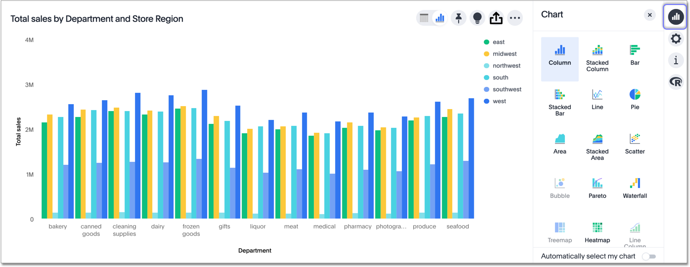
-
Select a different chart or visualization type.
Control default and available chart types Beta
You can now control the default display mode for Answers (table or chart). You can also decide which chart types are available and default for your cluster. For example, you can set the default chart type for an Answer as a bar chart. You could also decide to remove pie charts from your cluster. To enable this feature, contact ThoughtSpot support with details about which charts you want to designate as available, or which chart you want to designate as default.
Choosing a chart
| Some chart types may not be available, depending on the columns in your search. For example, if your search does not contain at least one geographical column, then you will not be able to select any of the geo chart types. ThoughtSpot shows unavailable chart types as grayed out. |
Hovering over a chart type icon tell you what columns you require before you can use it.
-
Column charts
The column chart is one of ThoughtSpot’s simplest, yet most versatile chart types. The column chart is often the chosen default chart type, and displays data as vertical columns. -
Stacked columns
The stacked column combines the different secondary dimensions into a single column, stacking them. Note that the dimensions retain their relative size and color. -
Bar charts
The bar chart is nearly identical to the column chart. The primary difference is that it displays data as horizontal bars. -
Stacked bar charts
Just like stacked columns, stacked bars combine the different secondary dimensions into a single stacked bar. -
Line charts
Like the column chart, the line chart is one of ThoughtSpot’s simplest, yet most versatile chart types. More often than not the line chart will be chosen as your default chart type. -
KPI charts
When you search a single measure, such asSales, ThoughtSpot automatically creates a KPI chart displaying the topmost value of that column.Add a time-related keyword to your Search to view a sparkline visualization of your key performance indicator.
-
Donut charts
The donut chart is a classic chart type that displays your search in a circular ring. -
Area charts
The area chart is based on the line chart, but has filled in regions. -
Stacked area charts
This option stacks the values of one dimension on top of the other, enabling you to clearly see the relative volume of data under the line. Contrast this with the presentation in the area chart, where data for different overlaps. -
Scatter charts
The scatter chart is useful for finding correlations or outliers in your data. -
Bubble charts
The bubble chart displays three dimensions of data with each containing a set of values. -
Pareto charts
The pareto chart is a type of chart that contains both columns and a special type of line chart. -
Waterfall charts
The waterfall chart is used to show how an initial value is affected by a series of intermediate positive or negative values. -
Treemap charts
The treemap chart displays hierarchical data as a set of nested rectangles. -
Heatmap charts
The heatmap chart displays individual data values in a matrix following a color scale. -
Line column charts
The line column chart combines the column and line charts. -
Stacked line column charts
The line stacked column chart combines stacked column and line charts. There are two y-axes, one for each measure. -
Funnel charts
The funnel chart shows a process with progressively decreasing proportions amounting to 100 percent in total. -
Geo charts
There are three geo charts that let you visualize geographical data in ThoughtSpot: Area, Bubble, and Heatmap. -
Pivot tables
Pivot tables in ThoughtSpot use the well known drag-and-drop interface. Creating a pivot table enables exploring alternate visualization of data in a wide table. The basic idea is that some data is easier to consume when laid out horizontally, while others, vertically. -
Sankey charts
Sankey charts show a flow from one set of values to another, usually with visual emphasis (brighter colors or larger bandwidths) for comparison of the values (for example, top cities in terms of sales might be emphasized). -
Radar charts
Radar charts display multivariate data on a two-dimensional chart of three or more quantitative variables that plot on axes (spokes) that originate at the same point. -
Candlestick charts
Candlestick charts efficiently collapse financial information, such as price movements on a single day, into a unified representation. A single 'candlestick' shows the open, high, low, and close prices for the same day.
Charts with multiple measures on the y-axis
You can have multiple measures on the y-axis of many charts, which is a great additional way of presenting information in a chart. A stacked column chart displays the measures stacked in the same column, while a column chart displays the measures side by side.
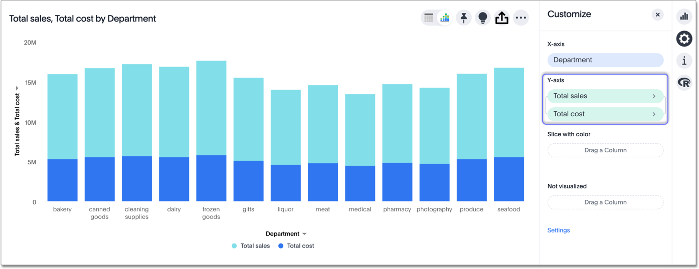
The following charts support multiple measures on the y-axis:
-
Column
-
Stacked Column
-
Bar
-
Stacked Bar
-
Line
-
Area
-
Stacked Area
-
Waterfall
-
Line Column
-
Line Stacked Column
To learn more, see Configure columns for the x and y axes.
Change chart gradient
You can now choose multiple colors to define a gradient in charts that support gradients — geo heatmap, geo area, heatmap, and treemap charts. You can control the low, mid, and high values, and numerical value points to customize the gradient.
To define the gradient in a geo heatmap, geo area, heatmap, or treemap chart, follow these steps:
-
Open your chart, click the gear icon, and select the measure tile under Value. In a search by sales, item type, and city, the value would be sales.
-
Select Edit under Gradient.
-
In the Gradient pop-up, define the colors for the Low, Midpoint, and High values using the color selector dropdowns.

-
In the text boxes below the color selectors, you can define the low, midpoint, and high points numerically. You can define the low point, high point and midpoint as a narrow range if you would rather only see gradients for the top values of your measure.
-
(Optional) Select Flip Color to switch the high and low value colors.
-
Select Save.
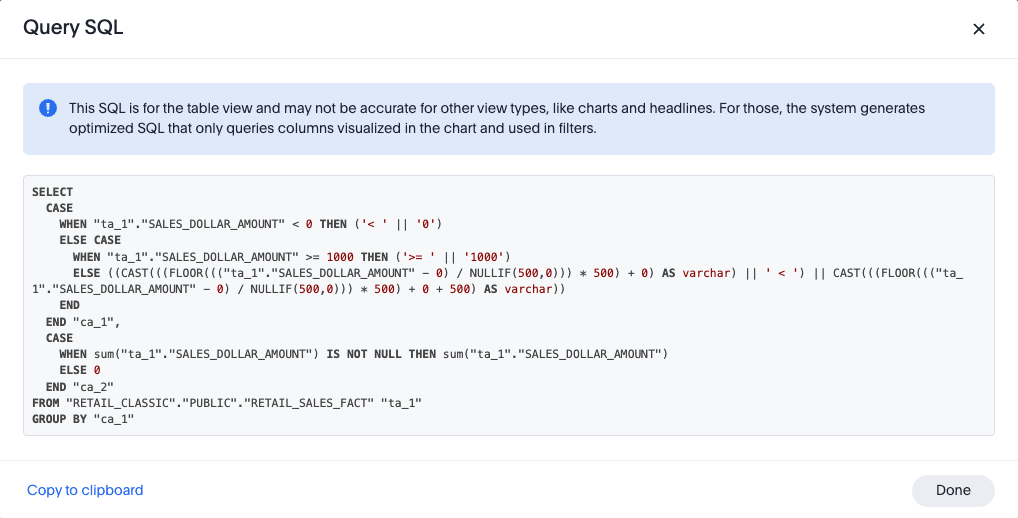
Query SQL
You can view the SQL query used to generate the chart by doing the following:
-
Click the Query visualizer button
 .
. -
Click the Query SQL button.