Pivot table
Pivot tables enable you to explore an alternate visualization of your data in a wide, customizable table. They allow you to visualize some of your data horizontally and some data vertically in the same table. A pivot table is a chart time table that uses a drag-and-drop interface.
If you would like to visualize your search as a pivot table, click the Type icon near the upper right of your screen, and select pivot table. You need at least one attribute and one measure in your search.
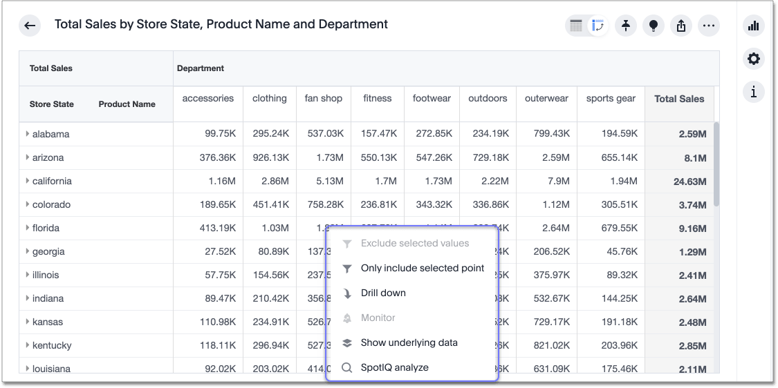
If you right-click a row or column heading, the system displays a contextual menu, allowing you to exclude or include values, drill down, show underlying data, SpotIQ analyze, or sort.
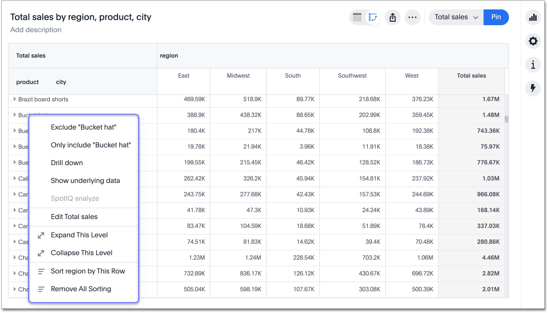
If you right-click a table cell, the system displays a contextual menu, allowing you to exclude or include values, drill down, show underlying data, or SpotIQ analyze.
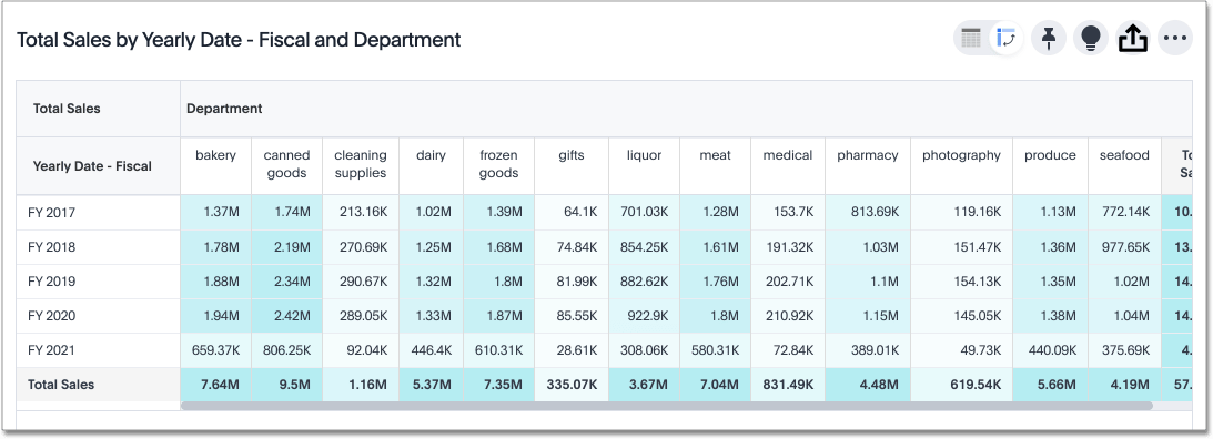
If your pivot table contains multiple values with long names, the column header has a horizontal scroll bar, so you can see all your measures without taking up excessive space in the pivot table.
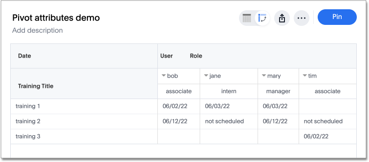
You can now include attributes in the pivot table cells as well as measures. This is useful for cases when you want to summarize text data such as user role, pass/fail, or other attributes. Note that when you add attributes to your pivot table cells, you will no longer see subtotals or grand totals below your pivot table.
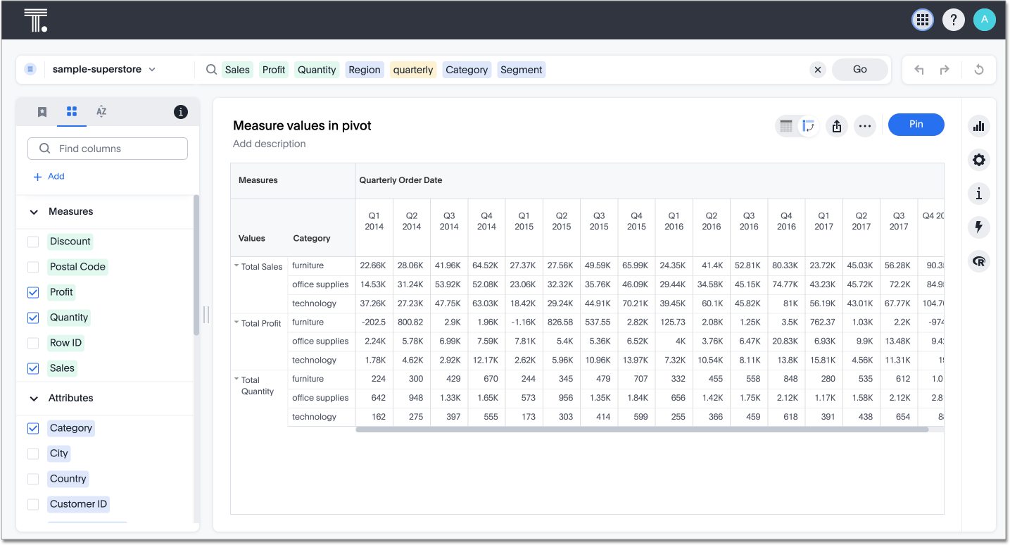
Grouping measure values
To compare multiple measures in a single view you can now group measures to share an axis. Grouping measures using Values allows you to control multiple measures in pivot table charts. You can move grouped measures and position them where you want in rows and columns. You can configure where the group measures appear in the table with respect to other attributes being used in either rows or columns.
When measures are grouped using Values, all subtotals and grand totals are turned off by default. Individual subtotals and grand totals can be turned on in settings.
| Adding attribute fields to Values is not supported. |
New Pivot Table charts
The New Pivot Table chart experience has the following features:
-
Performance
-
Faster interaction while expanding rows and columns
-
Pagination
-
-
Customization
-
Custom sort order support
-
Column widths
-
Slicing with measures and attributes
-
Measure names and values
-
-
UX
-
Tooltips
-
Legends
-
Zebra mode
-
Decluttered header space
-
New Pivot Table charts limitations
The following are limitations of the New Pivot Table:
-
Total size limit for a pivot table is 100,000/the number of measures in the pivot table.
-
If the query the pivot table is based on contains the
toporbottomkeyword, column and row summaries are not accurate. -
You cannot add conditional formatting to a pivot table in heatmap mode.
-
In new pivot tables, conditional formatting can only reference columns that are actively visualized (present in the Rows, Columns, or Values sections of the pivot). Columns moved to the Not Visualized section are excluded from the pivot’s data model instance and therefore cannot be used as conditions.
-
You cannot filter aggregated columns or columns with aggregated formulas.
-
Pivot tables do not support cumulative functions.
-
Pivot tables do not support moving functions.
-
Passthrough functions are not supported.
-
Version control is not supported for Answers which use the new pivot table.
-
New pivot tables do not support compact headers.
Pivot tables in Liveboard exports and schedules
You can export pivot tables in XLSX format. This feature ensures that pivot tables retain their full visual formatting and structural integrity when exported as XLSX files from a Liveboard. Previously, they would be exported as raw data table.
| This is only available when the Enable XLSX & CSV exports in Liveboard Report API or XLSX/CSV download of Liveboards Include any visualization in XLSX/CSV schedules features are enabled. |
| This feature is only supported for new pivot tables and not available for legacy pivot tables. |
Reorder your pivot table
You can restructure your pivot table by dragging and dropping the measures and attributes under edit chart configuration ![]() , or by dragging and dropping column and row headings on the table itself.
, or by dragging and dropping column and row headings on the table itself.
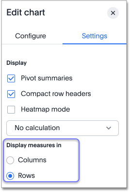
By default, ThoughtSpot displays measures in columns. To display measures in rows instead, follow these steps:
-
Click Display button on the right panel of the Answer.
-
Select Settings in the chart configuration panel.
-
Under Display measures in, select Rows.
Sort
To sort any column or row, right-click a row or column heading or subheading or a measure or attribute name and select Sort. You can also sort from the search bar. Type sort by <column name> [ascending | descending].
Sort your pivot table
You can sort your pivot table in the following ways:
-
You can sort on more than one attribute at a time, as long as it works within ThoughtSpot’s logic. See the sorting logic table.
-
When you sort by a measure, you sort rows only. This allows you to sort the rows by a measure and the columns by an attribute. For example, in the sample pivot table at the beginning of the article, you can sort the rows by
Total salesand the columns byStore State. -
When you save a pivot table that you sorted, all sorting saves as well.
-
If you sort both from the search bar and from the in-context row or column heading menus, whichever sorting is the latest overrides the other. For example, if you right-click a
Departmentrow heading and select Sort ascending, and then addsort by date monthlyto the search bar, ThoughtSpot sorts only bydate monthly.
| Starting state | Add sort on row attribute | Add sort on column attribute | Add sort on measure |
|---|---|---|---|
No sorts in place |
Adds sort |
Adds sort |
Adds sort, only across rows |
One or multiple sorts exist on row attributes |
Adds sort |
Adds sort |
Overrides previous sorts and sorts based on the measure |
One or multiple sorts exist on column attributes |
Adds sort |
Adds sort |
Adds sort, only across rows |
One sort on measure exists |
Adds sort. Overrides previous sort by measure |
Adds sort |
Overrides previous sort by measure |
Sort on both row and column attributes exists |
Adds sort |
Adds sort |
Adds sort. Overrides sort on row, retains sort on column |
Sort on column attribute and measure exists |
Adds sort. Overrides sort on measure, retains sort on column |
Adds sort |
Adds sort. Overrides sort on measure, retains sort on column |
Expand or contract columns and rows
Select a column or row heading to expand it, or by right-clicking the arrow on the upper left of a row or column heading.
When you pin a pivot table to a Liveboard, it retains your expansion settings.
Display data as a percentage of the total
You can see your data as a percent of a row or column total, or as a percent of the grand total. Grand totals aggregate all the data in your pivot table.
To see your data as a percent, select the Display icon, and select Display format from the chart configuration panel. Open the dropdown menu to choose whether you want to see your data as a percent of a row or column total, or as a percent of the grand total.
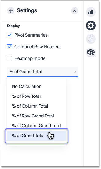
You only see 100% value when grand total rows is enabled. When it is disabled, the rows and columns have no parental total column, so the percentage cannot be calculated. All intermediate totals (columns or rows) display the percentage values calculated with respect to their parent. For each inner summary (column or row) the parental total values are assumed to be 100% internally.
Select options under Summary to see row and column totals.
Customize pivot summaries
You can now choose whether to display column and row summaries, and where in the pivot table they appear.
By default, pivot table summaries are calculated as separate SQL queries. The pivot total is the aggregate as defined for the column. For example, assuming that the formula is count(customerID) then the total will be a count. It is not possible to customize the total’s aggregate. In that case, modify the total to be an average where the line calculation is a count.
Note that a legacy instance-level setting does exist where the pivot total is a sum of the row numbers. As this is an instance flag, this will affect the behavior of all pivot tables. For more information, see Query generation and auto complete flags.
To customize pivot summaries, follow these steps:
-
Click Display button on the right panel of the Answer.
-
To display column and row summaries, select Show grand totals.
-
To display column and row subtotals, select Show subtotals.
-
To control whether the grand totals appear at the top of the chart or at the bottom, select Top or Bottom under Summary position.
| ThoughtSpot pivot table summary calculation changes now reflect any changes to the table data caused by filters or joins in the summary queries. |
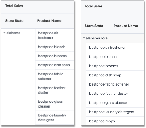
Format row headers
You can view your row headers in a more compact (tree) layout. To turn on compact row headers, select Compact row headers in the Settings menu.
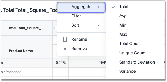
You can change the type of total shown for an aggregated measure from the header menu that appears when you select a header’s more icon:
Heatmap mode
The heatmap functionality allows you to see which measures contribute more to the total than others within the table.
To turn on the heatmap, click the Display icon. Check the Enable box under Heatmap mode.

| You cannot add conditional formatting to a pivot table in heatmap mode. |
Number and conditional formatting
You can perform conditional and number formatting on pivot tables. Both these features work the same way they work for regular ThoughtSpot tables, except that you cannot set different conditional formatting rules for pivot table cells and pivot table column summaries.
-
Click the Column icon

-
Select the measure you would like to add number or conditional formatting to.
-
Refer to Apply conditional formatting and Number formatting for more information.
Differences between old and new pivot tables
The following table describes the differences in conditional formatting behavior between old and new pivot tables:
| Feature | Old Pivot Tables | New Pivot Tables |
|---|---|---|
Conditional formatting scope |
Value-based only: you can only format a column based on its own values. For example, highlight cells where |
You can format a column based on any other visualized column’s values — more flexibility. For example, highlight cells where |
Non-visualized columns in conditional formatting |
Not supported |
Not supported |
Blended axes in a pivot table
With blended axes, you can group measures and control them through a system-defined chip called Values in the chart configuration settings. This chip acts like an attribute, with the different measures as its unique values. You can place measures anywhere across rows and columns in your pivot table. You can also place measures in rows of pivot tables instead of columns. This makes it possible to have more combinations and configurations of charts, and compare multiple measures together.
| For the Pivot Table (Classic), the Values chip can be moved around, but its default position is in the Not visualized. section. For Pivot Table New, the default position of Values chip is in the Columns section for multiple measures. |
Creating blended axes in a pivot table
To create blended axes in your pivot table, do the following:
-
In chart view, select the Layout button near the upper right of the Answer.
-
Drag one or more measures to the Values section.
-
Drag the Values chip to either the Rows or Columns section.
-
To view your changes, click the Update button.
-
Your pivot table reloads with your blended axes.
| You can only use measures in the Values section. |
Pivot table limitations
The pivot table chart type has the following limitations:
-
The pivot table displays a maximum of 100k rows. If your query returns more than 100k rows, you cannot visualize it with a pivot table.
-
If the query the pivot table is based on contains the
toporbottomkeyword, column and row summaries are not accurate. -
You cannot add conditional formatting to a pivot table in heatmap mode.
-
You cannot filter aggregated columns or columns with aggregated formulas.
-
Pivot tables do not support cumulative functions.
-
Pivot tables do not support moving functions.
-
Passthrough functions are not supported.
-
Subtotals and grand totals can be erroneous when one of the measures is a formula with aggregation.
-
Subtotals can be missing when categorizing by a formula.