Apply conditional formatting
You can apply conditional formatting to tables or charts to highlight values in the data. This makes values above, below, or within a particular threshold stand out.
Understand conditional formatting
Many companies create Liveboards with key metrics they want to track in daily or weekly staff meetings. Using conditional formatting, they can see at a glance how they are performing relative to these metrics.
You can add visual cues for KPIs (Key Performance Indicators) or threshold metrics to charts and tables, to easily show where you are falling short or exceeding targets. These visual cues are called conditional formatting, which applies color formatting to your search result. For tables, you can add conditional formatting to set the background color of cells in a table based on the values they contain. For charts, you can add conditional formatting to show the threshold(s) you defined, and the data that falls within them will be shown using the same color.
Apply conditional formatting to a table
You can apply conditional formatting to both table cells and column summaries. You can specify a background color, font color, and/ or font style: bold, italics, underlined, or strikethrough. You can create conditional formatting rules for both measures and attributes. For pivot tables, you can only create conditional formatting rules for measures.
Pivot tables follow the same conditional formatting rules as tables, even though they fall under ThoughtSpot’s chart category. However, you cannot set different conditional formatting rules for pivot table cells and pivot table column summaries.
| You can only apply conditional formatting to numbers and strings. For example, you can apply conditional formatting to a month of year column, with values such as January, but not to a date column where dates are in the format 1 Jan 2021. For pivot tables, you can only apply conditional formatting to measures, not attributes. Conditional formatting for pivot tables is only available in the new answer experience. |
If you create multiple conditional formatting rules for one measure or attribute, the first rule you create overrides the others, if there is a conflict. To change which rule overrides the others, simply drag and drop the rule to the top of the list of conditional formatting rules.
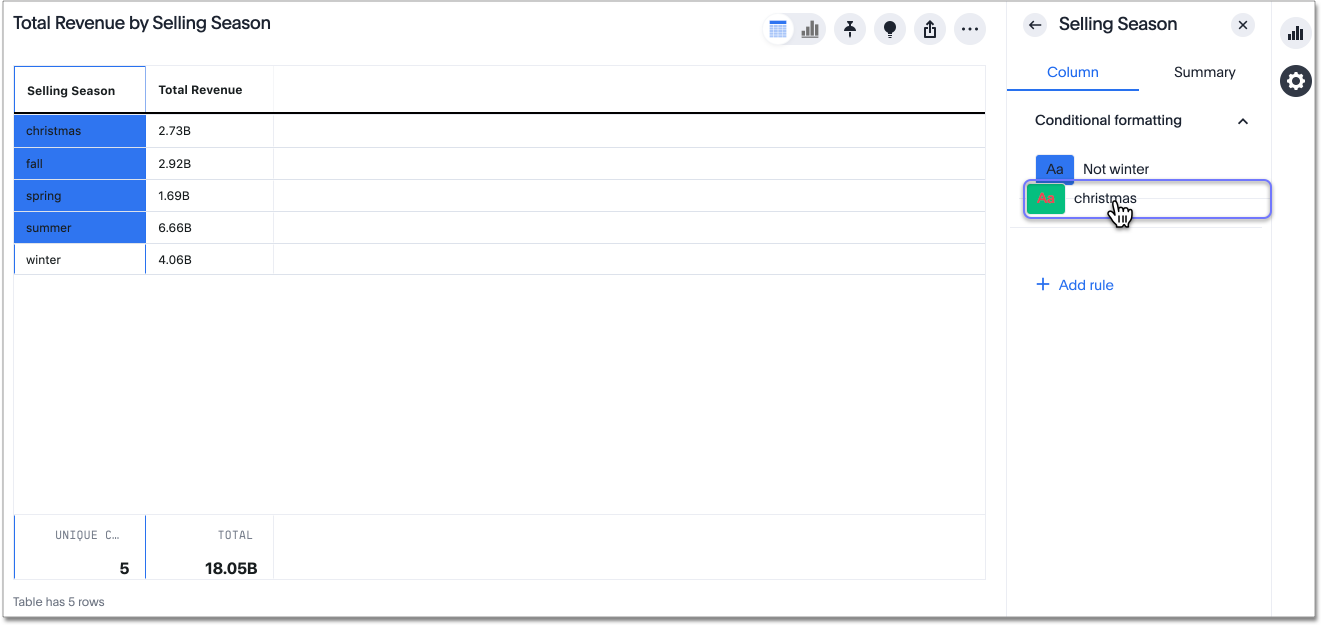
In the following example, the christmas table cell falls under both the is christmas rule, and the not winter rule. Currently, the not winter rule overrides the is christmas rule, so the christmas table cell does not have red text and a green background.
To create a conditional formatting rule:
-
Select the edit table configuration icon
 to the upper right of your table. The Edit table panel appears, on the Configure menu.
 -
Select the measure or attribute you would like to add a conditional formatting rule for.
-
The Edit panel for that column appears. Under Conditional formatting, select + Add rule. If you would like to add conditional formatting for a column summary, select Summary under the column name, and click + Add rule.
When you create a rule for a column, it does not automatically apply to the column summary. You must create a separate rule for the column summary. 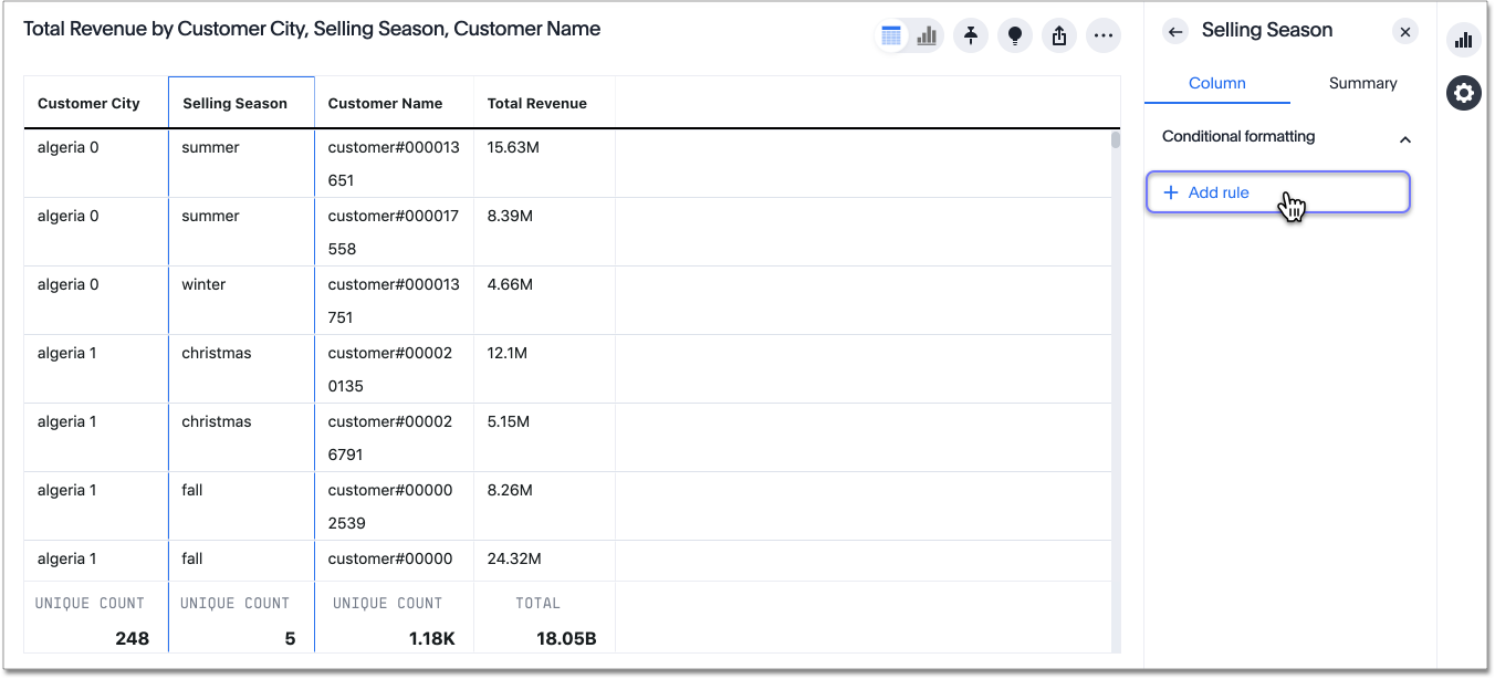
-
Select an operator. The valid options for attributes are
is,not,contains,does not contain,starts with,ends with,empty, andnot empty. The valid options for measures areless than,greater than,less than or equal to,greater than or equal to,equal to,not equal to,between,empty, andnot empty. -
Specify the column value(s) that the formatting should affect.
-
Choose a background color, font color, and/or font style: bold, italics, underlined, or strikethrough.
In this example, if the selling season
is (=) christmas, the background color for the table cell is green, and the font color is red.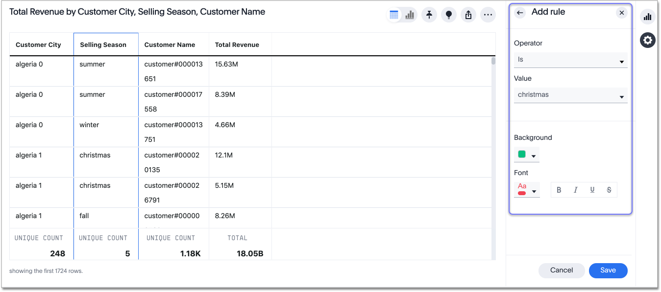
-
Select Save. The system applies the rule to the column or column summary.
-
You can edit an existing rule from the Edit panel for the column by selecting on the rule.
-
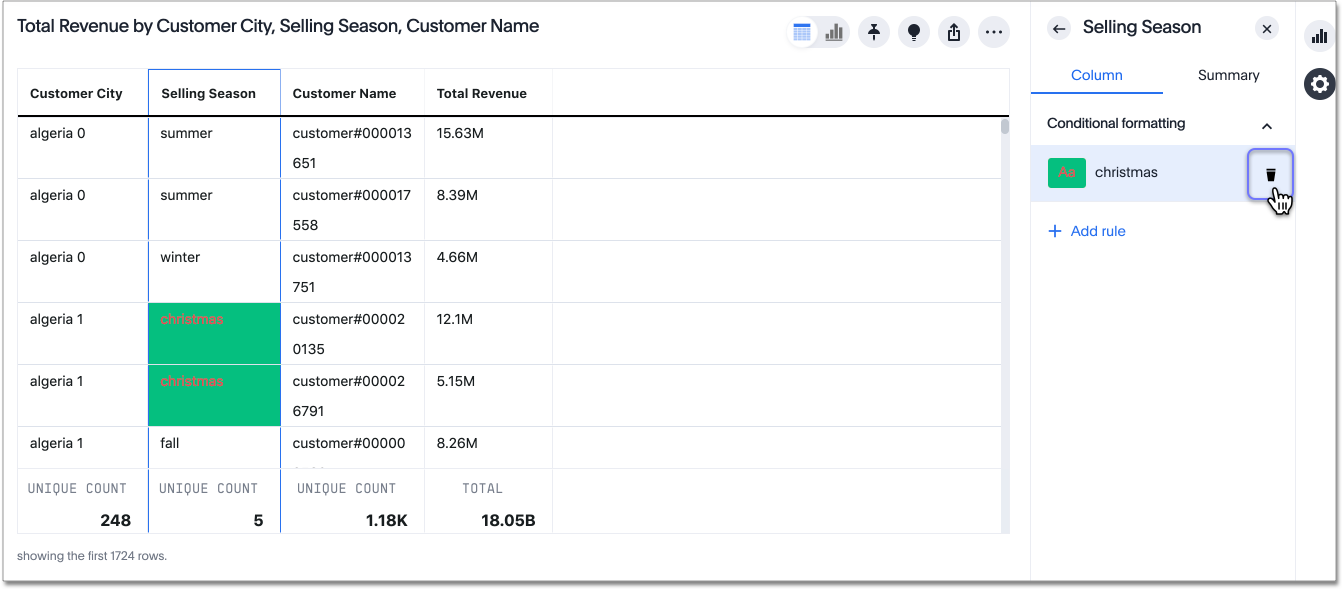
You can delete a conditional formatting rule from the Edit panel for the column. Select the delete icon that appears when you hover over a rule.
| If you change to a chart type, you must apply conditional formatting again. Conditional formatting is tied to the specific visualization. |
Apply conditional formatting to a chart
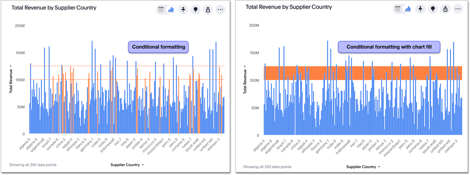
You can use conditional formatting to show charts with a target value or range drawn as a line in the chart, and the legend colors determined by where values fall relative to the target.
To apply conditional formatting to a chart, follow these steps:
-
Select the edit chart configuration icon
in the upper right of your chart. The Edit chart panel appears, on the Configure menu. Alternatively, you can select the Conditional formatting option in the axis menu for the measure you would like to add a conditional formatting rule for. If the new answer experience is off in your environment, you can only access chart conditional formatting from the axis menu. -
From the Edit chart menu, select the measure you would like to add a conditional formatting rule for.
-
The Edit panel for that column appears. Under Conditional formatting, select + Add rule.
-
Select an operator. The valid options for measures are
less than,greater than,less than or equal to,greater than or equal to,equal to,not equal to,between,empty, andnot empty. -
Select the conditional value, or in the case of the
betweenoperator, the conditional range. Here, we apply conditional formatting to revenue values between100 millionand125 million.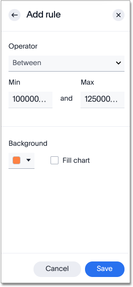
-
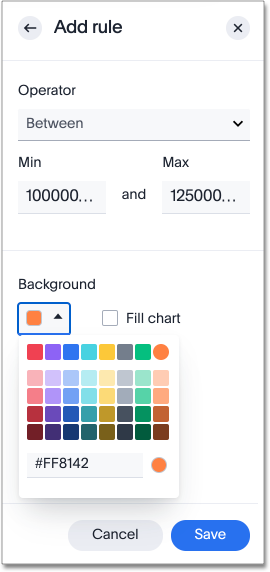
To specify a different color of the conditional format, select the new color from the color selector.
This option draws upper and lower limit lines on the chart, and colors the chart elements that meet the conditional requirements.
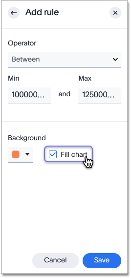
Alternatively, you can place a range band on the chart. Select the Fill chart option.
-
To add another condition, select + Add rule below the rule(s) you already created.
-
To remove a defined conditional format, navigate to the Edit panel for the measure. Select the delete icon that appears when you hover over a rule.
-
Select Done.
Here, you can see a chart that highlights elements with conditional formatting on some elements. You can also see how the same chart appears with a background chart band.
Limitations
The following chart types do NOT support conditional formatting:
-
Funnel
-
Geo area
-
Geo bubble
-
Geo heatmap
-
Heatmap
-
Pie
-
Radar
-
Sankey
-
Treemap


