Candlestick charts
A candlestick chart describes price movements of financial instruments, such as stocks, derivatives, currencies, and commodities.
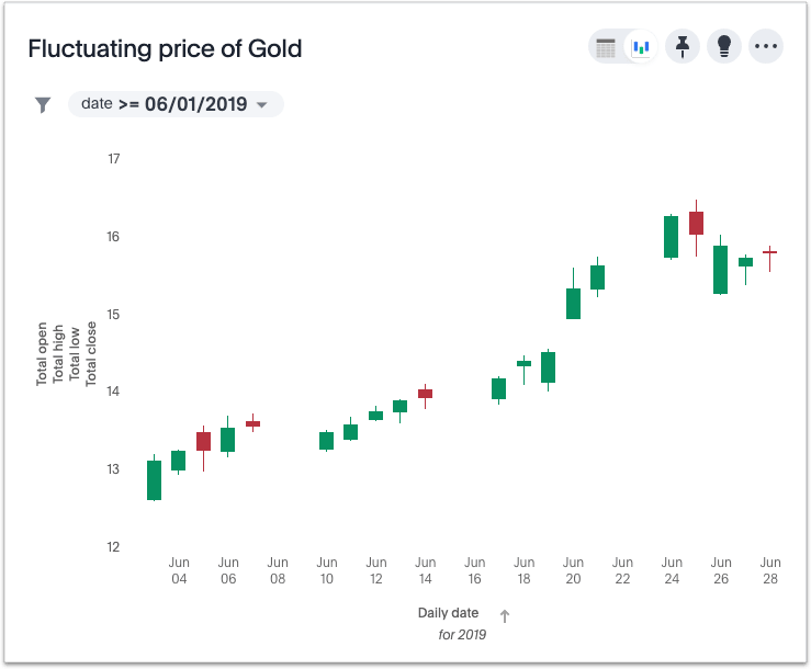
Candlestick charts enable fast decision-making in stock, foreign exchange, commodity, and option trading because they describe price movements over time in terms of OHLC measurements: open, high, low, and close prices. Each "candlestick" shows data for one day, so a monthly chart shows approximately 20 candlesticks, one for each trading day. The date is on the horizontal (X) axis, and it accounts for non-trading days. This chart type can accommodate intervals shorter or longer than one day, provided each interval clearly identifies the four measurements.
How candlestick charts represent data
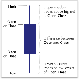
Candlestick charts have a very specific approach to representing data:
-
The High and Low values plot at the top and bottom of the candlestick.
-
The Open and Close positions vary, depending on the relative values of the price at opening and closing of the trading day.
-
The height of the rectangle depends on the difference between the Open and Close prices, and does not indicate the volume of trades.
-
The 'wick' that extends upwards from the rectangle indicates the difference between the highest of Open or Close, and highest traded value (High). Similarly, the extension downwards from the rectangle indicates the difference between the lowest of Open or Close, and the lowest traded value (Low).
-
Your search must compute four measures. Additionally, it must have a "for each" specification for the horizontal axis. Most commonly, this is a periodicity, such as
daily.
The search question can be expressed in the following form:
open high low close daily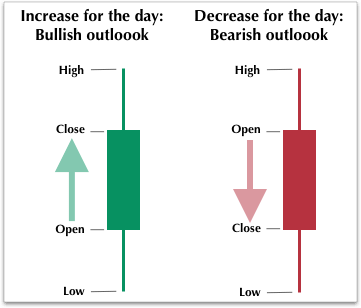
-
The candlestick chart does not show the volume of trades. However, the longer body of the candle generally correlates with the intensity of trading.
-
When the rectangle is green and high relative to other time periods, this is an indicator that the market for the financial instrument is very bullish, with a likely "buy" recommendation.
-
Alternatively, the red rectangles mean that the price is decreasing, and this pattern over time describes a bearish "sell" market for the instrument.
Interpreting candlestick charts
The following excerpt shows candlestick data for only three dates, June 26 - 28, 2019.
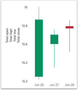
| Date | Open | High | Low | Close |
|---|---|---|---|---|
06-26-2019 |
$15.30 |
$16.00 |
$15.90 |
$15.90 |
06-27-2019 |
$15.60 |
$15.80 |
$15.70 |
$15.70 |
06-28-2019 |
$15.80 |
$15.90 |
$15.80 |
$15.80 |
Notice the following features of this chart:
-
For both June 26th and 27th, the Close price is higher than the Open price. The candlesticks for these days are rendered in green.
-
The close is lower than the open on June 28th, so the candlestick is red.
-
June 26th has the highest difference between its Open and Close prices. You can easily determine this based on the height of the rectangle.
-
The top-to-bottom size of the wicks vary with the High and Low prices. The range of prices in individual trades is greatest on June 26th, at $0.80. The range is identical, at $0.40, for both June 27th and June 28th.
-
The Open for one day almost never coincides with the Close of the previous day. This is due to after-hours trading.
Color customization in candlestick charts
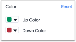
There are two color choices for this chart type:
-
Up Color
-
Down Color
ThoughtSpot uses Green and Red, respectively, as default.
Each candlestick renders in one of the two options, depending on the relative values of open and close measurements.
Adapting candlestick charts for other data
You can use this chart to display other statistical data, as long as you provide four measurements in addition to specifying the horizontal axis.


