Results that are tables
Tables display your answer in a format similar to an Excel spreadsheet.
In the table view, your search identifies attributes and/or columns, and presents them as a table.
ThoughtSpot aggregates the results based on the level of aggregation that you specify in the search.
For example, if you only type revenue, you see the total sum of revenue as a single number.
If you include the keyword monthly, the results are broken down by month.
From the column header, you can rename the column, or sort or filter the column.
You can rearrange the column order of your table by dragging and dropping the columns, either from the table itself or from the Edit table: Configure menu.
You can also change the column widths.
Rearrange column order
You can rearrange the column order of your table after adding all of your search terms.
To rearrange the column order:
-
While viewing your answer as a table, select the column header you would like to move.
-
Drag it across to its new position.
You can also rearrange the column order from the Edit table: Configure menu.
Select the edit table configuration icon ![]() .
Drag and drop the attribute or measure that you would like to move to a new position.
The order of columns in the Configure menu reflects the column order of the table.
.
Drag and drop the attribute or measure that you would like to move to a new position.
The order of columns in the Configure menu reflects the column order of the table.
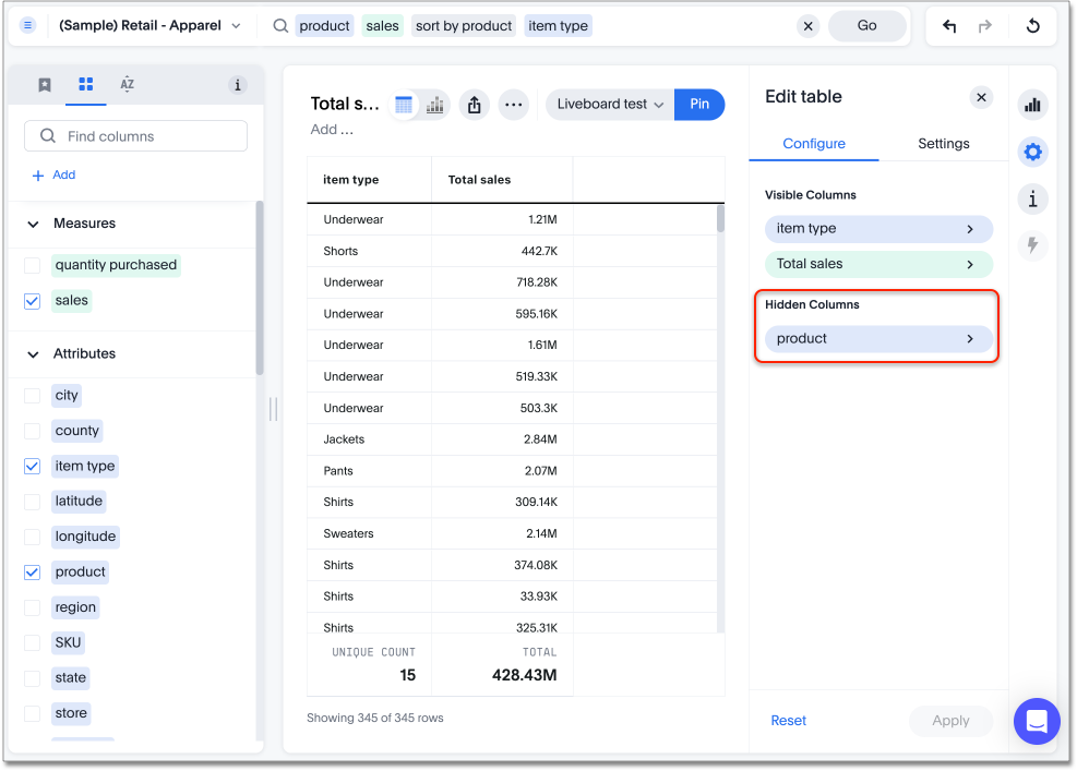
Hide a column
You can hide a column from your table without affecting the underlying search. For example, you can search for product item type sales sort by product, and then hide the product column from your table. Hiding the product column does not affect the sorting of the items.
To hide a column from a table, follow these steps:
-
Enter your search in the search bar and press Enter.
-
Select the table view of the results, and click the chart configuration icon
 .
. -
From the Visualized Columns section, select the column you want to hide, and drag it to the Hidden Columns section.
-
Click Apply.
Resize column widths
You can resize the column widths of your table after adding all of your search terms. Any adjustments you make to the column widths of your table are saved when you pin the table to a Liveboard. To resize the column widths:
-
While viewing your answer as a table, hover over a column border in the column header row.
-
Click and drag the border to create your preferred column width.
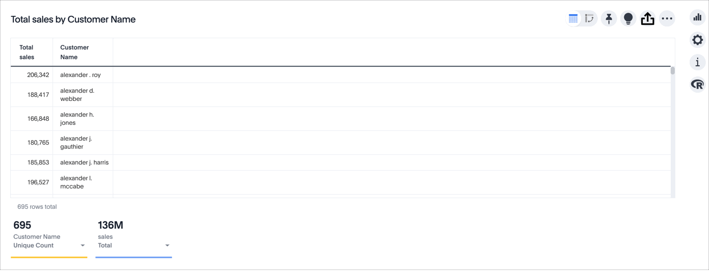
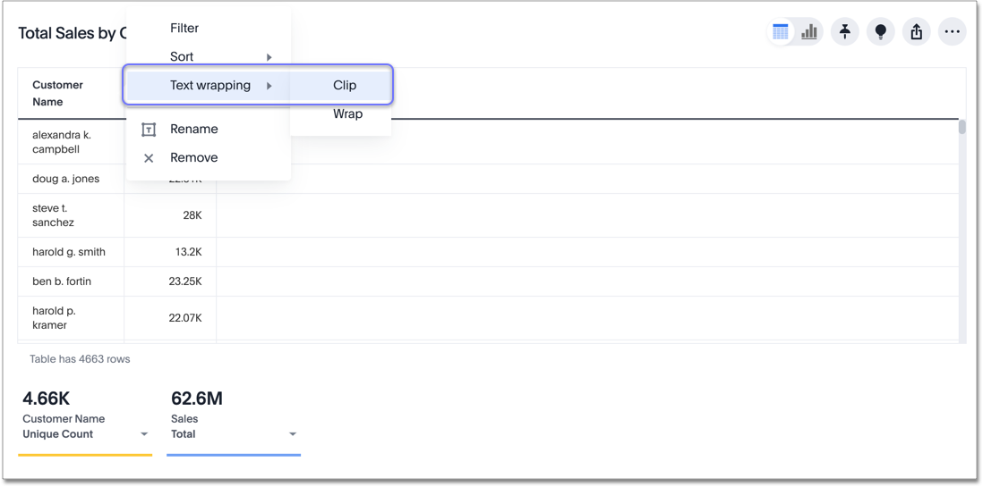
Clip or wrap text
You can clip or wrap long text in a table cell, or on a table header. You can configure clipped or wrapped text for the entire table, or for each column individually.
When you clip long text, the table cells show only the beginning of the text. The rest appears if you increase the column width.
When you wrap long text, the table shows all the text in its cells by increasing the number of lines in the cells.
To clip or wrap text for the entire table, select the edit table configuration icon ![]() .
Select Settings.
Under text wrapping, choose wrap or clip.
.
Select Settings.
Under text wrapping, choose wrap or clip.
To clip or wrap text for each column individually, hover over the column name and select the more options menu icon ![]() .
Select text wrapping, and choose wrap or clip.
.
Select text wrapping, and choose wrap or clip.
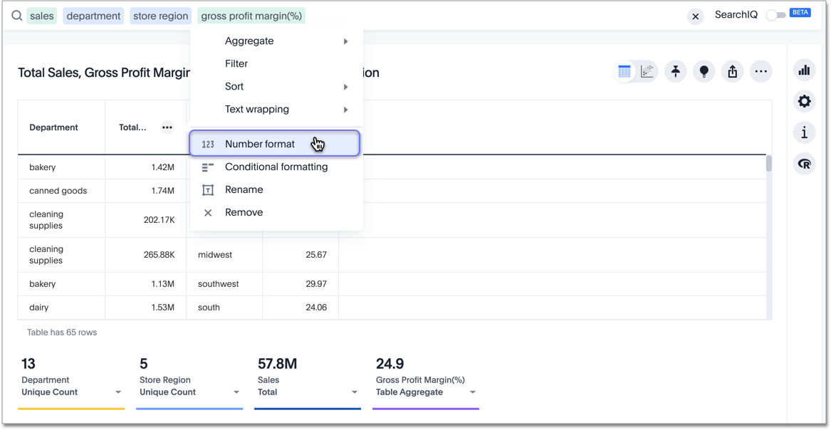
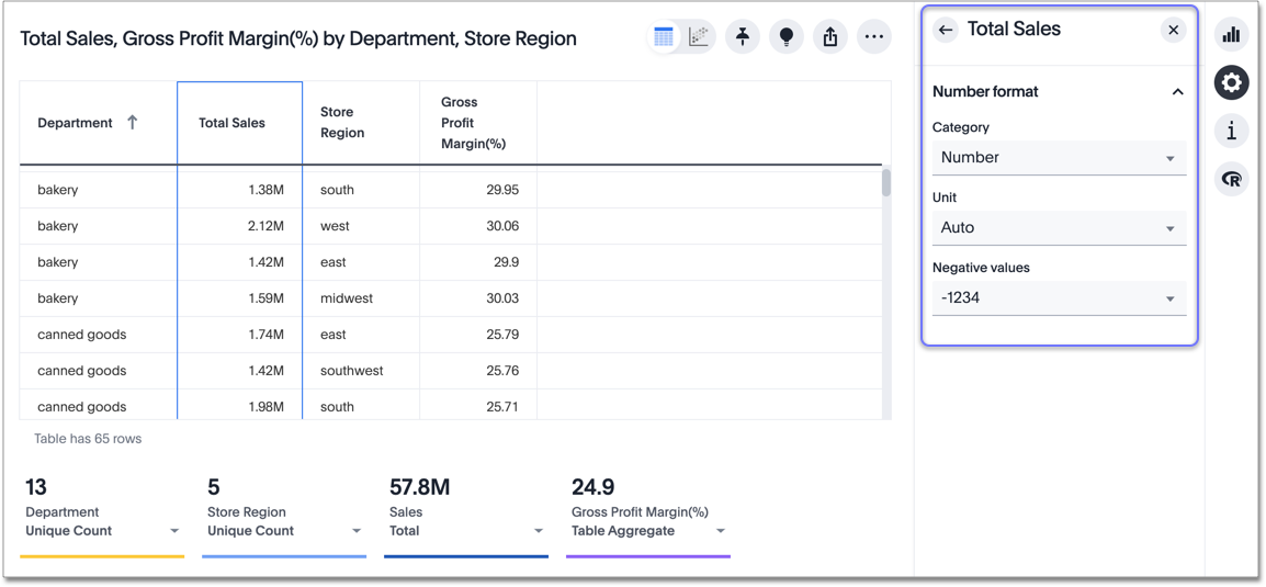
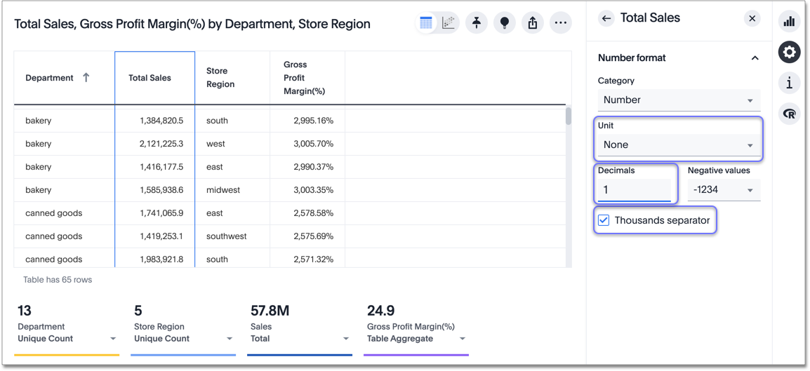
Number formatting
You can format the numbers in any table column or column summary based on a measure. This functionality allows you to change the category (number, percentage, or currency), units (auto, none, thousand, million, billion, or trillion), or method of writing negative values (-1234, 1234-, or (1234)).
| When you change the formatting for a column, you do not change the formatting for its column summary. You must separately change the number formatting for column summaries. |
To change the number formatting:
-
Select the edit table configuration icon
to the upper right of your table.
The Edit table panel appears, on the Configure menu. -
Select the column you want to format the values of, or the column whose column summary you would like to format.
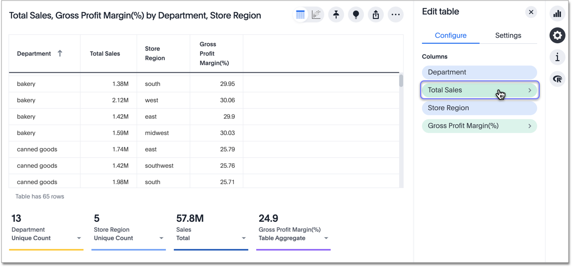
The Edit panel for that column appears. To format the column summary, select Summary.
You can also reach this panel from the more icon that appears when you hover over a column name:
On the table, the column that you are editing is highlighted in a blue box.
-
Under number formatting, you can edit the category, units, or method of writing negative values. Select the dropdown menus to select new values.
-
Specify a category: number, percentage, or currency. If you select currency, you can select the type of currency: USD, AUD, EUR, and so on. If you do not pick a category, ThoughtSpot automatically picks the best category for your data.
-
Specify units: Select none to see your data down to two decimal points, for example, or select millions to see labels rounded to the millions. If you do not specify units, ThoughtSpot automatically picks the best units for your data.
Depending on the unit, you can also specify the number of decimal places, and remove or include the thousand separator.
-
Specify the method for writing negative values: -1234, 1234-, or (1234). The default is -1234.
Conditional formatting
You can perform conditional formatting on both measures and attributes, within table cells and in the table summaries.
Refer to Apply conditional formatting.
Note that certain elements of conditional formatting are part of the new answer experience. These elements include conditional formatting for table summaries and improved conditional formatting for attributes and measures in table cells. The new answer experience is on by default. You can toggle it on or off from the Experience manager in your profile. If that option is not available, contact your administrator.
Sort columns
You can sort a table by column values by selecting the column title.
If you hold down the SHIFT key, you can sort on multiple column titles at a time.
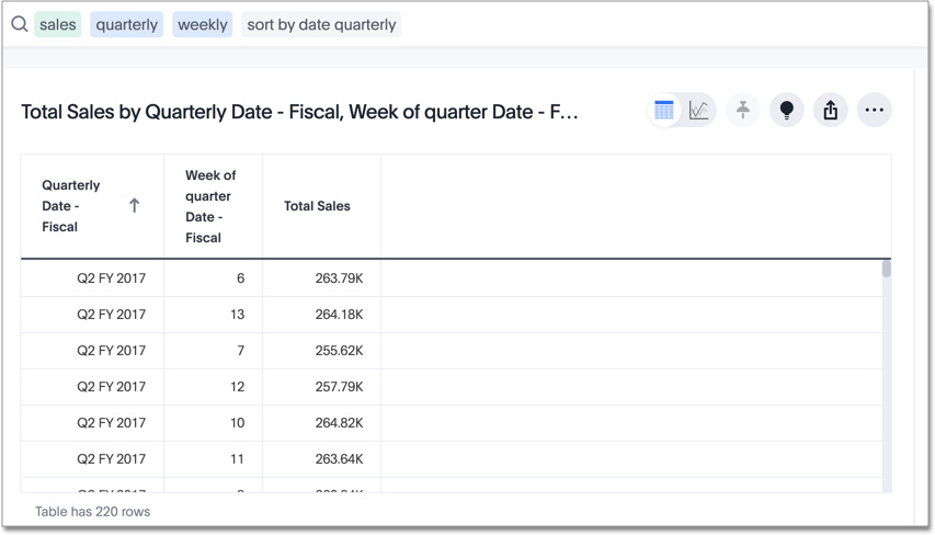
This is especially useful for date columns.
For example, if you search for sales by week and by quarter, and just sort the quarterly column, the weeks are not in order:
If you press SHIFT and then select the weekly column header, the weeks are in order, by quarter:
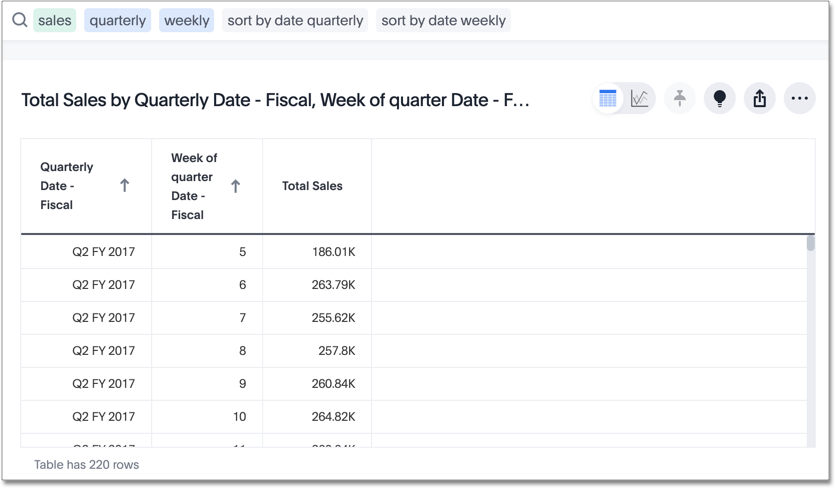
You can achieve this from the search bar, as well, by adding sort by date quarterly and sort by date weekly.
| This same functionality is available on tables you see elsewhere in ThoughtSpot. For example, a table in the Data page is also sortable in this manner. |
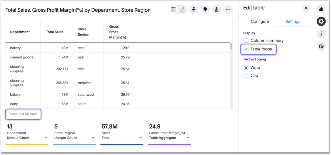
Table footer
Tables automatically have footers that tell you the number of rows the table has. You can enable or disable this footer from the Settings menu.
-
Select the edit table configuration icon
to the upper right of your table.
The Edit table panel appears, on the Configure menu. -
Select Settings.
-
Select table footer to enable or disable it.
Content density
Content density is part of the new answer experience, which is on by default. You can turn it on or off from your profile. You can view more table rows at a time by changing the content density. You can change the content density from the Settings menu.
-
Select the edit table configuration icon
to the upper right of your table. The Edit table panel appears, on the Configure menu. -
Select Settings.
-
Under Content density, select regular or compact.
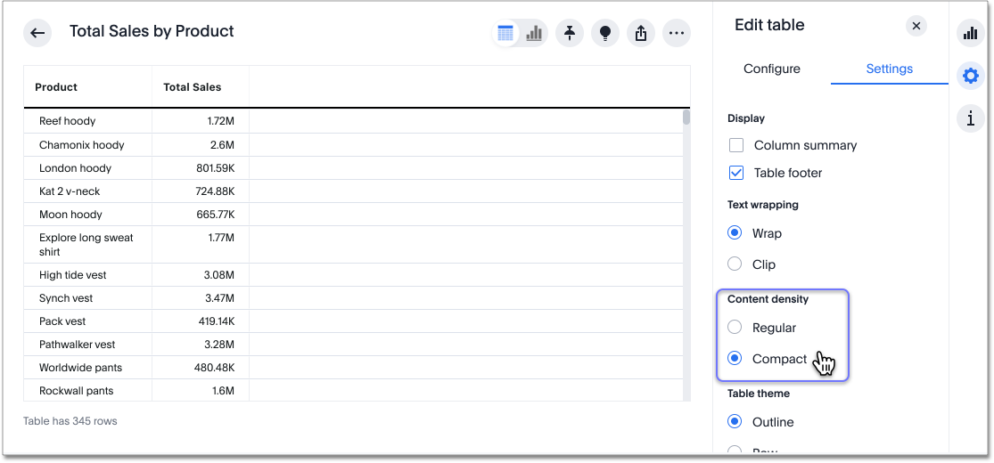
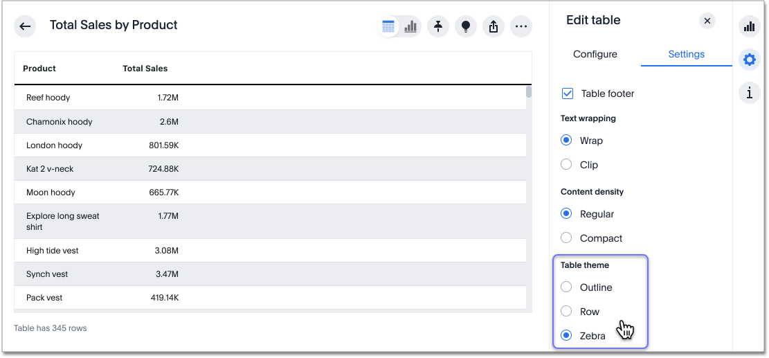
Table theme
Table themes are part of the new answer experience, which is on by default. You can turn it on or off from your profile. You can change the table theme from the default (outline) to row or zebra. You can change the table theme from the Settings menu. Row removes the lines between columns, and zebra changes the color of every other row.
-
Select the edit table configuration icon
to the upper right of your table. The Edit table panel appears, on the Configure menu. -
Select Settings.
-
Under Table theme, select outline, row, or zebra.
Column summaries
For columns with numeric information, you can turn on column summaries that display column totals. You can perform number and conditional formatting on column summaries, just like you can for column values.
Enable or disable column summaries
-
Select the edit table configuration icon
to the upper right of your table.
The Edit table panel appears, on the Configure menu. -
Select Settings.
-
Select column summary to enable or disable column summaries for your table. You can also enable or disable individual column summaries, from the Summary section in a column’s Edit
panel.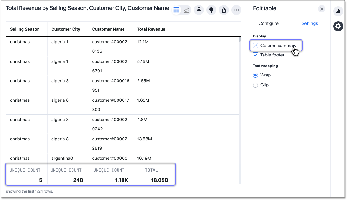
Column summaries are not available for tables with more than 15000 rows, unless the data comes from a direct connection to the external database.
If you are using the new answer experience, which is on by default, and your query generates more than 15,000 distinct table rows, the column summary shows a dash instead of a number, and tells you to use a filter to reduce the number of rows.
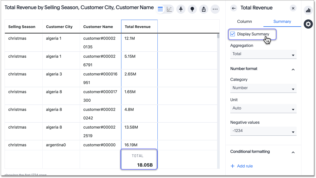
Column summary aggregation
You can modify how you would like a column summary value to be displayed by clicking the dropdown on a summary and selecting a different type of aggregation. This aggregation menu is also available from the Summary section in a column’s Edit ![]() panel. For measures, the available aggregations are
panel. For measures, the available aggregations are total, average, standard deviation, variance, min, and max. For attributes, the available aggregations are unique count and total count.
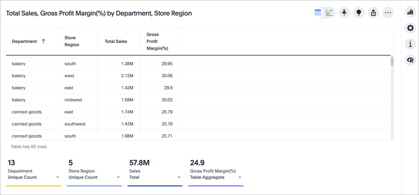
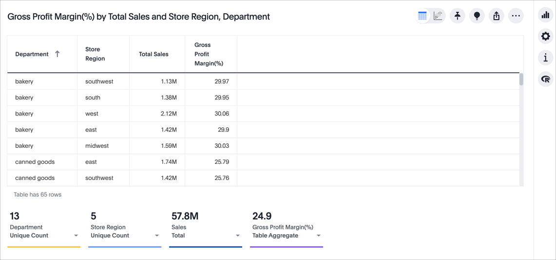
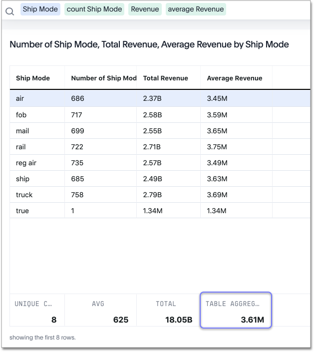
Table aggregate summary
The Table Aggregate summary appears when you use an aggregate function either through a formula or a search bar query, such as average of a measure. It recalculates the function for the entire table. In such cases, the Table Aggregate summary appears by default, instead of the “Avg” option, which does a second level of aggregation on top of the existing aggregation.
In the following example, the table aggregate is a result of the Average Revenue formula sum ( revenue ) / count ( ship mode ), which divides the total profit of each ship mode by the sum total count for that ship mode. ThoughtSpot recalculates that function for the entire table, taking the sum total profits of all ship modes and dividing it by the sum total count of all ship modes. Here, that results in a table aggregate average profit of 3.61M. The average summary option, by comparison, sums the average revenue for all ship modes and divides it by the number of ship modes (8), providing a less accurate average.
When a user searches with a formula containing both a conditional clause and a group_aggregate expression, then ThoughtSpot detects the aggregation type on the first non-constant output clause and uses it in the Headline summary. In this context, a non-constant output clause means any base column reference (for example, Revenue), or formula (for example, sum(revenue)).
For example, consider the formula group_aggregate(sum(if (Color = 'blue') then 0 else group_unique_count(Discount))). In this case, the headline summary would use COUNT_DISTINCT. Of the two output clauses in this formula, then 0 is a constant, while else group_unique_count(Discount) is non-constant and has an aggregation type of COUNT_DISTINCT.
Table summary aggregate matrix
| Function | Total | Average | Min | Max | Variance | Standard deviation | Table aggregate | Total count | Unique count |
|---|---|---|---|---|---|---|---|---|---|
Column measure |
Yes |
Yes |
Yes |
Yes |
Yes |
Yes |
No |
No |
No |
Column attribute |
No |
No |
No |
No |
No |
No |
No |
Yes |
Yes |
average(x) |
No |
No |
Yes |
Yes |
No |
No |
Yes |
No |
No |
count(x) |
Yes |
Yes |
Yes |
Yes |
Yes |
Yes |
No |
No |
No |
max(x) |
No |
Yes |
Yes |
Yes |
Yes |
Yes |
No |
No |
No |
median(x) |
No |
No |
Yes |
Yes |
No |
No |
No |
No |
No |
min(x) |
No |
Yes |
Yes |
Yes |
Yes |
Yes |
No |
No |
No |
percentile(x) |
No |
No |
Yes |
Yes |
No |
No |
No |
No |
No |
stddev(x) |
No |
No |
Yes |
Yes |
No |
No |
Yes |
No |
No |
sum(x) |
Yes |
Yes |
Yes |
Yes |
Yes |
Yes |
No |
No |
No |
unique count(x) |
Yes |
Yes |
Yes |
Yes |
Yes |
Yes |
No |
No |
No |
variance(x) |
No |
No |
Yes |
Yes |
No |
No |
Yes |
No |
No |
cumulative_* |
No |
No |
Yes |
Yes |
No |
No |
No |
No |
No |
moving_* |
No |
No |
Yes |
Yes |
No |
No |
No |
No |
No |
rank |
No |
No |
No |
No |
No |
No |
Yes |
No |
No |
rank_percentile |
No |
No |
Yes |
Yes |
No |
No |
No |
No |
No |
group_* - with aggregate in search. For example, sum fxExample |
Yes |
Yes |
Yes |
Yes |
Yes |
Yes |
Yes |
No |
No |
group_* - with NO aggregate in search. For example, fxExample |
No |
No |
No |
No |
No |
No |
No |
Yes |
Yes |
group_aggregate - with outer aggregate. For example, sum(group_aggregate….) |
Yes |
Yes |
Yes |
Yes |
Yes |
Yes |
Yes |
No |
No |
group_aggregate - with NO outer aggregate. For example, (group_aggregate….) |
No |
No |
No |
No |
No |
No |
No |
Yes |
Yes |
group_aggregate - with NO outer aggregate. For example, (group_aggregate….) Aggregate defined in search. For example, sum fxExample |
Yes |
Yes |
Yes |
Yes |
Yes |
Yes |
Yes |
No |
No |
sum - last_value/first_value |
Yes |
Yes |
Yes |
Yes |
Yes |
Yes |
Yes |
No |
No |
count - last_value/first_value |
Yes |
Yes |
Yes |
Yes |
Yes |
Yes |
Yes |
No |
No |
unique count - last_value/first_value |
Yes |
Yes |
Yes |
Yes |
Yes |
Yes |
No |
No |
No |
min - last_value/first_value |
Yes |
Yes |
Yes |
Yes |
Yes |
Yes |
Yes |
No |
No |
max - last_value/first_value |
Yes |
Yes |
Yes |
Yes |
Yes |
Yes |
Yes |
No |
No |
average - last_value/first_value |
No |
No |
Yes |
Yes |
No |
No |
Yes |
No |
No |
standard deviation - last_value/first_value |
No |
No |
Yes |
Yes |
No |
No |
Yes |
No |
No |
variance - last_value/first_value |
No |
No |
Yes |
Yes |
No |
No |
Yes |
No |
No |
Table aggregate
Table aggregates are applied when aggregations are non-composable or when an expression is built on functions of aggregates, such as AVG(x) + SUM(x).
Non-composable aggregations
Non-composable aggregations produce incorrect results when applied to already aggregated data. These functions depend on row count and require special handling.
Consider the following examples:
- AVG(x)
-
The average of averages does not equal the true overall average.
- VARIANCE(x) or STDDEV(x)
-
These depend on all data points and cannot be aggregated.
- Expressions containing multiple aggregates, like
AVG(x)+SUM(x) -
These lose accuracy when derived from aggregated data.
Composable aggregations
Composable aggregations can be applied multiple times at different levels of aggregation without losing correctness. These functions do not depend on row count and can be safely reaggregated.
Consider the following examples:
- SUM(x)
-
The sum of sums is still a valid sum.
- COUNT(x)
-
Counting counts still produces the correct total.
- MAX(x) or MIN(x)
-
The maximum or minimum of values remains correct.
| Condition | Applicable |
|---|---|
Single composable function at root level (SUM, MAX, COUNT, etc.) |
No |
Single/multiple standard functions ONLY (except supported cases) |
Yes |
Single/multiple cumulative functions ONLY |
No |
Single/multiple group functions ONLY |
Yes |
Single/multiple moving functions ONLY |
No |
Constant functions (for example, SUM(1)) |
No |
Group function supported cases
Table aggregates apply when the expression contains a group function, as long as there are no non-aggregate subexpressions.
Supported cases:
-
group_average(revenue, color) -
min(group_aggregate(average(revenue), querygroups() + {color}, {})) -
group_average(revenue, city, region) / group_average(revenue,region)
Not supported:
-
revenue - group_average(revenue, color). Contains a non-aggregate subexpression.


