Radar charts; spiderweb charts
The radar (or spiderweb) chart contains both columns and a special type of line chart. It displays data in the form of a two-dimensional chart of three or more qualities, represented on axes that radiate from the same point.
You can use radar charts to visualize user ranking of an experience or product. You can use a spiderweb chart to examine the relative values for a single data point, or to locate outliers.
When you build a radar chart, you must provide at least one attribute and one measure. The measure values move from smallest to largest, to the outer edge of the web. Each spoke of the web is reserved for one of the variables. The points where each value lies on the web are connected.
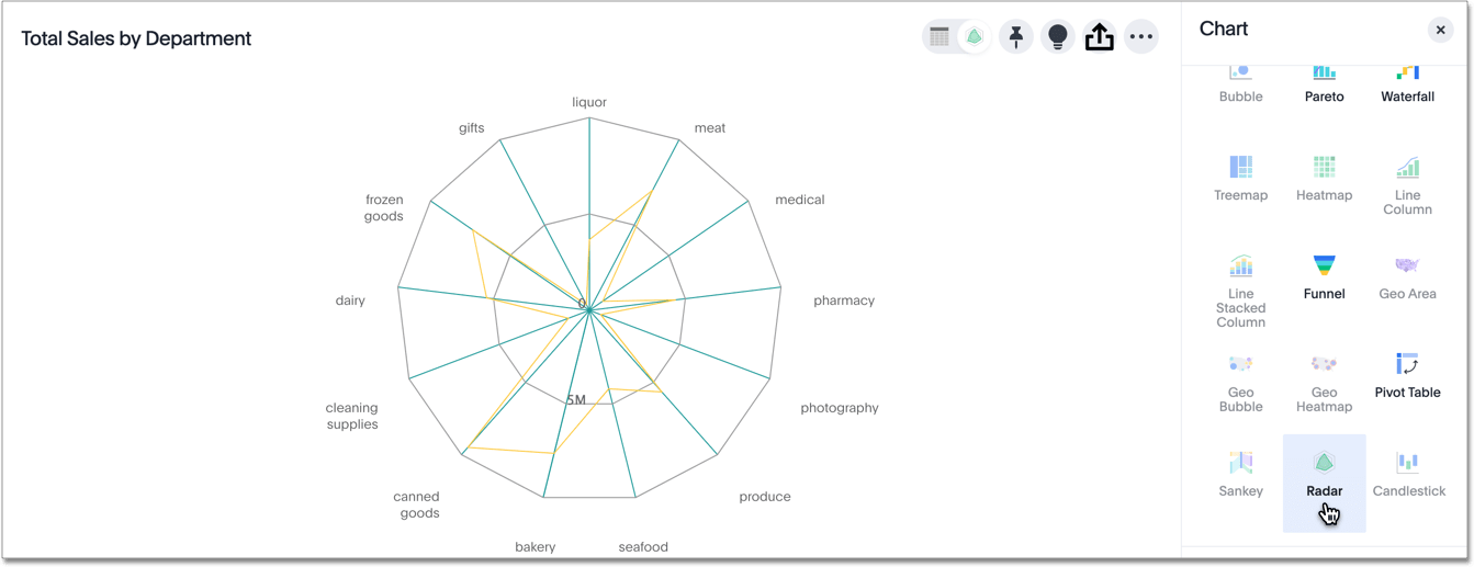
You may notice that sales of gift items are outliers, and minimal compared to the average.


