Charts and tables that display a very large number of data values
ThoughtSpot’s charts and tables can support many data values, and you can easily understand how much of the data your chart or table displays.
High cardinality tables
ThoughtSpot tables are no longer limited to 1000 rows. If your data is in ThoughtSpot’s in-memory database, the new default maximum number of rows is 20,000. You can configure this maximum, up to 35,000. If your data comes from a connection to an external database, there is no maximum.
To configure the maximum number of rows on a table for data in ThoughtSpot’s in-memory database, contact ThoughtSpot support.
Note that the behavior of a table with many rows may differ, depending on your connection to your data. ThoughtSpot automatically loads the first 1000 rows of your data, regardless of where you store your data.
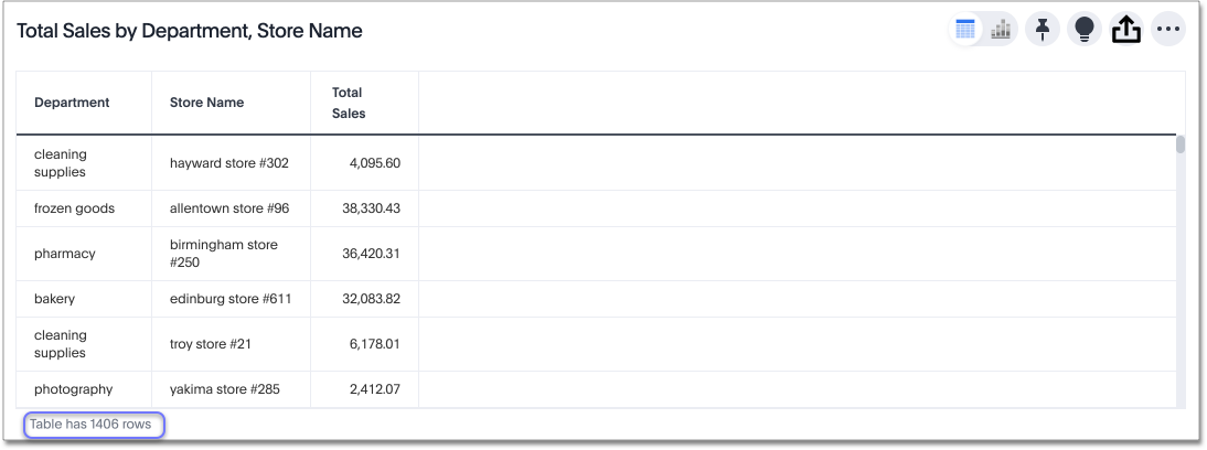
If your data is in ThoughtSpot’s in-memory database, the footer shows the total number of rows in the table, up to the cluster-configured maximum. For example, if your cluster’s maximum number of rows is 25,000 rows, and you have a table with 24,000 rows, the footer message for that table reads Showing 1,000 of 24,000 rows. When you scroll past the first 1,000 rows, it reads Showing 2,000 of 24,000 rows, and so on. For a table with 26,000 rows, the footer message for the table reads Showing 1,000 of many rows. If you scroll all the way down, it reads Showing 25,000 of many rows, because that is your cluster maximum.
Here, the table has 1406 rows. This image comes from data in ThoughtSpot’s in-memory database.
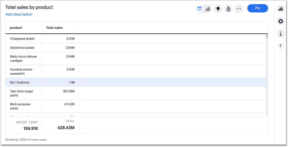
The following image comes from data from a connection to an external cloud data warehouse. Here, the table has many rows, and ThoughtSpot is showing the first 1000. The footer text displays Showing 1000 of many rows. If you scroll down, ThoughtSpot shows the next 1000, and the footer text displays Showing 2000 of many rows. If you scroll all the way down on your table, the footer text might display Showing 5018 of 5018 rows, for example. If your table has more than 1,000 rows, it does not tell you how many rows are in the data set, until you scroll all the way down. If your table has less than 1,000 rows, ThoughtSpot displays the number of rows in the data set in the footer.
Column summaries are not available for tables with more than 15000 rows, unless the data comes from a direct connection to the external database.
High cardinality charts
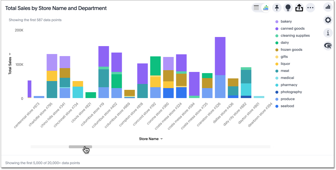
ThoughtSpot charts contain several new features. You are no longer limited to 1000 data points. When your chart has a very large number of data values, you see a horizontal scroll bar at the bottom. The new default maximum number of data points is 20,000. You can configure this maximum, up to 35,000. To configure the maximum number of data points on a chart, contact ThoughtSpot support.
Note that the behavior of a chart with many data points may differ, depending on your connection to your data. ThoughtSpot automatically loads the first 5000 data points of your data. If your data is in ThoughtSpot’s in-memory database, the footer shows the total number of data points in the chart, up to the cluster-configured maximum. If your data comes from a connection to an external database, the footer does not tell you how the number of data points in the table. The following image comes from data in ThoughtSpot’s in-memory database.
If you want to see the whole chart at one time, you can select the fit to screen option.
To fit to screen, click the edit chart configuration ![]() icon, and select the Settings menu.
Select fit to screen.
icon, and select the Settings menu.
Select fit to screen.
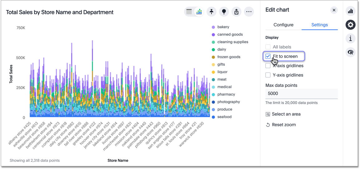
When you fit to screen, you see the whole chart. You can easily return to the zoomed-in view, by unselecting the fit to screen option.
Note that when you enable fit to screen, the all labels option is grayed out. You cannot turn on all labels when you fit to screen, unless the visualization does not have enough data points to require a scroll bar, and thus defaults to fit to screen mode.
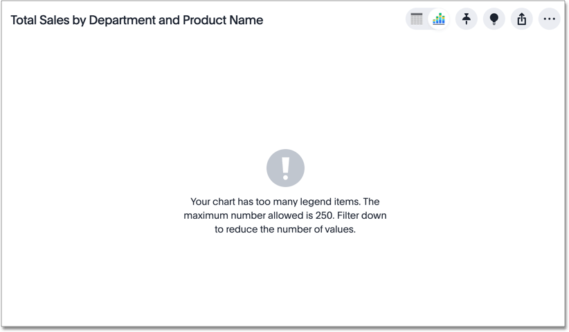
You can now have more than 40 legend items in your chart. You can slice with color using a column that has up to 250 values.
If you attempt to slice with color using a column that has more than 250 values, ThoughtSpot does not display the chart. You receive this error message, telling you to filter to reduce the number of values:
ThoughtSpot also warns you if your search contains too many data points, so that you can filter your search.


