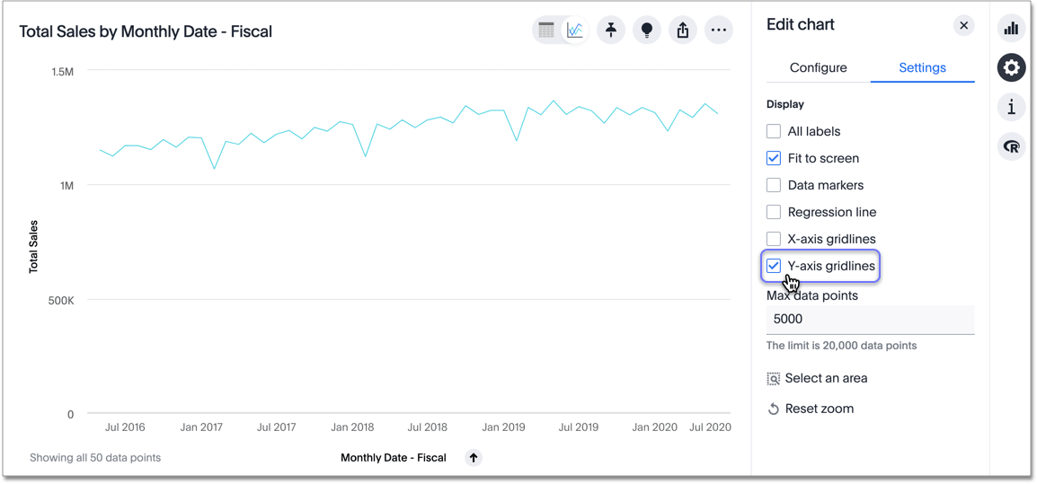
Display gridlines
Charts with x- and y-axes can display gridlines. Y-axis gridlines provide horizontal gridlines, and x-axis gridlines provide vertical gridlines.
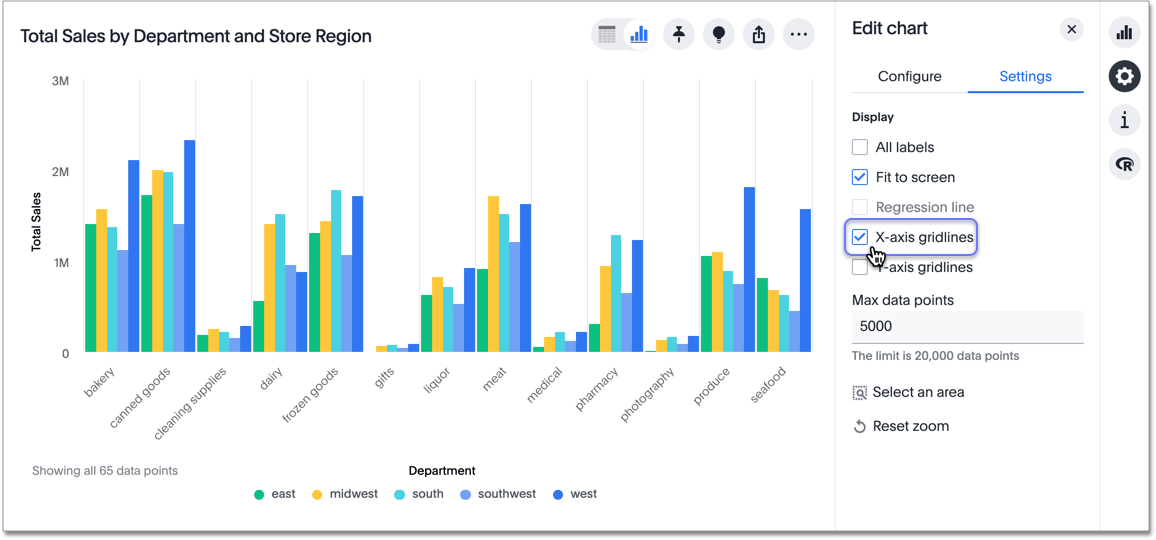
| When you create bar and column charts and slice by color, ThoughtSpot automatically enables gridlines to make the chart easier to read. You can choose to disable gridlines under the chart configuration menu. |
To display gridlines, follow these steps:
-
While viewing your answer as a chart, select the chart configuration icon
 on the upper right.
 -
The Edit chart panel appears. Select the Settings menu.
-
Select one or both of the gridline options.
X-axis gridlines are useful when you have a more complicated chart. For example, if you view a column chart for sales by department and store region, you might want to use gridlines to more easily visualize the column groups. You might also use gridlines when your chart includes a time element.
Was this page helpful?Give us feedback!


