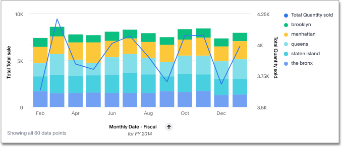
Line stacked column charts
This chart is similar to the line column chart, except that it divides its columns with an attribute in the legend. The line stacked column chart combines stacked column and line charts. There are two y-axes, one for each measure.
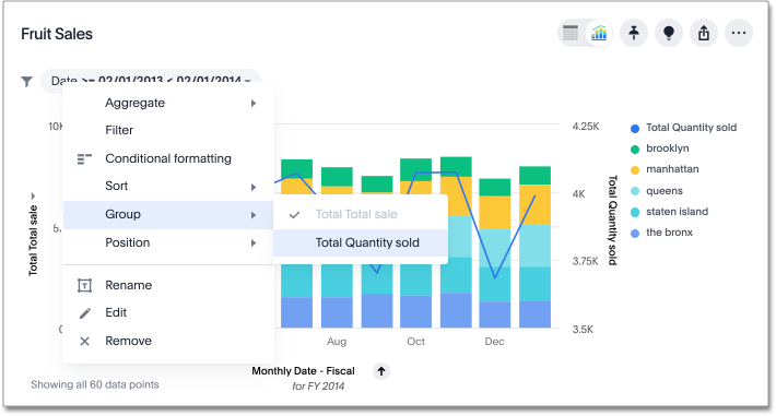
You can enable a shared y-axis by selecting the dropdown menu icon ![]() next to the y-axis label and selecting Group for both measures.
next to the y-axis label and selecting Group for both measures.
Was this page helpful?Give us feedback!


