KPI charts
You can now create visualizations of your data’s Key Performance Indicators (KPIs). KPI charts are part of the new Answer experience. Using this feature, you can track the changes in important KPIs in your data. When you configure the KPI chart to suit your business use case, you can save it as an answer, or add it to a Liveboard to increase visibility.
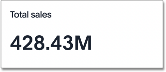
When you search a single measure or attribute (for example, "Sales" or "Date"), ThoughtSpot automatically creates a KPI chart displaying the top, or most recent, value of that column. If you search multiple terms, you can configure the column visualized in your KPI chart. To tailor the KPI visualization to your business use case, add time comparison keywords such as "weekly" or "monthly" to change the aggregation of your KPI, use the chart configuration menu to decide how much information to display, or apply conditional formatting.
Configure visualized column
If you search multiple measures or attributes, the KPI chart automatically displays only the first search term. To create a KPI chart based on another measure or attribute from your search, follow these steps:
-
Select the chart configuration icon
 .
. -
Drag and drop the currently visualized column to the Not visualized section.
-
Select the new measure or attribute from the Not visualized section and drag and drop it into the Visualized section.
If you include a time column (columns of type Date, Datetime, Timestamp and Time) or time period keyword (Hourly, Daily, Weekly, etc.) in your search, the keyword appears in the Time axis section.
Time-series aggregation in KPIs
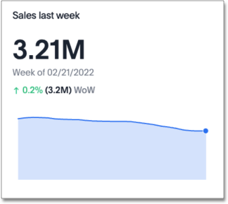
If you search a measure with a keyword comparing across time periods, for example, Sales weekly, your KPI visualization displays data corresponding to the most recent date bucket associated with your search, and the percent increase or decrease in that data from the previous data point.
In the following example, the total sales for the week of 02/21/2022 was 3.21MM. This measure increased 0.2% compared to the total sales for the previous week, 3.2M. Here, “WoW” signifies that the percent change is calculated week-over-week. You can also search a measure by day (DoD), month (MoM), quarter (QoQ), or year (YoY).
To create a KPI chart that displays the change between two specific date buckets, define the time periods for comparison in the search bar. For example, to compare the change in sales between this quarter and the previous quarter, search for sales quarterly this quarter last quarter.
| You can only create KPI charts with data arranged in ascending, or chronological, order. You cannot create a KPI chart from any search using “date descending” as a filter. |
You can also use time keywords to change the sorting when you create an attribute KPI. For example, if you search for Product, your KPI displays the ‘top’ value for that column. If you search Product weekly, your KPI instead displays the top product by date ascending, or the most recent result in chronological order.
For more information on using time period keywords in search, see Time series analysis.
Sparkline visualization for time-series KPIs
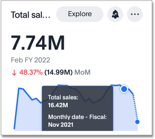
When you search for a measure with a time-series keyword, for example Sales weekly, your KPI chart automatically displays a sparkline visualization of all the data points defined in your query. For ease of comparison, the two most recent data points are highlighted in the sparkline visualization. When the date bucket defined by your query is in progress (for example, a sales weekly KPI you consult on a Wednesday), your sparkline visualization shows a dotted line between the last data point and the accumulated value by the latest date.
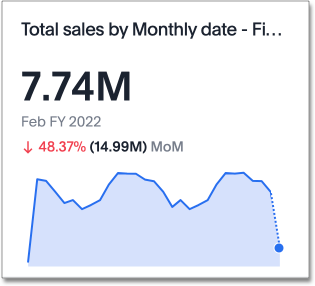
Hover over the sparkline visualization to see the exact value of the metric and corresponding date for each data point.
Custom comparison points
Previously, time-series KPI charts had limited options when comparing to past periods. A weekly KPI could be compared against the previous week, the previous month’s same week, the previous quarter’s same week, or the previous year’s same week. Now, you can set a custom point in data against which ThoughtSpot compares the most recent data point, any number of weeks ago.
To set your KPI’s custom comparison point, follow these steps:
-
Navigate to Search data and create a time-series KPI, by searching for a measure and a date keyword, such as
sales weekly, and selecting the KPI chart type. -
Open the Edit chart configuration menu
and select Settings. -
Under Compare with, select Custom from the dropdown.
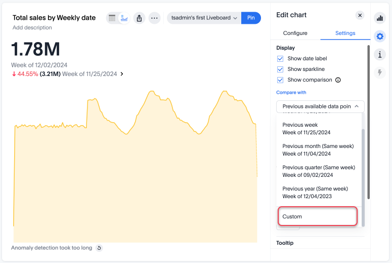
-
Enter the numerical value of the desired custom comparison point in the text box that appears. For example, you can select to compare the most recent data point to 3 weeks ago.
Configure KPI display options
When you create a KPI chart with a time period keyword, you can change the display options before saving as an answer or pinning to a Liveboard.
Click the chart configuration icon ![]() and select Settings to make the following display changes:
and select Settings to make the following display changes:
-
Show date label to display or hide the date label.
-
Show Sparkline to display or hide the time-series visualization.
-
Show Comparison to display or hide the percentage change since the last period selected.
-
Positive change color to change the color of the percentage increase label.
-
Negative change color to change the color of the percentage decrease label.
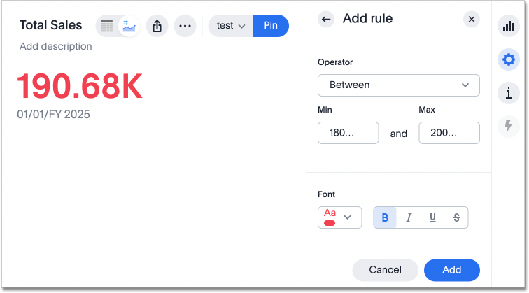
Apply conditional formatting
You can add visual cues for KPIs or threshold metrics to easily show where you are falling short or exceeding targets. These visual cues, called conditional formatting, apply color and font formatting to your search result. Use conditional formatting to show the threshold(s) you define, and the data that falls within them will be shown using the same color.
| Conditional formatting affects the text of a KPI visualization, it does not appear in sparkline visualizations. |
To apply conditional formatting to your KPI, follow these steps:
-
Select the chart configuration icon
to the right of your KPI. -
Select the measure tile under the Visualized section, for example, “Total Sales”.
-
Under the Conditional formatting dropdown, select +Add rule.
-
Define the values of your range and set the formatting options. In the following example, the KPI text turns red and bold when its value satisfies the condition, "between 180,000 and 200,000."
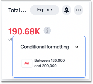
You can view the conditional formatting rule(s) applied to a KPI by selecting the information icon ![]() that appears to the right of the measure.
that appears to the right of the measure.
Limitations
You can’t create a KPI chart with a group aggregation function.


