Pie charts
A pie (or a circle) chart is a statistical graphic that divides data into slices to illustrate numerical proportion. In a pie chart, the arc length of a slice is proportional to the quantity it represents.
The pie chart is a classic chart type that displays your search in a circle. The default pie chart in ThoughtSpot displays data in the shape of a doughnut, or a thick ring.
How pie charts divide data
Pie charts divide your data into sectors that each represent a proportion of a whole circle. You can display the exact values of each slice, in addition to the percentage values by toggling on Additional chart options found under Change chart configuration.
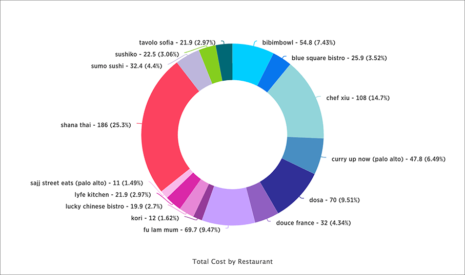
Your search needs at least one attribute and one measure to be represented as a pie chart. Also, there must be fewer than 50 values in the attribute column.
Pie in pie charts
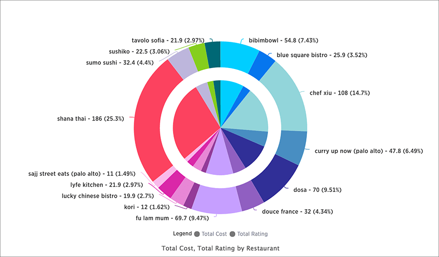
The pie in pie chart can be created from a regular pie chart in order to compare more than one component of an attribute. Pie in pie charts show two concentric pie charts comparing different measures.
To see a pie in pie chart, assign two different measures to the y-axis under Configure Chart.
Color customization of pie in pie charts
You can customize the colors of each pie in a pie chart using the Style widget.
-
Choose a pinboard that has a pie chart.
-
Click the Edit chart style (paintbrush icon) to open the Style widget.
-
From the Style widget, assign a color of your choice to each pie as listed in the widget.
-
Click … and choose Update to save the changes.
-
Click Close.
-
Optionally, you can click Reset to use the default color.


