Changing charts
You can adjust all aspects of ThoughtSpot charts: color, legends, axis, number format, and many more.
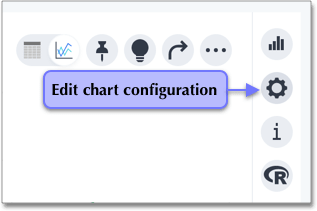
To make changes to the chart configuration, click the gear icon in the top right corner of the visualization.
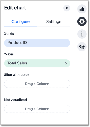
This opens the Edit chart panel for the chart, which contains the Customize and Settings menus. Using this menu, you can drag and drop measure and attribute chips to or from an axis. Click on any measure or attribute chip that has a more icon (>) to customize it. In the image below, Total Sales is customizable.
You can edit some of the elements of the chart directly, by clicking on them. For example, you can change the appearance of a chart axis by clicking it and making selections in the available options.
Through the Edit chart menu, you can perform a number of customizations:
-
Drag and drop measures and attributes to or from an axis
-
Set up your chart by dragging and dropping the measures and attributes in your search onto the appropriate axis. If you want a column to be part of your search and show up in the table view, but you do not want to include it in your chart, you can drag it to the ‘Not Visualized’ section. You can also use this functionality to perform a hidden sort, by moving the measure column you want to sort by to the ‘Not Visualized’ section.
-
-
Number formatting for all data labels
-
Category (Number, Percentage, Currency)
-
Units (K, M, B)
-
Decimals
-
Independent control for each measure on the chart
-
-
-
Grouping and ungrouping of axes
-
Axis renaming
-
Changing the position of an axis
-
Changing the axis minimum and maximum values
-
Changing number formatting on the axis.
-
-
-
No line limit for headers in wrap mode
Use the configuration options to perform any other chart adjustments, such as:
-
Reorder labels on the axis or legend
When there are multiple columns on the x- or y-axis or legend of a chart, you can change their position in the chart by using the chart configuration icon.
-
You can manually set the y-axis range by using the chart configuration icon.
-
You can hide and show values on the chart using the legend.
-
You can configure charts to show the y-axis data values.
-
You can show data markers for line charts.
-
You can easily change the date bucketing on a chart or table, from weekly to month of quarter, for example.
-
You can add a regression line to your chart.
-
You can add X and Y gridlines to your chart.
-
Disable automatic selection of chart type
You can turn off 'automatically select my chart' if you want a specific chart type to persist throughout a search
-
You can zoom into your chart by selecting an area with your mouse.


