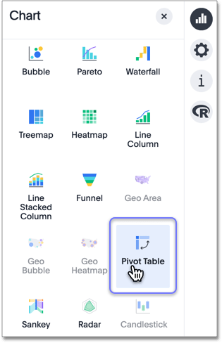
Pivot table
A pivot table is a chart type.
Pivot tables enable you to explore an alternate visualization of your data in a wide, customizable table. They allow you to visualize some of your data horizontally and some data vertically in the same table. A pivot table is a chart time table that uses a drag-and-drop interface.
If you would like to visualize your search as a pivot table, click on the change visualization icon ![]() near the top right of your screen, and select pivot table.
You need at least one attribute and one measure in your search.
near the top right of your screen, and select pivot table.
You need at least one attribute and one measure in your search.
You can restructure your pivot table by dragging and dropping the measures and attributes under edit chart configuration ![]() , or by dragging and dropping column headings on the table itself.
, or by dragging and dropping column headings on the table itself.
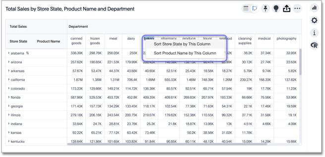
If you right-click a row or column heading, the system displays a contextual sort menu, or allows you to remove all sorting:
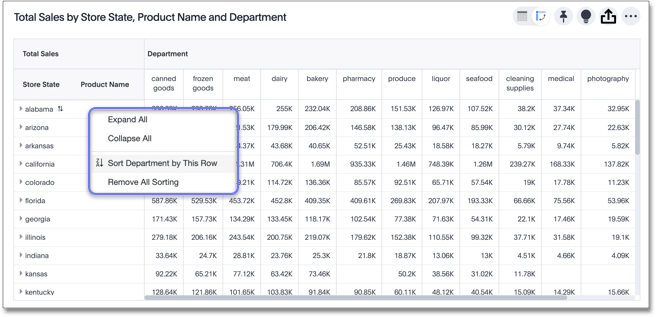
Expanding or contract columns and rows
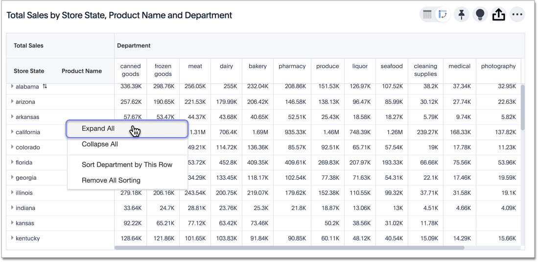
Click on a column or row heading to expand it. Additionally, you can expand or collapse all columns and rows by right-clicking the arrow on the top left of a cell.
When you pin a pivot table to a Pinboard, it retains your expansion settings.
Display totals
You can see your data as a percent of a row or column total, or as a percent of the grand total. Grand totals aggregate all the data in your pivot table.
To see your data as a percent, click the edit chart configuration ![]() icon, and click settings at the bottom of the chart configuration panel.
Click on the dropdown menu to choose whether you want to see your data as a percent of a row or column total, or as a percent of the grand total.
icon, and click settings at the bottom of the chart configuration panel.
Click on the dropdown menu to choose whether you want to see your data as a percent of a row or column total, or as a percent of the grand total.
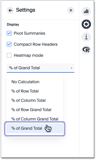
You only see 100% value when grand total rows is enabled. When it is disabled, the rows and columns have no parental total column, so the percentage cannot be calculated. All intermediate totals (columns or rows) display the percentage values calculated with respect to their parent. For each inner summary (column or row) the parental total values are assumed to be 100% internally.
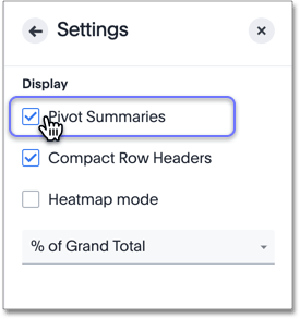
Select Pivot Summaries in the Settings menu to see row and column totals.
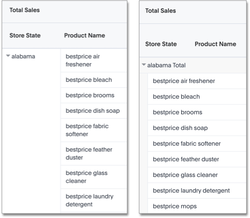
Format row headers
You can view your row headers in a more compact (tree) layout. To turn on compact row headers, select Compact row headers in the Settings menu.
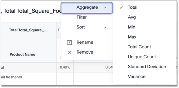
You can change the type of total shown for an aggregated measure from the header menu that appears when you click on a header’s more icon:
Heatmap mode
The heatmap functionality allows you to see which measures contribute more to the total than others within the table.
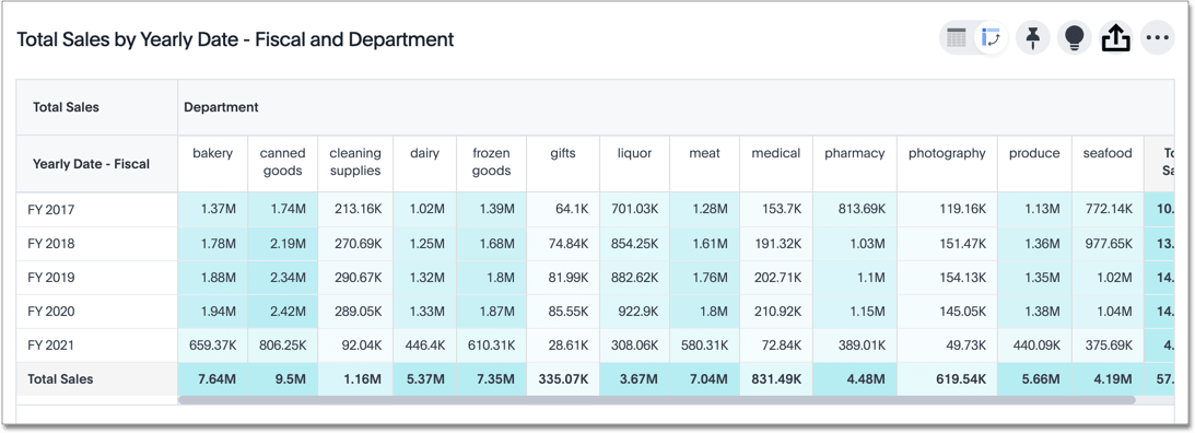
To turn on the heatmap, click the edit chart configuration ![]() icon, and click settings at the bottom of the chart configuration panel.
Select heatmap mode.
icon, and click settings at the bottom of the chart configuration panel.
Select heatmap mode.
Pivot table limitations
The pivot table chart type has these limitations:
-
The pivot table displays a maximum of 100k rows. If your query returns more than 100k rows, you cannot visualize it with a pivot table.
-
You cannot show underlying data.
-
You cannot use conditional formatting.
-
Pivot tables do not support use of group aggregation functions.


