Bubble charts
The bubble chart is a variation of the scatter chart, with the data points replaced with bubbles. These bubbles add a third data dimension to your answer.
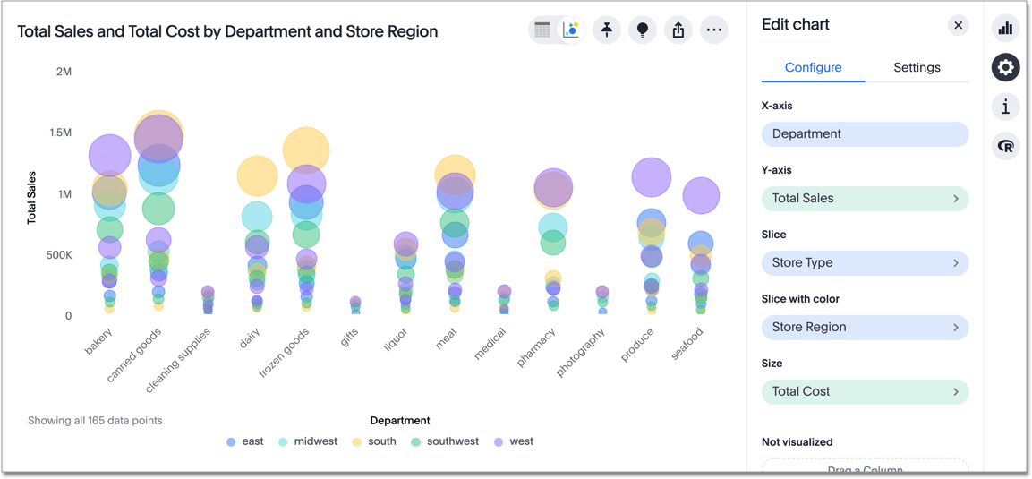
The size of each bubble depends on the measure you choose under Edit chart ![]() .
.
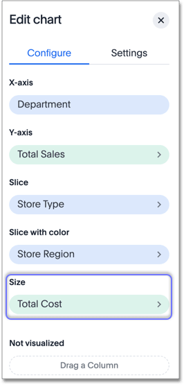
Note that this chart type allows you to both slice and slice with color.
The slice option only appears for bubble and scatter charts.
It allows you to break up data based on a specific column in your data;
in this case, store type.
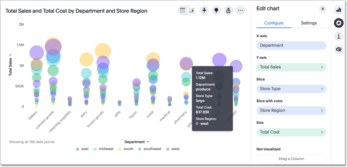
If you hover over a data point, you can see what store type it represents:
Your search needs at least one attribute and two measures to be represented as a bubble chart.
Was this page helpful?Give us feedback!


