Change analysis
With SpotIQ change analysis, you can compare any two data points in a visualization for change and identify key change drivers from the underlying attribute columns.
SpotIQ change analysis compares data points of simple or complex measures using these aggregates:
-
Sum
-
Count
-
Sum over sum, which generates 'what-if' percentage insights
-
Average, which generates 'what-if' percentage insights
-
Other functions which use a 'versus' analysis to show the absolute change grouped by different drill attributes
When using custom calendar with change analysis, the custom calendar endof must be equal to startof for the next period.
|
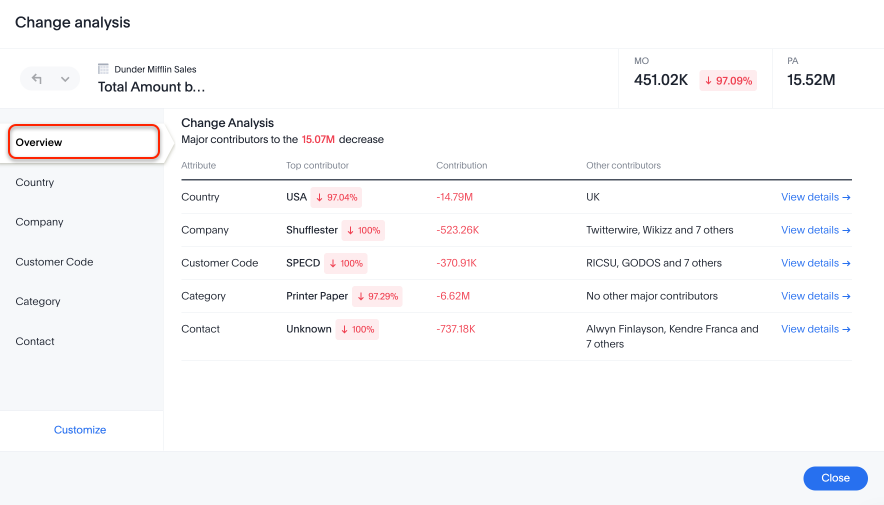
Change analysis summary tab
Now with change analysis, you get a snapshot view of all the factors/attributes that have changed in a single view, to get an overview of your changes in the chart. You can click View details to see the changes by attribute, or Customize attributes to change which attributes to analyze.
Note that when you run change analysis on a chart created with ratio keywords like average, the overview tab does not appear and you instead see the previous change analysis interface, one attribute at a time.
Contextual change analysis
ThoughtSpot supports contextual change analysis for area, line, column, bar, line-column, donut, and KPI charts. Contextual change analysis works by looking at the difference between the value of a measure across two points, then slicing both the points along another attribute. Then the changes are analyzed to see if the attribute can be used to explain the differences in the two points. You do not need SpotIQ privileges to run contextual change analysis.
To perform this analysis, follow these steps:
-
On an area, line, column, bar, line-column, pie, or KPI chart, hold down the command key (macOS) or control key (Linux or Windows).
-
Select the two columns or data points you plan to compare.
Note that if you are analyzing a KPI chart, you must either click the percent change label or select two points from the sparkline visualization. You cannot run change analysis on a KPI chart with no sparkline visualization. -
Right-click to see the dropdown menu, and select Run change analysis.
-
The SpotIQ window modal appears with the results of your analysis. By default, SpotIQ picks the top 5 most relevant columns, based on what it learned from your past activity.
To select other columns to analyze, click Customize attributes in the lower left corner of the window and select the desired column from the window that appears.
Each colored section of a SpotIQ insight represents a statistically significant outlier among the values of your chosen columns. For more information on how statistically significant outliers are calculated, see How contextual change analysis is calculated. -
You can now examine each visualization of the analysis for details of comparison.
In some instances, ThoughtSpot may point out that certain attribute values account for more than 100% of the total change. This is generally for cases where attribute values contribute to a trend that is opposite to the total change (positive change when the overall trend is negative, for example). You may see cases, for example, where two attribute values account for a 300% increase in sales, while the remaining attribute values indicated account for 200% of the total decrease. -
You can add the specific visualization to an existing Liveboard, or create a new Liveboard and add it there.
-
You can run another round of SpotIQ analysis, download the data as a CSV file, edit this visualization, or make a copy of the visualization.
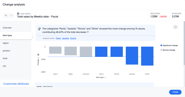
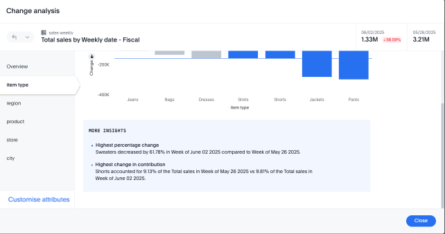
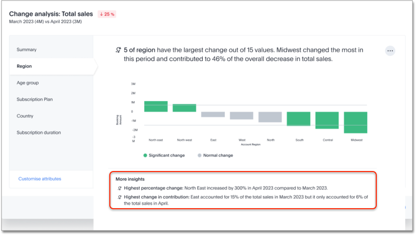
When you run SpotIQ change analysis, ThoughtSpot detects additional insights and displays them below the change analysis visualizations. These insights display values that underwent the highest percentage change between the data points defined in your analysis, and values whose share of the total changed the most. Note that insights do not appear for measures of type unique counts and ratios.
Remember personalized columns
ThoughtSpot now remembers your personalized columns. Users with edit permissions on a Liveboard can set their preferred attribute columns through the change analysis window and select to keep those selections for any subsequent change analysis calculations on that Liveboard, therefore applying the changes to all users.
To set personalized attribute columns that will persist on the Liveboard, follow these steps:
-
On an area, line, column, bar, line-column, pie, or KPI chart, hold down the command key (macOS) or control key (Linux or Windows).
-
Select the two columns or data points you plan to compare.
Note that if you are analyzing a KPI chart, you must either click the percent change label or select two points from the sparkline visualization. You cannot run change analysis on a KPI chart with no sparkline visualization. -
Right-click to see the dropdown menu, and select Run change analysis.
-
The SpotIQ window modal appears with the results of your analysis. By default, SpotIQ picks the top 5 most relevant columns, based on what it learned from your past activity.
-
In the lower left corner of the SpotIQ window, select Customize attributes. Select your desired columns from the list that appears.
-
In the lower right corner of the Customize attributes window, click Apply to all users.
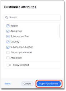
Individual users can still override these preferred columns on their own SpotIQ analysis by running the calculation and selecting Customize attributes.
Iterative change analysis
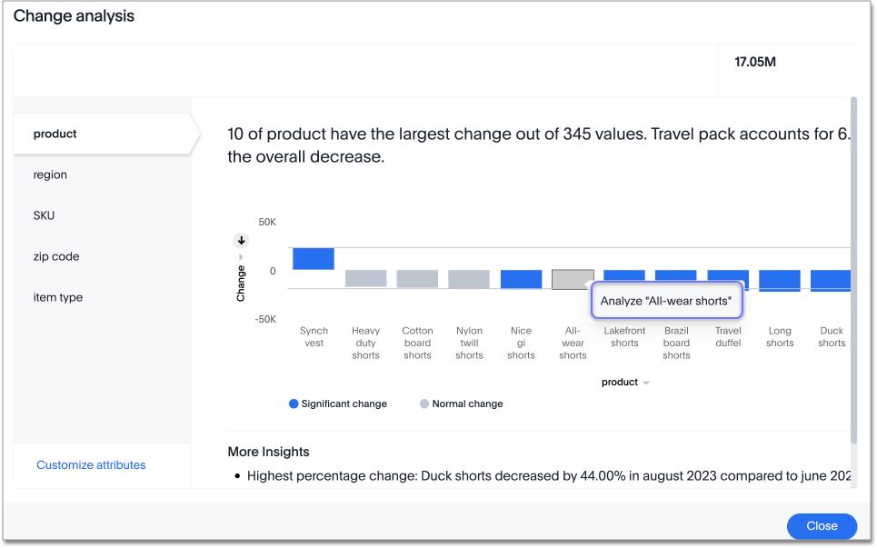
You can now drill down on the results of change analysis to learn more about change drivers in your data.
To run iterative change analysis, follow these steps:
-
Select two points on a chart and right-click to select Run change analysis.
-
Right-click on an attribute value in the resulting change analysis and select Analyze <attribute_value>. For example, if you want to deep-dive to understand what’s driving change in "California" in "State" attribute, right click on "California" and click "Analyze California".
-
ThoughtSpot adds the specified attribute value as a filter and re-calculates change analysis for the original comparison points.
Other features of iterative change analysis
In the upper-left section of the change analysis window, you use the  button to do any of the following:
-
Undo: Click the left-facing arrow to undo your last action.
-
Redo: Click the downward-facing arrow and select Redo to redo the last action you undid.
-
Reset: Click the downward-facing arrow and select Reset to revert all changes you made during your current session.
In the top section of the window, you can see the source and Answer name. Also, the iterative change analysis window provides AI-driven suggested attribute values to help encourage effective analysis.
Natural language narratives
ThoughtSpot generates insight narratives in natural language to summarize the data analyzed in SpotIQ. Admin users can enable natural language narratives by navigating to the Search and SpotIQ section of the Admin page and setting Natural language narratives for SpotIQ change analysis to Enabled. The narratives are generated by LLM, and appear above the charts created by SpotIQ.
How contextual change analysis is calculated
In order to process different aggregations in the data, contextual change analysis is broken into three categories.
- Type 1 - Simply decomposable
-
A simply decomposable measure can be expressed as a disjoint union of finite measures. For example, measures having aggregation
SUMorCOUNT.SUM(x + y) = SUM(x) + SUM(y). - Type 2 - Ratio of simply decomposable
-
Measures in this type are ratios of measures from type 1. For example, measures of the form
AVERAGEorSUM/SUM. - Type 3 - Unknowns
-
Measures that are neither in type 1 nor in type 2 fall under this type. For example,
UNIQUE COUNT,SUM * SUM.
Type 1 algorithm
We compare measurements at two different times for each attribute. Then, we calculate the upper and lower thresholds based on the most significant absolute changes between these two timestamps. Any change values lying outside the range of threshold values are marked as outliers.
We determine the upper and lower thresholds by looking at the top ten absolute changes. If the combined contribution of a measure at the first or second timestamp exceeds 50%, we stop iterating. The largest negative change becomes the lower threshold, while the smallest positive change becomes the upper threshold.
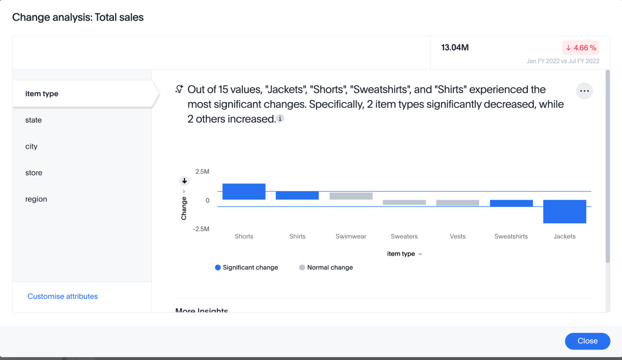
In the example above, based on the absolute change values, the upper threshold is calculated as 708.09K, and the lower threshold value is calculated as -606.58K. Attribute values lying on or outside the threshold values are marked as outliers.
Type 2 algorithm
While working with rations, ThoughtSpot can’t perform the difference analysis as with the Type 1 algorithm. This limitation arises because ratio values become exceedingly large whenever the denominator approaches zero. To address this concern, we adopt an alternative approach: for each attribute value, we compute a hypothetical percentage change. This calculation determines the overall percentage change in the measured value assuming that specific value remained constant between the two reference points. A smaller hypothetical percentage change for an attribute value indicates that this value significantly contributes to explaining the overall change. This is because if that attribute had not changed, the overall change in the measure would have been smaller.
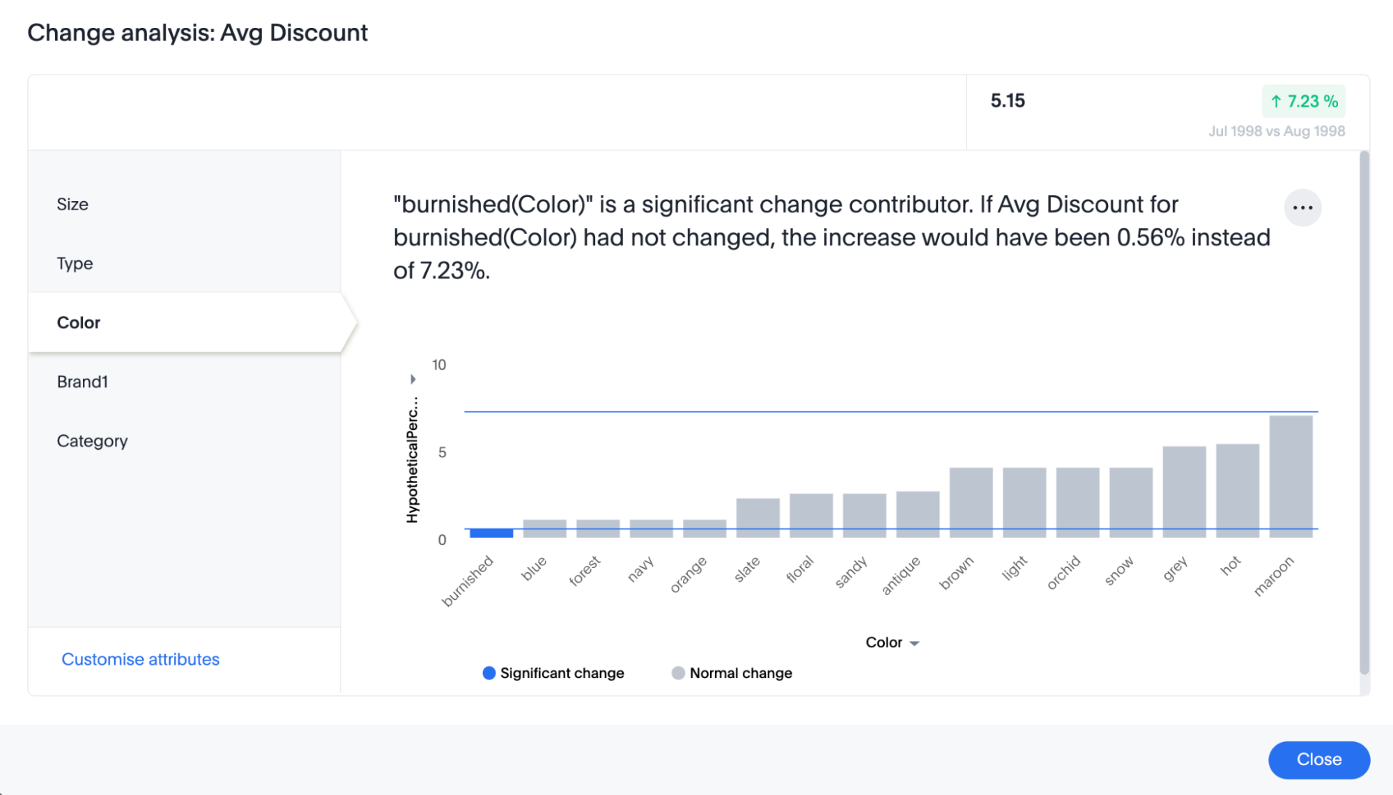
For example, if we do change analysis on the average discount monthly for July 1998 and August 1998, the insight says that "burnished(Color)" is a significant change contributor. If the average discount for burnished(Color) had not changed, the increase would have been 0.56% instead of 7.23%. This means that the overall average profit increased by 7.23% from July 1998 to August 1998, but if we disregard the change in the average discount of burnished(Color), the overall average profit would have increased by just 0.56%.
Type 3 algorithm
We start by comparing measurements at two different times for each attribute. Next, we treat the changes as a normal distribution and calculate the values of upper and lower thresholds using the Z-score calculation. Any change values lying outside the range of threshold values are marked as outliers.
A Z-score represents the number of standard deviations from the mean a data point is. Z-scores are a way to compare results from a test to a "normal" population. The basic Z-score formula for a sample is: z = (x – μ) / σ where σ is the standard deviation, μ is the mean, x is the data value. Upper threshold is assigned as μ + N * σ and lower threshold is assigned as μ - N * σ. So any value with a Z-score less than or greater than N is an anomaly.
The minimum value of N is 2.0, which covers 95.45% of points in a normal distribution. The maximum is 5.0, which covers 99.99994% of points in a normal distribution. The value of N is decided according to the table provided below:
| Attribute Cardinality | Value of N |
|---|---|
<= 100 |
2.0 |
500 |
2.69 |
2000 |
3.301 |
10000 |
4.0 |
50000 |
4.69 |
>= 100000 |
5.0 |
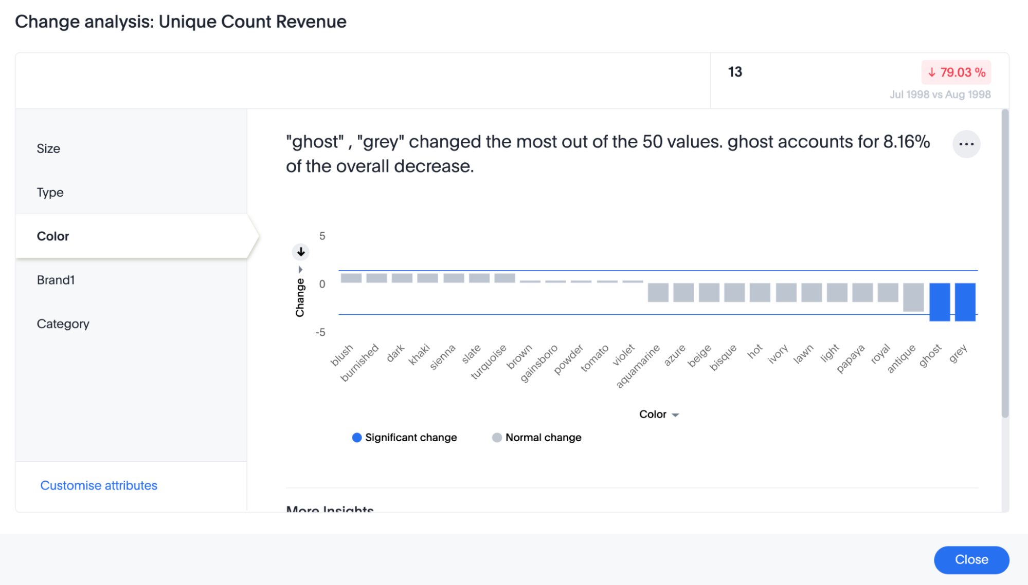
In the example above, based on the absolute change values, the upper threshold is calculated as 1.29 and the lower threshold is calculated as -3.26. Attribute values lying on or outside the threshold values are marked as outliers.
Limitations
-
Change analysis is not supported on queries based on the "growth of" keyword.
-
Change analysis is not supported on queries based on the "versus" keyword.
-
Change analysis is not supported on certain complex formulas built upon group_* functions. For example, any calculations using functions such as sum(group_*) or sum(x) / group_* are not supported. However, simple functions that use only group_* are supported.
-
When running change analysis on a chart with different attributes represented in different colors (sliced by color), you can only run change analysis between attributes of the same type. For example, if you slice the measure "ship mode" by color, you can compare two values for the "air" ship mode, not one value for "air" and one for "ship".
-
When a runtime filter is applied to a model’s hidden column, change analysis does not respect that filter.