Advanced chart settings
You can now access advanced chart customization settings by selecting the Edit chart configuration icon ![]() and selecting Advanced settings. Use these settings to adjust the size and appearance of tooltips, regression lines, gridlines, and chart backgrounds. All choices persist only for the Answer you are currently customizing.
and selecting Advanced settings. Use these settings to adjust the size and appearance of tooltips, regression lines, gridlines, and chart backgrounds. All choices persist only for the Answer you are currently customizing.
Answer-level advanced settings
For the following settings, select the Edit chart configuration icon ![]() , navigate to the Settings header, and click Advanced settings on the bottom of the screen. These settings are relevant to the Answer as a whole.
, navigate to the Settings header, and click Advanced settings on the bottom of the screen. These settings are relevant to the Answer as a whole.
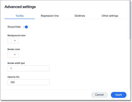
Tooltip options
From the tooltip options tab, you can affect the following settings:
-
Show/hide tooltips
-
Select background color
-
Select border color
-
Enter border width in pixels
-
Set the percentage opacity
You can make the following changes to the column name label:
-
Select the font color
-
Enter the font size
-
Bold the font
-
Underline the font
-
Italicize the font
You can make the following changes to the values in the tooltip:
-
Select the font color
-
Enter the font size
-
Bold the font
-
Underline the font
-
Italicize the font
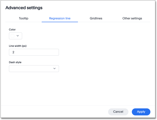
Regression line options
For charts that include a regression line, you can make the following changes:
-
Select the color of the regression line
-
Enter the line width in pixels
-
Select the dash style: Solid, Dot, or Dash
Gridlines options
You can make the following selections for x- and y-axis gridlines.
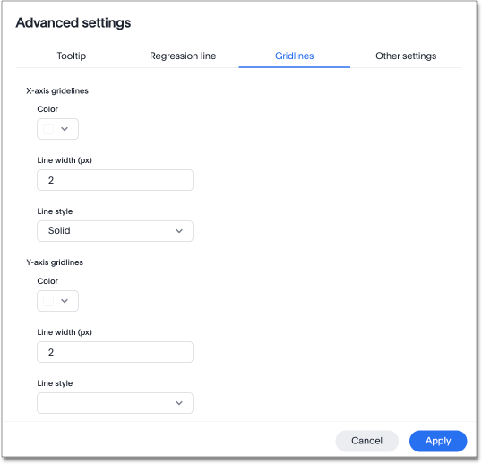
For x-axis gridlines:
-
Select the color
-
Enter the line width in pixels
-
Select the line style: Solid, Dot, or Dash
For y-axis gridlines:
-
Select the color
-
Enter the line width in pixels
-
Select the line style: Solid, Dot, or Dash
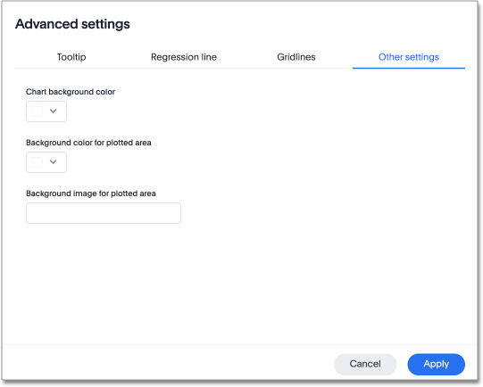
Other settings
For other properties of charts, you can make the following selections:
-
Select the chart background color
-
Select the background color for the plotted area
-
Enter the background image for the plotted area
You must enter the URL of the background image. ThoughtSpot only displays images from whitelisted domains.
X-axis options
To configure the x- and y-axis options, select the Edit chart configuration icon ![]() .
.
To configure the x-axis options, select the edit icon ![]() to the right of the x-axis label. From the x-axis configuration menu, you can change the name of the measure or attribute mapped on the x-axis.
to the right of the x-axis label. From the x-axis configuration menu, you can change the name of the measure or attribute mapped on the x-axis.
Advanced x-axis options
To affect other x-axis settings, select the edit icon ![]() to the right of the x-axis label and click Advanced settings.
to the right of the x-axis label and click Advanced settings.
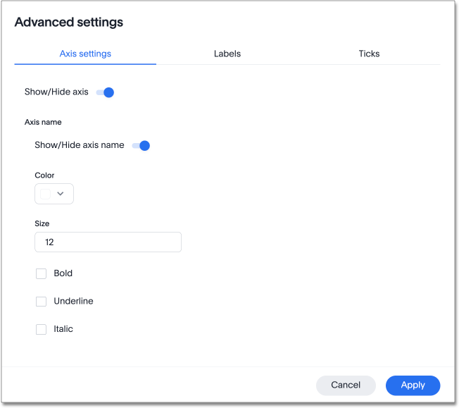
From the Advanced menu, you can make the following changes:
-
Axis settings
-
Show/hide axis
-
Show/hide axis name
-
Enter axis name color
-
Enter axis name font size
-
Bold axis name
-
Underline axis name
-
Italicize axis name
-
-
Labels
-
Show/hide labels
-
Enter maximum number of characters
-
Enter font color
-
Enter font size
-
Bold font
-
Underline font
-
Italicize font
-
Enable text wrapping
-
-
Ticks
-
Show/hide ticks
-
Enter tick width (px)
-
Enter tick length (px)
-
Enter tick color
-
Y-axis options
To configure the y-axis options, select the edit icon ![]() to the right of the y-axis label. From the y-axis configuration menu, you can change the following settings:
to the right of the y-axis label. From the y-axis configuration menu, you can change the following settings:
-
Name
-
Position (left or right)
-
Min values
-
Max values
You can also configure the number format in the following ways:
-
Category (number, percentage, or currency)
-
Unit (auto, none, thousand, million, billion, or trillion)
-
Negative values (-1234, 1234-, or (1234))
Advanced y-axis options
To affect other y-axis settings, select the edit icon ![]() to the right of the y-axis label and click Advanced settings.
to the right of the y-axis label and click Advanced settings.
From the Advanced menu, you can make the following changes:
-
Axis settings
-
Show/hide axis
-
Show/hide axis name
-
Enter axis name color
-
Enter axis name font size
-
Bold axis name
-
Underline axis name
-
Italicize axis name
-
-
Labels
-
Show/hide labels
-
Enter maximum number of characters
-
Enter font color
-
Enter font size
-
Bold font
-
Underline font
-
Italicize font
-
Enable text wrapping
-
-
Ticks
-
Show/hide ticks
-
Enter tick width (px)
-
Enter tick length (px)
-
Enter tick color
-
Column settings
You can select the arrow icon on a column button and click Advanced settings to access customization options for each column.
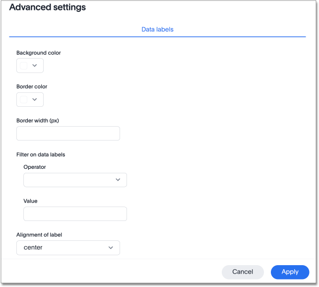
From the advanced options, you can make the following changes to the column’s data labels:
-
Enter background color
-
Enter border color
-
Enter border width (px)
-
Filter operator on data labels (less than, greater than, less than or equal to, greater than or equal to, equal to)
-
Filter value on data labels
-
Select alignment of label (left, right, center)
-
Label style:
-
Label color
-
Label font size
-
Bold label font
-
Underline label font
-
Italicize label font
-
Enter maximum number of characters
-
Limitations
Advanced chart settings are supported only for the following chart types:
-
Column charts
-
Stacked column charts
-
Line charts
-
Pie charts
-
Bar charts
-
Stacked bar charts
-
Line column charts
-
Line stacked column charts
-
Area charts
-
Stacked area charts
-
Scatter charts
-
Bubble charts
-
Waterfall charts
-
Funnel charts
-
Radar charts
-
Candlestick charts
-
Pareto charts


