KPI charts
You can create visualizations of your data’s Key Performance Indicators (KPIs). Use this feature to track the changes in important KPIs in your data. When you configure the KPI chart to suit your business use case, you can save it as an Answer, add it to a Liveboard to increase visibility, or create alerts to receive notifications on the changes in the KPI using the Monitor feature.
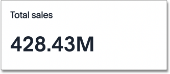
When you search a single measure, such as Sales, ThoughtSpot automatically creates a KPI chart displaying the topmost value of that column. If you search multiple terms, you can configure the column visualized in your KPI chart. To tailor the KPI visualization to your business use case, you can add time comparison keywords such as "weekly" or "monthly" to change the aggregation of your KPI, use the chart configuration menu to decide how much information to display, or apply conditional formatting.
KPI charts for attributes
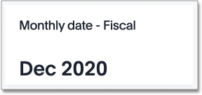
You can visualize an attribute (string, date, boolean value) as a KPI chart. This feature allows you to create KPIs for values such as "Date" or "Product".
To create an attribute KPI, follow these steps:
-
Search for the attribute in the Search bar.
-
A table displaying all values of the attribute appears. To view the KPI chart, choose one option:
-
Select the table to chart toggle above your Answer and select the chart icon.

-
Select the Change visualization icon
 to the right of your Answer and choose the KPI chart option.
-
-
If your search contains multiple columns, select the chart configuration icon
 to the right of your Answer. Drag and drop the attribute column into the visualized section to visualize it in the KPI chart.
Please note that if your query returns more than one row of results, the KPI chart displays the topmost value from the result table.
Configure visualized columns
If you search multiple measures or attributes, the KPI chart automatically displays only the first search term. To create a KPI chart based on another measure or attribute from your search, select the chart configuration icon ![]() and drag and drop the currently visualized column to the Not visualized section. Select the new measure or attribute from the Not visualized section and drag and drop it into the Visualized section.
and drag and drop the currently visualized column to the Not visualized section. Select the new measure or attribute from the Not visualized section and drag and drop it into the Visualized section.
If you include time column (columns of type Date, Datetime, Timestamp and Time) or time period keyword (Hourly, Daily, Weekly, etc.) in your search, the keyword appears in the Time axis section.
Time-series aggregation in KPIs
If you search a measure or attribute with a keyword comparing across time periods, such as Sales weekly, your KPI visualization displays data corresponding to the most recent date bucket associated with your search. For a measure KPI, the percent increase or decrease in that data from the previous data point appears.
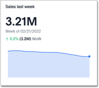
In the following example, the total sales for the week of 02/21/2022 was 3.21M. This measure increased 0.2% compared to the total sales for the previous week, 3.2M. Here, "WoW" signifies that the percent change is calculated week-over-week. You can also search a measure by day (DoD), month (MoM), quarter (QoQ), or year (YoY).
To create a KPI chart that displays the change between two specific date buckets, define the time periods for comparison in the search bar. For example, to compare the change in sales between this quarter and the previous quarter, search for sales quarterly this quarter last quarter.
| You can only create KPI charts with data arranged in ascending, or chronological, order. You cannot create a KPI chart from any search using "date descending" as a filter. |
For more information on using time period keywords in search, see Time series analysis.
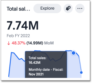
Sparkline visualization for time-series KPIs
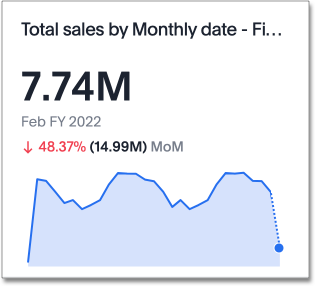
When you search for a measure with a time-series keyword, for example Sales monthly, your KPI chart automatically displays a sparkline visualization of all the data points defined in your query. For ease of comparison, the two most recent data points are highlighted in the sparkline visualization. When the date bucket defined by your query is in progress (for example, a sales weekly KPI you consult on a Wednesday), your sparkline visualization shows a dotted line between the last data point and the accumulated value by the latest date.
To see the exact value of the metric and corresponding date for each data point, hover over the sparkline visualization.
Configure KPI display options
When you create a KPI chart with a time period keyword, you can change the display options before saving as an Answer or pinning to a Liveboard.
Click the chart configuration icon ![]() and select Settings to make the following display changes:
and select Settings to make the following display changes:
-
Show Date Label to display or hide the date label.
-
Show Sparkline to display or hide the time-series visualization.
-
Show Comparison to display or hide the percentage change since the last period selected.
-
Compare with to display a percent change comparison from the most recent data point to the comparison point you choose.
-
Positive change color to change the color of the percentage increase label.
-
Negative change color to change the color of the percentage decrease label.
-
Max data points to define the maximum number of data points to appear in the visualization.
Advanced KPI display options
Navigate to the Column Settings tab of a KPI chart and toggle to Advanced to:
-
Specify whether to show or hide the current date, previous date, and previous value.
-
Abbreviate previous day (PD), previous month (PM), previous quarter (PQ), or previous year (PY).
-
Choose to display null data as 'zero' or 'no data found'.
-
Decide how missing dates are displayed (as gaps, ignored, or treated as 0).

Navigate to the Display Settings tab of a KPI chart and toggle to Advanced to:
-
Show changes as percentages or absolute values.
-
Show interpretation of increases as positive or negative changes.
This designation helps Spotter report whether an increase in a measure is a positive or negative change when it creates a summary.
-
Set different colors for anomalies, indicating whether they are above or below the expected value.

KPI styling on Liveboards
For KPI charts without sparklines, you can now control font size on Liveboards. To edit KPI font size, follow these steps:
-
Open the Liveboard containing the KPI. Select Edit from the More menu
 .
. -
From the top bar, select Styling.
-
Under KPI settings, select the desired font size from the dropdown. You can choose XS, S, M, L, or XL.
-
Click Save.
Comparison points
You can now set your KPI chart to display a percent change comparison between the most recent data point and a selected comparison point.
Comparison points depend on the time-based keywords you use in your search, such as 'monthly' or 'weekly'. When you search using one of the following time buckets, you can choose to compare the most recent data point with the corresponding options:
- Hourly
-
Previous available data point, previous hour
- Daily
-
Previous available data point, previous day, previous week (same day), previous month (same day), previous quarter (same day), previous year (same day)
- Weekly
-
Previous available data point, previous week, previous month (same week), previous quarter (same week), previous year (same week)
- Monthly
-
Previous available data point, previous month, previous quarter (same month), previous year (same month)
- Quarterly
-
Previous available data point, previous quarter, previous year (same quarter)
- Yearly
-
Previous available data point, previous year
Note that the default comparison point is "previous available data point", which compares your most recent data point to the last recorded data point. In cases where there is missing data between the most recent data point and your chosen comparison point, use "previous available data point" to see the percent change from the last recorded data point.
To set your KPI’s comparison point, follow these steps:
-
Navigate to Search data and create a time-series KPI, by searching for a measure and a date keyword, such as
sales weekly, and selecting the KPI chart type. -
Open the Edit chart configuration menu
and select Settings. -
Under Compare with, select the desired comparison point from the dropdown.
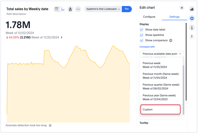
Custom comparison points
Previously, time-series KPI charts had limited options when comparing to past periods. A weekly KPI could be compared against the previous week, the previous month’s same week, the previous quarter’s same week, or the previous year’s same week. Now, you can set a custom point in data against which ThoughtSpot compares the most recent data point, any number of weeks ago.
To set your KPI’s custom comparison point, follow these steps:
-
Navigate to Search data and create a time-series KPI, by searching for a measure and a date keyword, such as
sales weekly, and selecting the KPI chart type. -
Open the Edit chart configuration menu
and select Settings. -
Under Compare with, select Custom from the dropdown.
-
Enter the numerical value of the desired custom comparison point in the text box that appears. For example, you can select to compare the most recent data point to 3 weeks ago.
Apply conditional formatting
You can add visual cues for KPIs or threshold metrics to easily show where you are falling short or exceeding targets. These visual cues are called conditional formatting, which applies color and font formatting to your search result. Add conditional formatting to show the threshold(s) you defined, and the data that falls within them will be shown using the same color.
| Conditional formatting affects the text of a KPI visualization, it does not appear in sparkline visualizations. |
To apply conditional formatting to your KPI, follow these steps:
-
Select the chart configuration icon
to the right of your KPI. -
Select the measure tile under the Visualized section, for example, "Total Sales".
-
Under the Conditional formatting dropdown menu, select Edit.
-
Define the values of your range and set the formatting options. In the following example, the KPI text turns red and bold when its value satisfies the condition, "between 180,000 and 200,000".
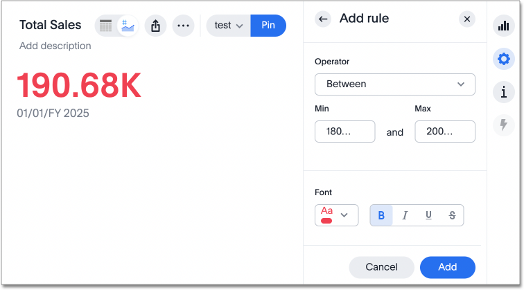
If advanced conditional formatting is on in your environment, you can compare the values of your KPI to another column as well as to a threshold.
-
Select Add.
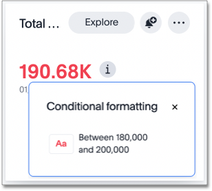
View the conditional formatting rule(s) applied to a KPI by selecting the information icon ![]() that appears to the right of the measure.
that appears to the right of the measure.
KPI change analysis
You can now use SpotIQ analysis to directly identify the key drivers for recent change in your KPIs. KPI change analysis allows you to drill down into the causes of change in your KPIs and customize the insights generated by SpotIQ.
To access this feature, go to your KPI chart and click the Analyze change button at the bottom of the chart. You see a summary of all changes in the KPI. The Run change analysis pop-up allows you to customize the columns ThoughtSpot analyzes. Note that ThoughtSpot runs change analysis between the two most recent data points defined by the KPI’s time bucket (for example, daily or weekly).
For more information on comparative analysis in ThoughtSpot, see Change analysis.
Monitor your KPI
When you pin a KPI visualization to a Liveboard or save it as an Answer, you can create alert notifications for yourself and others. You must have view access to the KPI’s data source to schedule notifications for yourself. You must have edit access to the underlying data source to schedule notifications for teammates regardless of whether they have access.
For more information on the Monitor feature, see Monitor Key Performance Indicators in your data.
You can also add your KPIs to the watchlist on your Home Page. The KPIs can be added to the watchlist from the,
-
Home Page: Select Add KPIs to your watchlist and then select a single or multiple KPIs to add. For more information, see Track important KPIs.
-
Liveboard: Click the more menu
on the KPI visualization in the Liveboard, and select Add to watchlist. -
Saved Answer: Click the more menu
on the KPI in the saved Answer, and select Add to watchlist.