Add a filter to a chart
You can add a simple filter from a chart axis while viewing your answer as a chart.
You can filter a chart in two ways:
-
Select the legend labels to toggle the values on or off.
-
Follow the steps shown here to filter on the axis values.
To add a filter from the chart axes:
-
While viewing your answer as a chart, click the chart axis you want to filter on, and select Filter.
-
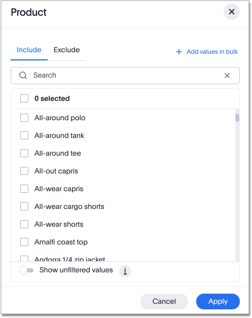
The filter modals for attributes and measures are different. The modal for an attribute looks like this:
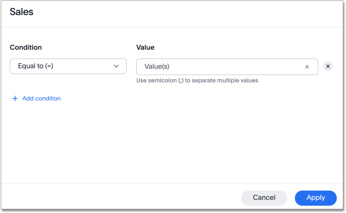
The modal for a measure looks like this:
-
For an attribute filter, select values to include or exclude. You can also select all or clear all. If there are too many values, you can use the filter search bar to find the ones you want. The filter modal only shows 500 values; if the column you selected has more than 500 values, you must use the filter search bar to find the additional values.
-
For a measure filter, select Add a condition. Choose an operator, such as
is greater than, and enter a number. For example, to see under-performing stores, with sales under 10 million, select is less than or equal to and enter10 million. To add another filter for that measure, select Add another. -
Select Done.
Related information


