Set the y-axis range
You can have multiple measures on the y-axis of many charts. You can manually set the y-axis range by selecting edit from the y-axis label dropdown, or from the chart configuration menu.
Setting the y-axis range from the axis label
To set the y-axis range:
-
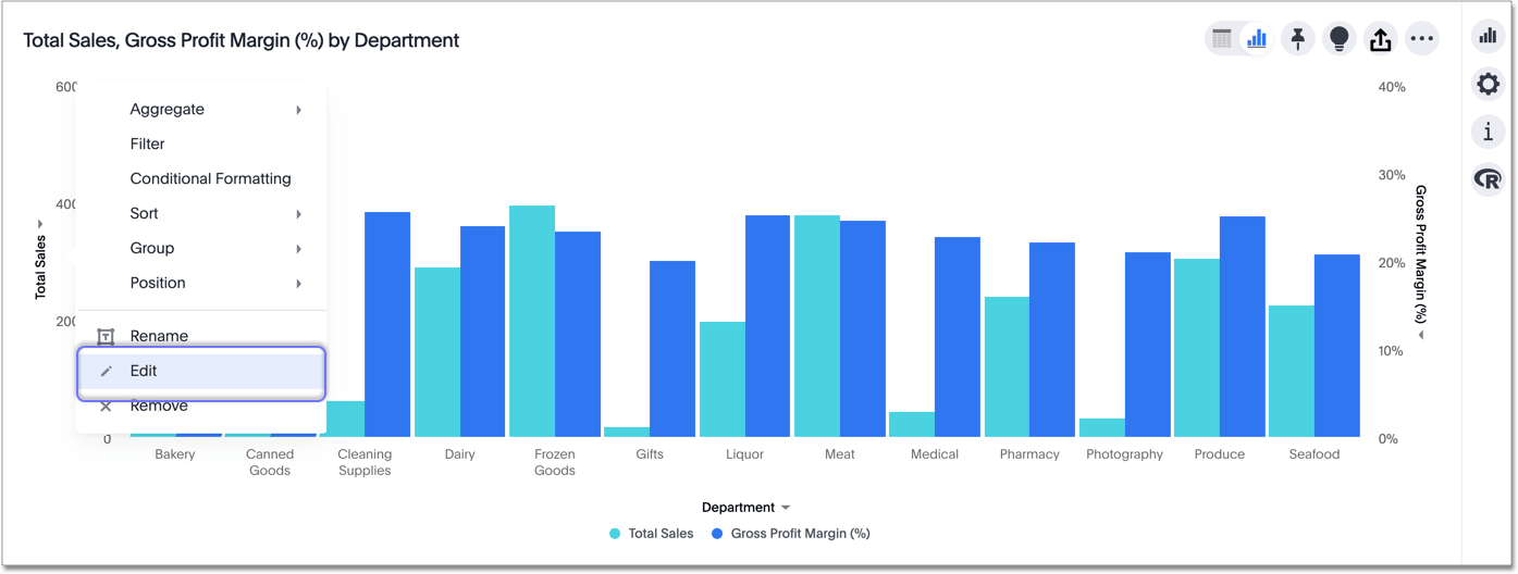
While viewing your answer as a chart, select the dropdown menu icon
 next to the y-axis label you want to change.
 -
Select edit.
-
Under Min and Max, set the y-axis range by specifying start and end values.
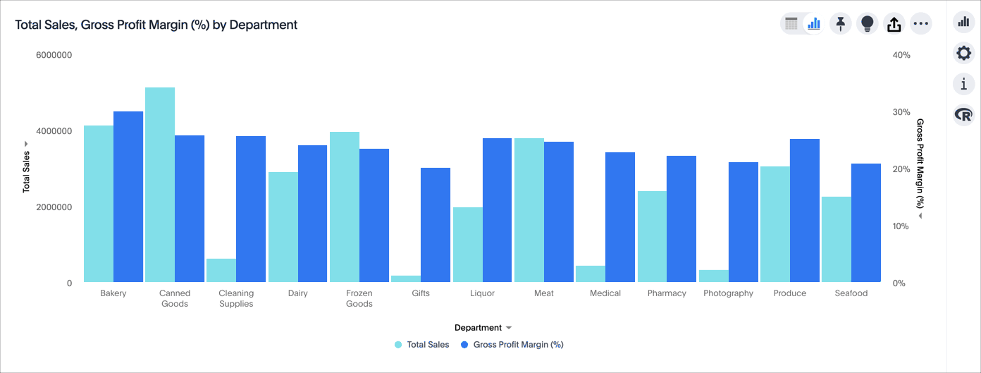
In this example, the original chart shows sales values by department from 0 to over $5M. We can enter a y-axis range of
2500000to5000000to show only sales between $2.5M and $5M.The chart reorganizes itself to reflect the new y-axis range.
To change the range for gross profit margin, select the dropdown menu icon next to the gross profit margin axis label.

Setting the y-axis range from the chart configuration menu
To set the y-axis range:
-
While viewing your answer as a chart, select the chart configuration icon
 on the upper right.
 -
Select the edit button
 that appears when you hover over y-axis.
 -
If you have multiple measures on the y-axis, select the measure you want to set the range for.
-
Under Min and Max, set the y-axis range by specifying start and end values.
In this example, the original chart shows sales values by department from 0 to over $5M. We can enter a y-axis range of
2500000to5000000to show only sales between $2.5M and $5M.The chart reorganizes itself to reflect the new y-axis range.
Create charts with multiple measures on the y-axis
You can have multiple measures on the y-axis of most (but not all) chart types. You can configure this in the chart configuration panel, by dragging and dropping measures out of the not visualized section. To learn more, see these topics:


