Scatter charts
The scatter chart is useful for finding correlations or outliers in your data. Scatter charts display your data as a collection of points, which can either be evenly or unevenly distributed.
Each point is plotted based on its own axes values. This helps you determine if there is a relationship between your searched columns.
In this chart, there is a correlation between total sales and total cost:
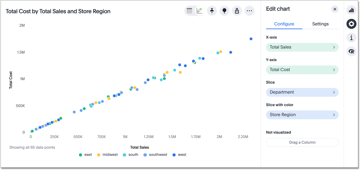
Note that this chart type allows you to both slice and slice with color.
The slice option only appears for scatter and bubble charts.
It allows you to break up data based on a specific column in your data;
in this case, department.
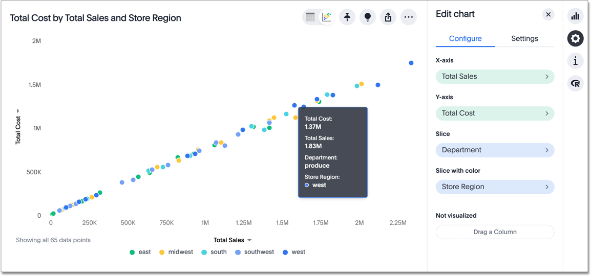
If you hover over a data point, you can see what department it represents:
Your search needs at least one attribute and one measure to be represented as a scatter chart.


