Sankey charts
The Sankey chart type contains both columns and a special type of line chart.
Sankey diagrams illustrate a flow through, a process, or a system. Transactional data is optimal for this type of diagram. For example, financial transactions that take place as money moves through accounts or as a product is processed. Many marketing users are familiar with Sankey charts as they analyze sales conversions.
When you build a Sankey chart, you must provide at least 2 (two) attributes and one measure. Your x-axis attributes can contain at most 13 values; any more and you cannot view a SanKey chart. ThoughtSpot Sankey charts are read from left to right. The width of the flow represents the measure, the attributes or "steps" appear as solid bars:
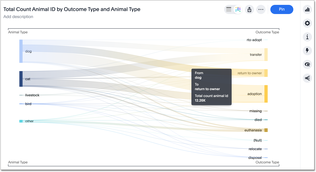
The Austin Animal Center Outcomes data shows the outcome of processing for different breeds of animal. The measure is the count of total animals. This chart shows the general outcomes for each animal type that entered the system.
When you select a flow, you can see the total number of animals in any flow. For example, you can see that dogs were by far the most likely animal to be returned to their owner, while dogs and cats were both adopted at a high rate.


