Line column charts
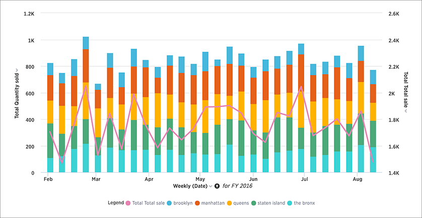
The line stacked column chart combines stacked column and line charts.
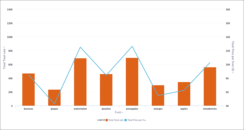
The line column chart combines the column and line charts. Your search needs at least one attribute and two measures to be represented as a line column chart.
Understand line column charts
Line column charts display one measure as a column chart and the other as a line chart. Each of these measures has its own y-axis.
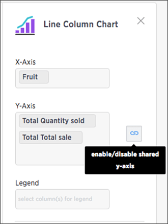
You can choose to enable shared y-axis by clicking the link icon found under Edit chart configuration.
Line stacked column charts
This chart is similar to the line column chart, except that it divides its columns with an attribute in the legend. There are two y-axes, one for each measure.
You can choose to enable shared y-axis by clicking the link icon found under Edit chart configuration.
Was this page helpful?Give us feedback!


