Run prebuilt R scripts on answers
Anyone with R privileges can run an R analysis ThoughtSpot using provided scripts, you don’t need to be an expert.
If you have R privileges on your ThoughtSpot instance, you can run R analyses on search results, and save and share the resulting visualization with others. The users you share visualizations with do not need R privileges.
Run an R analysis
-
Click the R icon
 on the toolbar for any search result (answer).
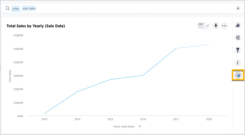
From here, you have options to write a custom script, or load a pre-built or ThoughtSpot provided script.
-
In the Analyze dialog, click the More icon
 next to the Custom R Script panel, and choose Load.
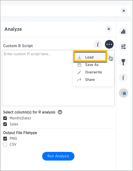
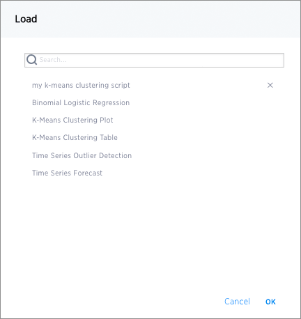
This brings up a list of pre-built scripts, both provided by ThoughtSpot and any created by programmers on your team.
-
Select a script, then choose the columns you want to include in the analysis and the output file type (PNG or CSV).
Note that the output file type must match the script.
For example, if you select one of the ThoughtSpot provided time series scripts, the comment at the top of the script provides guidance on what columns to select.
 # NOTE: Only two columns are needed for this analysis.
 # The first column should represent some date column
 # and the second should be some numeric measure column.
Also, scroll through the script to identify whether it’s coded to produce graphical (PNG) or tabular (CSV) output. The time series scripts are both set up to produce graphical output, as indicated by a line like this at the end of the scripts.
 png(#output_file#, width=1000);
 print(img);
-
Select Run Analysis to execute the script.
Time Series Outlier Example
In this example, we ran an analysis for Time Series Outlier Detection on search results that show sales totals by date.
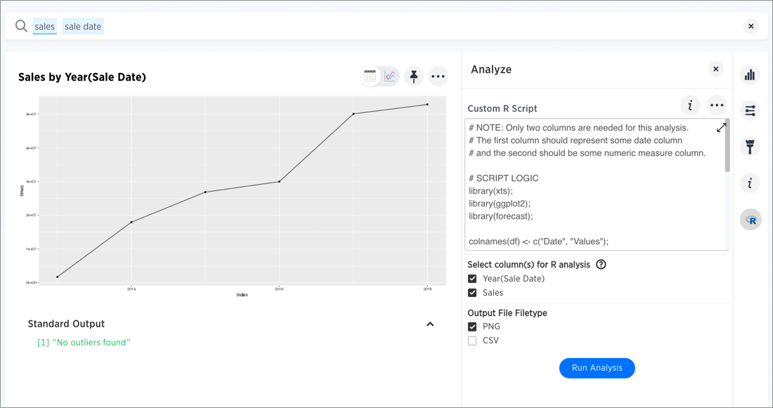
Note that we included a date column and a measure, and selected PNG as the output to match what the script requires. The original search could have had more columns than this, but you can always structure the analysis properly by selecting only the date column and measure column you want to focus on.
In this case, no outliers were found, so the R visualization matches the original search result line graph.
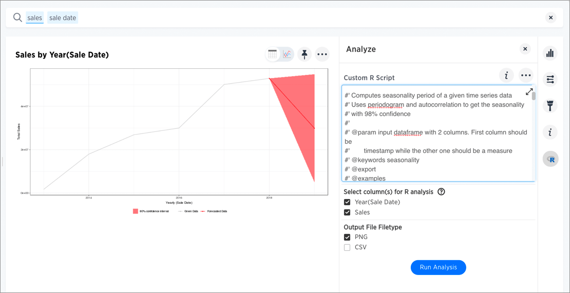
Time Series Forecast Example
In this example, we ran a Time Series Forecast on the same search result.
Diverging Bars Example
Here is an example of taking a script found online and repurposing it for a use case in ThoughtSpot. Antony Chen demo’ed this in a SpotOn webinar. You can find his full presentation on Custom R Scripts and demo at SpotOn Learning: ThoughtSpot 5.0 BI and Data Science Features in the Community.
Consider this script, found on this website of Top 50 ggplot2 Visualizations - The Master List (With Full R Code). A direct link to this script is here.
library(ggplot2)
theme_set(theme_bw())

# Data Prep
data("mtcars")  # load data
mtcars$`car name` <- rownames(mtcars)  # create new column for car names
mtcars$mpg_z <- round((mtcars$mpg - mean(mtcars$mpg))/sd(mtcars$mpg), 2)  # compute normalized mpg
mtcars$mpg_type <- ifelse(mtcars$mpg_z < 0, "below", "above")  # above / below avg flag
mtcars <- mtcars[order(mtcars$mpg_z), ]  # sort
mtcars$`car name` <- factor(mtcars$`car name`, levels = mtcars$`car name`)  # convert to factor to retain sorted order in plot.

# Diverging Barcharts
ggplot(mtcars, aes(x=`car name`, y=mpg_z, label=mpg_z)) +
  geom_bar(stat='identity', aes(fill=mpg_type), width=.5)  +
  scale_fill_manual(name="Mileage",
                    labels = c("Above Average", "Below Average"),
                    values = c("above"="#00ba38", "below"="#f8766d")) +
  labs(subtitle="Normalised mileage from 'mtcars'",
       title= "Diverging Bars") +
  coord_flip()
You can modify the script above to support the phone sales use case discussed in the webinar.
In this script, mtcars is replaced with references to our phone sales (df$Sales) and car name is replaced with Device Name both from the column data in the search example used in the webinar demo.
The script uses the ThoughtSpot data frame object (df), and adds two lines at the end to specify output type as a png image.
library(ggplot2)
theme_set(theme_bw())

# Data Prep
df$sales_z <- round((df$Sales - mean(df$Sales))/sd(df$Sales), 2)  # compute normalized mpg
df$sales_type <- ifelse(df$sales_z < 0, "below", "above")  # above / below avg flag
df <- df[order(df$sales_z), ]  # sort
df$`Device Name` <- factor(df$`Device Name`, levels = df$`Device Name`)  # convert to factor to retain sorted order in plot.

# Diverging Barcharts
img <- ggplot(df, aes(x=`Device Name`, y=sales_z, label=sales_z)) +
  geom_bar(stat='identity', aes(fill=sales_type), width=.5)  +
  scale_fill_manual(name="Sales",
                    labels = c("Above Average", "Below Average"),
                    values = c("above"="#00ba38", "below"="#f8766d")) +
  labs(subtitle="Normalised Sales for Phones",
       title= "Diverging Bars") +
  coord_flip()
png(#output_file#, width=1000, height=1000)
print(img)

