Charts that display a very large number of data values
High cardinality tables
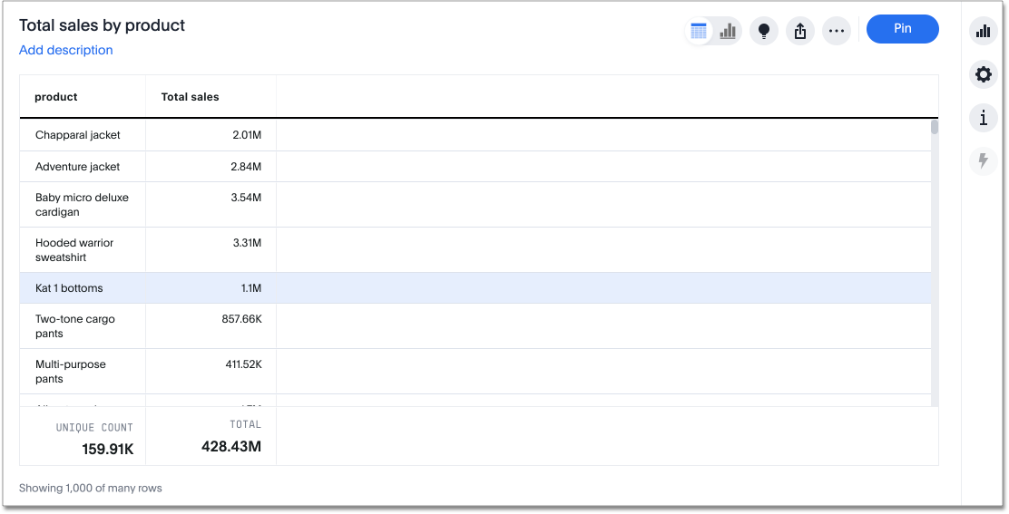
ThoughtSpot tables are no longer limited to 1000 rows. There is no maximum number of rows for tables.
Here, the table has many rows, and ThoughtSpot is showing the first 1000. The footer text displays Showing 1000 of many rows. If you scroll down, ThoughtSpot shows the next 1000, and the footer text displays Showing 2000 of many rows. If you scroll all the way down on your table, the footer text might display Showing 5018 of 5018 rows, for example. If your table has more than 1,000 rows, it does not tell you how many rows are in the data set, until you scroll all the way down. If your table has less than 1,000 rows, ThoughtSpot displays the number of rows in the data set in the footer.
High cardinality charts
ThoughtSpot charts contain several new features. You are no longer limited to 1000 data points. When your chart has a very large number of data values, you see a horizontal scroll bar at the bottom. The new default maximum number of data points is 20,000. You can configure this maximum, up to 35,000.
To configure the maximum number of data points on a chart for your whole cluster, contact ThoughtSpot support. To configure it for an individual chart, select the chart configuration icon ![]() , and open the Settings menu. Under Max data points, enter the maximum number of data points you would like ThoughtSpot to show at once, up to 35,000. If your administrator configured a smaller number as the cluster-wide maximum, you cannot individually configure a bigger maximum.
, and open the Settings menu. Under Max data points, enter the maximum number of data points you would like ThoughtSpot to show at once, up to 35,000. If your administrator configured a smaller number as the cluster-wide maximum, you cannot individually configure a bigger maximum.
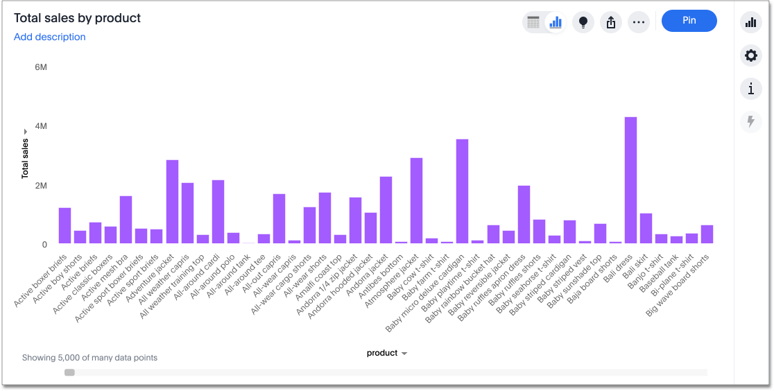
The footer text displays Showing 5,000 of many data points by default. If you adjust the Max data points to 15,000, for example, the footer text displays Showing 15,000 of many data points. If your chart has more than the maximum number of data points, it does not tell you how many data points are in the data set.
If you want to see the whole chart at one time, you can select the fit to screen option.
To fit to screen, click the edit chart configuration ![]() icon, and select the Settings menu.
Select fit to screen.
icon, and select the Settings menu.
Select fit to screen.
When you fit to screen, you see the whole chart, up to 35,000 data points, or your administrator-configured maximum. You can easily return to the zoomed-in view, by deselecting the fit to screen option.
Note that when you enable fit to screen, the all labels option is grayed out. You cannot turn on all labels when you fit to screen, unless the visualization does not have enough data points to require a scroll bar, and thus defaults to fit to screen mode.
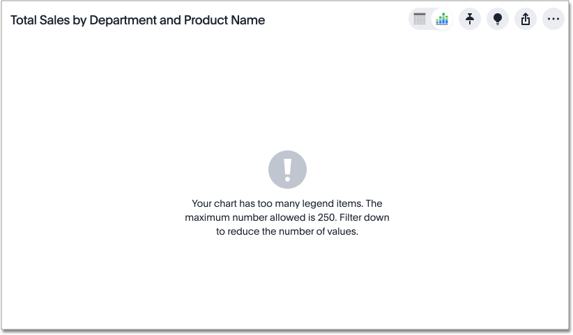
You can now have more than 40 legend items in your chart. You can slice with color using a column that has up to 250 values.
If you attempt to slice with color using a column that has more than 250 values, ThoughtSpot does not display the chart. You receive this error message, telling you to filter to reduce the number of values:
ThoughtSpot also warns you if your search contains too many data points, so that you can filter your search.