Change chart colors
To change the colors used in a chart, use the Customize menu to dive into the chip for the column or value you would like to change. You can set colors for:
-
bars, lines, areas, bubbles, maps, and other visuals on charts
-
slice with color
-
legends on charts
-
tables for conditional formatting
You can also apply a conditional format to change the color, based on specified criteria. This type of conditional formatting does not work with Line charts.
Colors are maintained across searches within a session.
For example, when doing a search on revenue by state, each state will keep the color assigned to it even if you change the search or chart type.
Set colors on a chart
-
While viewing your search or Answer as a chart, select the chart configuration icon
 to open the chart configuration menu.
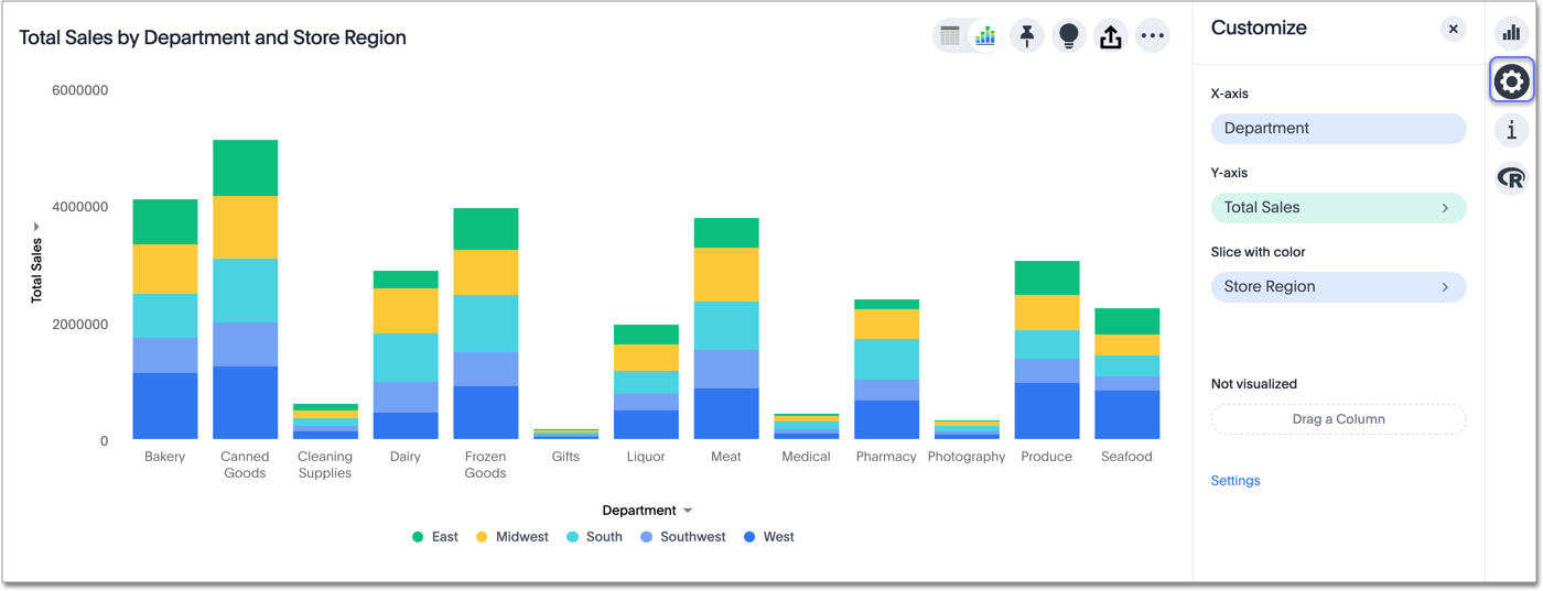
-
Select the color chip for the column or value you would like to change. Editable chips have a greater than icon: >.
-
Use the color picker to choose a new color to represent that value.
You can also enter a HEX value directly.
Your changes are saved immediately.
-
Select the X at the upper right to dismiss the chart configuration panel.
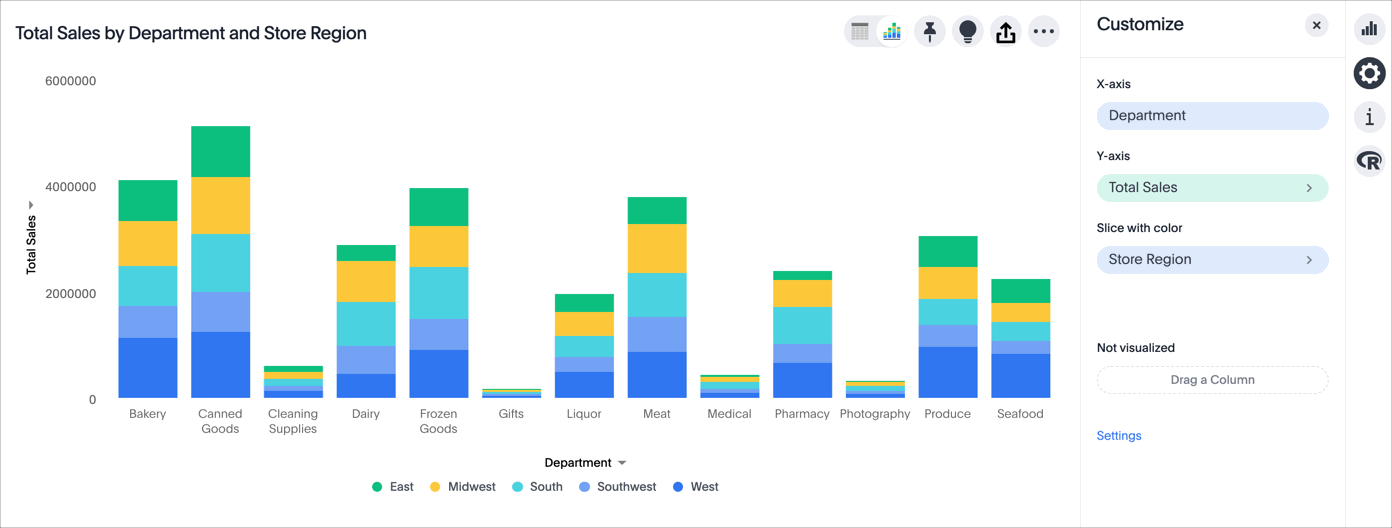
In the following example, we edited the colors used to slice with color.
Set colors from the legend
When you slice with color, or when you have more than one column on an axis, a legend appears next to or below your chart. The legend tells you the value each color in your chart stands for. You can change the colors in your chart directly from the legend. Simply select the color circle next to a legend item, and choose a different color, or input a HEX value.
Note that you must select the color circle next to the legend item to change the color. If you select the legend item itself, you temporarily hide it from the visualization.
How chart colors work
ThoughtSpot uses a specific logic to determine the colors in your charts. To learn more, expand the following Chart color logic section.
View the chart color logic
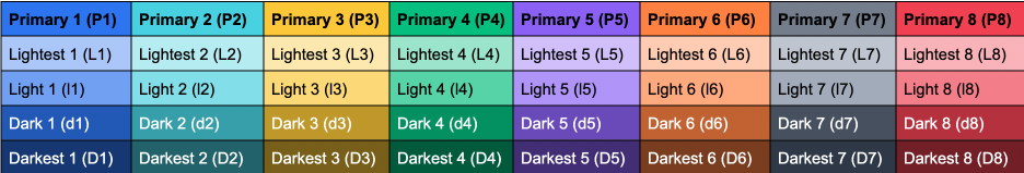
ThoughtSpot’s color palette is in the following format. ThoughtSpot assumes that any custom color palettes are in a similar format.
Standard color palette
| Primary 1 (P1) | Primary 2 (P2) | Primary 3 (P3) | Primary 4 (P4) | Primary 5 (P5) | Primary 6 (P6) | Primary 7 (P7) | Primary 8 (P8) |
|---|---|---|---|---|---|---|---|
Lightest 1 (L1) |
Lightest 2 (L2) |
Lightest 3 (L3) |
Lightest 4 (L4) |
Lightest 5 (L5) |
Lightest 6 (L6) |
Lightest 7 (L7) |
Lightest 8 (L8) |
Light 1 (l1) |
Light 2 (l2) |
Light 3 (l3) |
Light 4 (l4) |
Light 5 (l5) |
Light 6 (l6) |
Light 7 (l7) |
Light 8 (l8) |
Dark 1 (d1) |
Dark 2 (d2) |
Dark 3 (d3) |
Dark 4 (d4) |
Dark 5 (d5) |
Dark 6 (d6) |
Dark 7 (d7) |
Dark 8 (d8) |
Darkest 1 (D1) |
Darkest 2 (D2) |
Darkest 3 (D3) |
Darkest 4 (D4) |
Darkest 5 (D5) |
Darkest 6 (D6) |
Darkest 7 (D7) |
Darkest 8 (D8) |
Standard color algorithm
The standard rules for color application for charts are as follows:
-
If the chart requires only one color, ThoughtSpot selects a primary color depending on whether you enabled color rotation.
-
ThoughtSpot selects the number of primary colors based on the total number of colors required. These colors always appear in order: Primary 1 appears first, then Primary 3, and so on. See Primary color count selection.
-
If the chart requires more than one color, ThoughtSpot determines the number of shades of each color by dividing the total number of colors by the number of primary colors. For example, if the chart requires 20 colors, ThoughtSpot uses 6 primary colors. 20/6 = 3 shades of each color. ThoughtSpot picks the remaining two shades from the first two primary colors.
-
Depending on the number of shades required, ThoughtSpot uses the following shades of each color, in sequence:
Number of shades Default mode Rainbow mode 1
Primary
Primary
2
Primary, Lightest
Primary, Light
3
Primary, Lightest, Dark
Primary, Light, Dark
4
Primary, Lightest, Dark, Light
Primary, Lightest, Dark, Light
5
Primary, Lightest, Dark, Light, Darkest
Primary, Lightest, Dark, Light, Darkest
Primary color count selection
The number of primary colors a chart uses depends on the number of total colors the chart requires. Refer to the following table:
| Number of colors required | Number of primary colors used |
|---|---|
1 |
1 |
2-8 |
4 |
9-15 |
5 |
16-24 |
6 |
25-35 |
7 |
36+ |
8 |
Color rotation
The Style Customization color rotation option determines whether single-color charts use a random primary color or always use the first primary color in the palette. If you enable color rotation, ThoughtSpot may choose any color from Primary 1 through Primary 6 in your color palette for single-color charts. If you disable color rotation, ThoughtSpot always chooses Primary 1.
| Disabling color rotation only affects single-color charts. It does not apply to multi-colored charts. |
Rainbow mode
Some chart types use rainbow mode to allocate colors instead of the default allocation. The default allocation uses all shades of a color first and then applies all shades of the next color required. Rainbow mode uses all the primary colors in your color palette, then one shade of each primary color, then the next shade of each primary color, and so on.
Chart-specific color algorithms
For information on how colors work for specific charts, refer to the following table.
| Chart type | Color algorithm | Mode | Notes | ||
|---|---|---|---|---|---|
Column |
Standard |
Default |
N/A |
||
Stacked Column |
Standard |
Default |
N/A |
||
Line |
Standard |
Rainbow |
N/A |
||
KPI |
Standard |
Rainbow |
Cannot currently select colors manually. As a workaround, select a color in a different chart type, and switch back to KPI. |
||
Pivot Table |
N/A |
N/A |
If in heatmap mode, follows heatmap logic. |
||
Pie |
Standard |
Default |
N/A |
||
Bar |
Standard |
Default |
N/A |
||
Stacked Bar |
Standard |
Default |
N/A |
||
Line Column |
Standard |
Default |
N/A |
||
Area |
Standard |
Default |
N/A |
||
Stacked Area |
Standard |
Default |
N/A |
||
Line Stacked Column |
Standard |
Default |
The line counts as another color. ThoughtSpot applies color to the line before applying color to the columns. |
||
Scatter |
Standard |
Default |
ThoughtSpot chooses colors for points based on the order of the points in the data response. |
||
Bubble |
Standard |
Rainbow |
Bubble charts use translucent versions of the standard color palette. |
||
Waterfall |
Standard |
Rainbow |
N/A |
||
Heatmap |
Uses a color range based on Primary 2.
|
Default |
N/A |
||
Treemap |
Uses a color range based on Primary 1.
|
Default |
N/A |
||
Funnel |
Standard |
Default |
N/A |
||
Geo Bubble |
Standard |
Default |
Bubbles are translucent and appear lighter than the selected color. |
||
Geo Heatmap |
Uses a specific lilac.
|
Default |
No overrides are available currently. |
||
Geo Area |
Uses a specific yellow-to-red gradient. You can select an individual color to use, and ThoughtSpot builds a gradient around that color.
|
N/A |
N/A |
||
Sankey |
Standard |
Default |
Cannot override the colors used. ThoughtSpot chooses colors for points based on the order of the points in the data response. |
||
Radar |
ThoughtSpot sets the base color by default. The color of the radar line is determined by the standard algorithm. |
Default |
N/A |
||
Candlestick |
Up/down default to green/red respectively. You can override them manually. |
N/A |
N/A |
||
Pareto |
Standard |
Default |
The cumulative line is the first color. The active measure is the second color. |
Change chart gradient
You can now choose multiple colors to define a gradient in charts that support gradients — geo heatmap, geo area, heatmap, and treemap charts. You can control the low, mid, and high values, and numerical value points to customize the gradient.
To define the gradient in a geo heatmap, geo area, heatmap, or treemap chart, follow these steps:
-
Open your chart, click the gear icon, and select the measure tile under Value. In a search by sales, item type, and city, the value would be sales.
-
Select Edit under Gradient.
-
In the Gradient pop-up, define the colors for the Low, Midpoint, and High values using the color selector dropdowns.

-
In the text boxes below the color selectors, you can define the low, midpoint, and high points numerically. You can define the low point, high point and midpoint as a narrow range if you would rather only see gradients for the top values of your measure.
-
(Optional) Select Flip Color to switch the high and low value colors.
-
Select Save.


