Change axis options
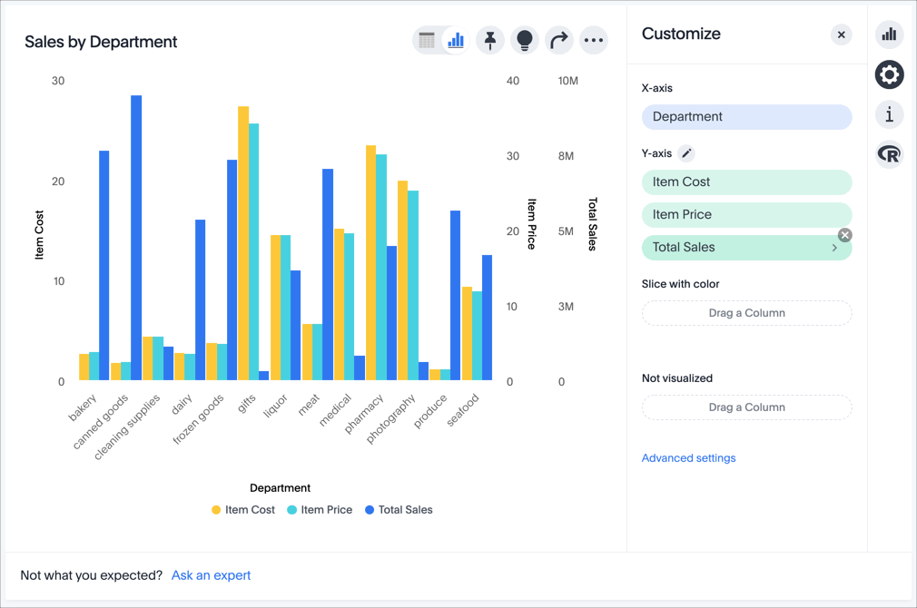
Change the axis aggregate
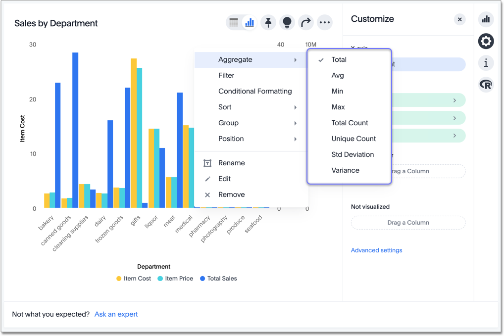
To change the axis aggregation, click the Aggregate option in the axis menu, and select an alternative from the list of options.
Depending on the type of data type and other settings, the aggregation options include Total, Avg, Min, Max, Total Count, Unique Count, Std Deviation, and Variance.
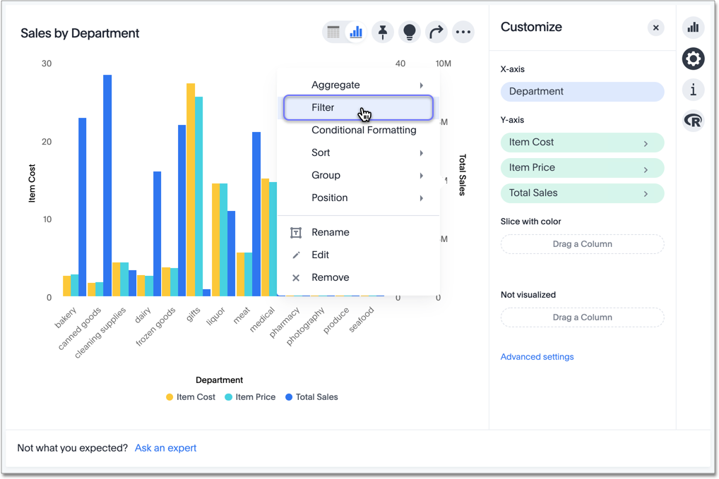
Add, change, and remove filters
To manage the filters applied to the axis (in this example, Total Sales), follow these steps:
-
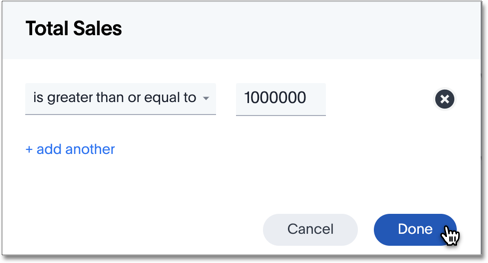
Select the Filters option in the axis menu.
-
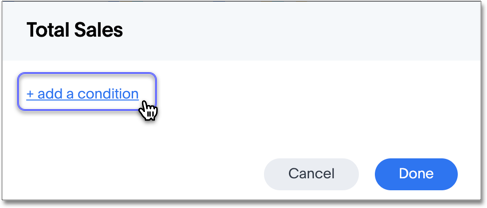
In the window modal, select + add a condition.
-
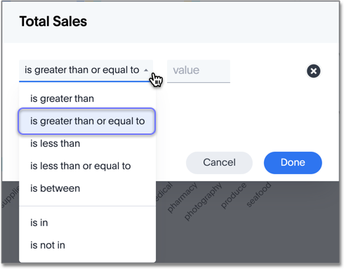
Select the comparison option.
Here, the options include is greater than, is greater than or equal to, is less than, is less than or equal to, is between, is in, and is not in.
In this example, select is greater than or equal to.
-
Set the relevant numerical limits.
Here, enter the maximum of
1000000.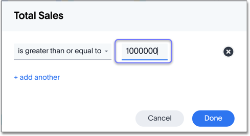
Note that if you select the is between comparison operator, you must set two limits: minimum and maximum. Similarly, is in and is not in operators require a list of values separated by ";".
-
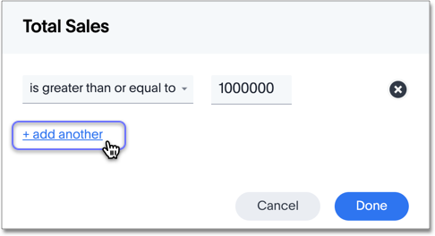
To add another filter condition, select + add another.
-
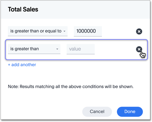
To remove a filter condition, select the delete icon (x) next to its definition.
-
Select Done.
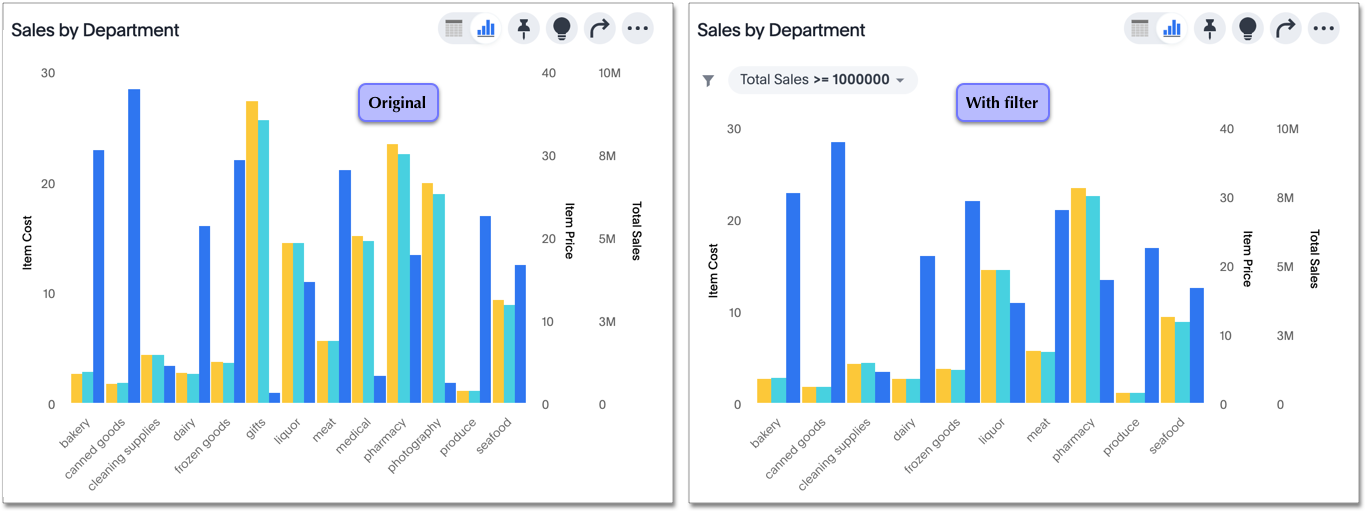
Here, you can see differences between the original chart and the one with the filter applied: Three (3) of the departments had sales less than $1,000,000, and they don’t appear on the newer chart.
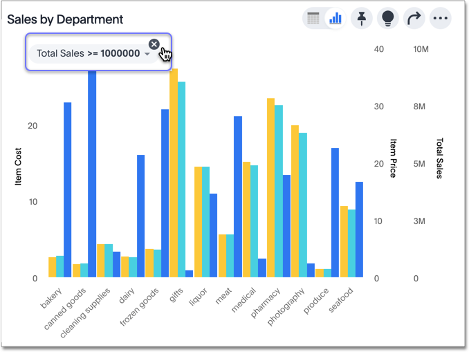
To remove a filter from the chart, select the x icon on the filter tile.
Apply conditional formatting
You can use conditional formatting to show charts with a target value or range drawn as a line in the chart, and the legend colors determined by where values fall relative to the target.
To apply conditional formatting to a chart (in this example, Total Revenue by Supplier Country), follow these steps:
-
Select the edit chart configuration icon
 to the upper right of your chart.
The Edit chart panel appears, on the Configure menu.
Alternatively, you can select the Conditional formatting option in the axis menu for the measure you would like to add a conditional formatting rule for.
If the new Answer experience is off in your environment, you can only access chart conditional formatting from the axis menu.
to the upper right of your chart.
The Edit chart panel appears, on the Configure menu.
Alternatively, you can select the Conditional formatting option in the axis menu for the measure you would like to add a conditional formatting rule for.
If the new Answer experience is off in your environment, you can only access chart conditional formatting from the axis menu.
If the advanced conditional formatting feature is on in your environment, you can compare the values of your chosen column to other columns as well as to static thresholds. -
From the Edit chart menu, select the measure you would like to add a conditional formatting rule for.
-
The Edit panel for that column appears. Under Conditional formatting, select + Add rule.
-
Select an operator. The valid options for measures are
less than,greater than,less than or equal to,greater than or equal to,equal to,not equal to, andbetween. -
Select the conditional value, or in the case of the
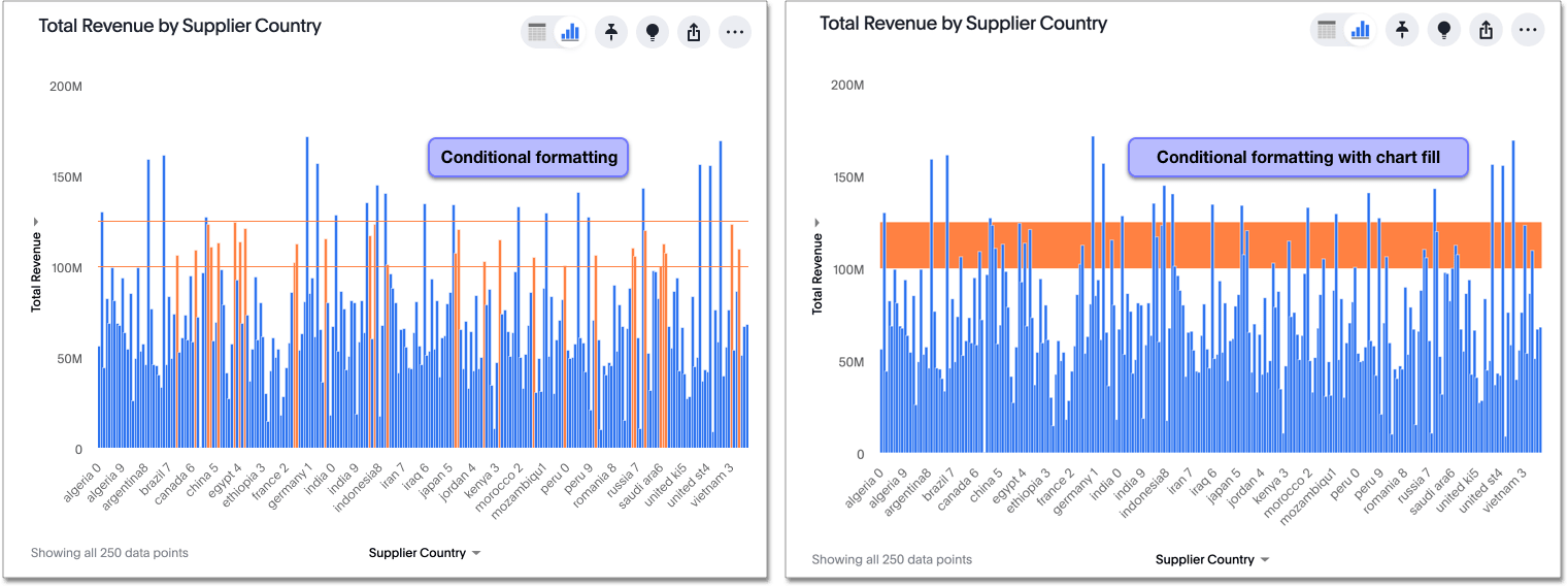
betweenoperator, the conditional range. Here, we apply conditional formatting to revenue values between100 millionand125 million.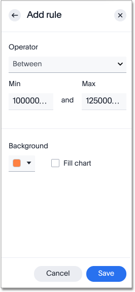
-
To specify a different color of the conditional format, choose the new color from the color selector.
This option draws upper and lower limit lines on the chart, and colors the chart elements that meet the conditional requirements.
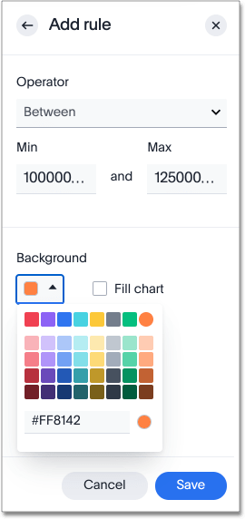
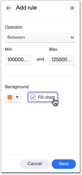
Alternatively, you can place a range band on the chart. Select the Fill chart option.
-
To add another condition, select + Add rule below the rule(s) you already created.
-
To remove a defined conditional format, navigate to the Edit panel for the measure. Select the delete icon that appears when you hover over a rule.
-
Select Done.
Here, you can see a chart that highlights elements with conditional formatting on some elements. You can also see how the same chart appears with a background chart band.
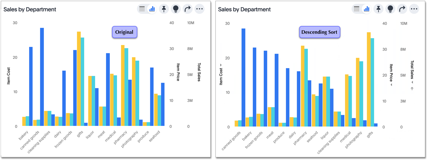
Change the sort
To change the sorting of a measure on an axis, select the Sort option in the axis menu, and choose an alternative from the list of options: Ascending or Descending.
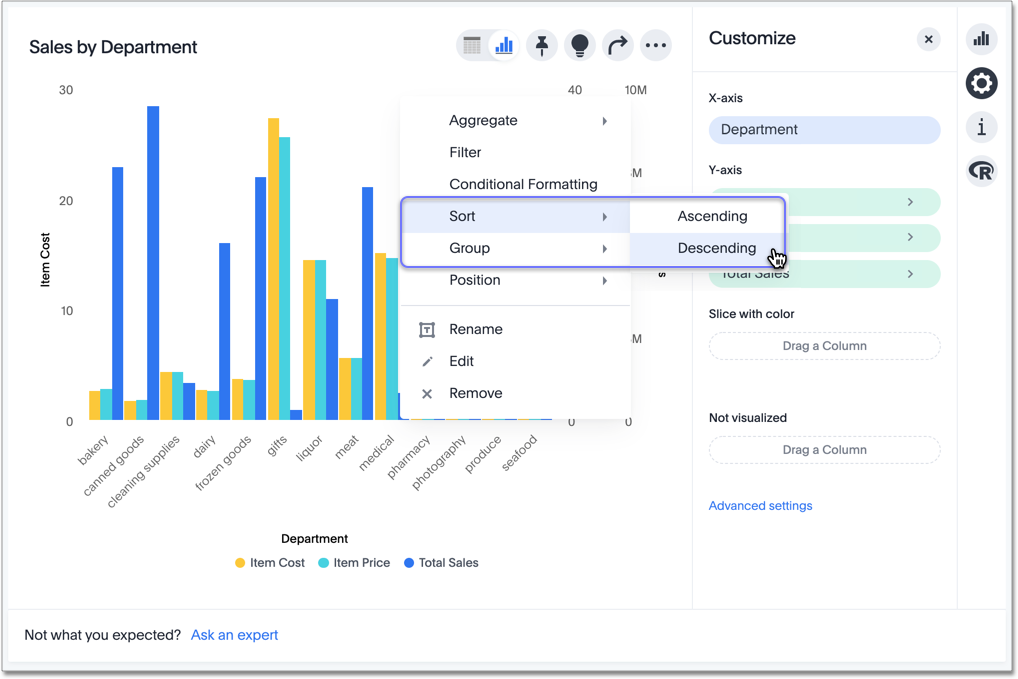
Here, you can compare the original chart that was not sorted on the Total Sales axis with the chart that uses descending sort.
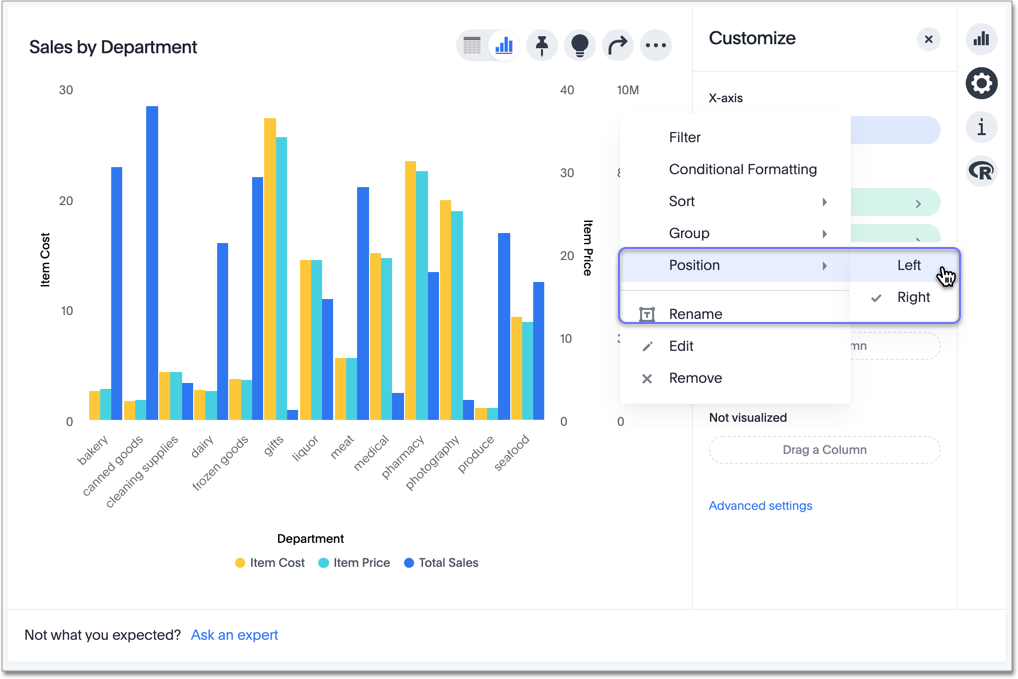
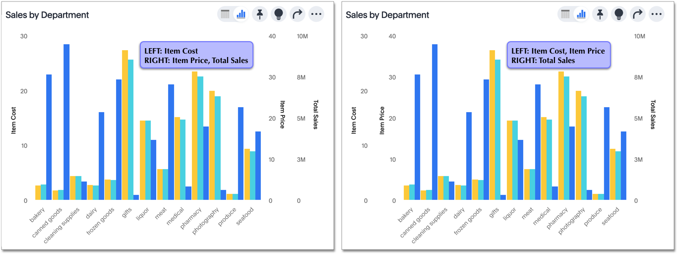
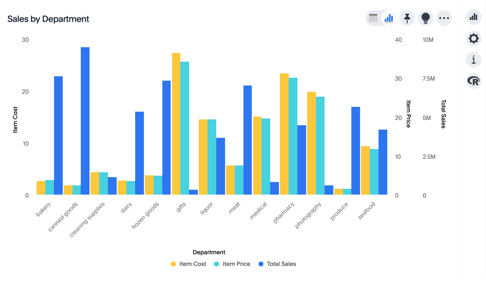
Change the position of the axis
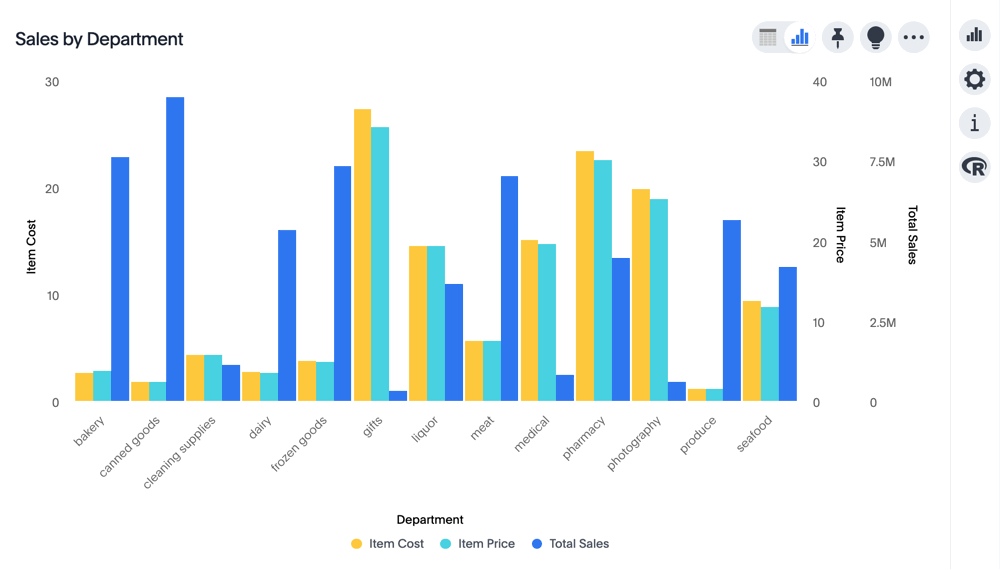
It is generally easier to interpret a chart if axes that use the same units of measurement or scale appear on the same side of the chart. In our example, we can best visualize Item Cost and Item Price on the same side of chart.
To change the position of an axis, click the Position option in the axis menu, and then select an alternative from the list of options: Left or Right.
Here, we move the Item Price axis from the right side of the chart to the left side.
You can compare the original chart with the one where the Total Sales axis is on the right, while Item Cost and Item Price both appear on the left.
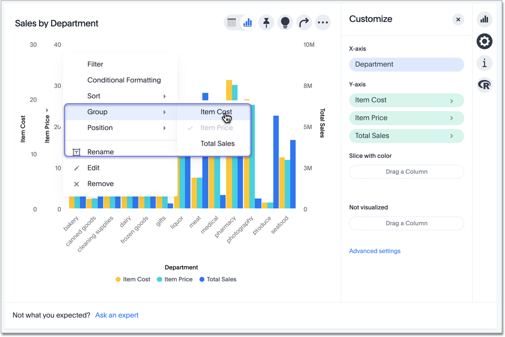
Change the grouping
When two axes use the same unit of measurement and a similar scale, we can group them together.
To change the grouping on an axis, select the Group option in the axis menu, and choose an alternative from the list of options, which are the measures on the other axes.
Here, we change the Item Price axis by grouping it with Item Cost.
Compare the original chart with one that groups Item Price and Item Cost as Item Price & Item Cost. The chart looks cleaner, and clearly communicates the distinct information for each of the two measures.
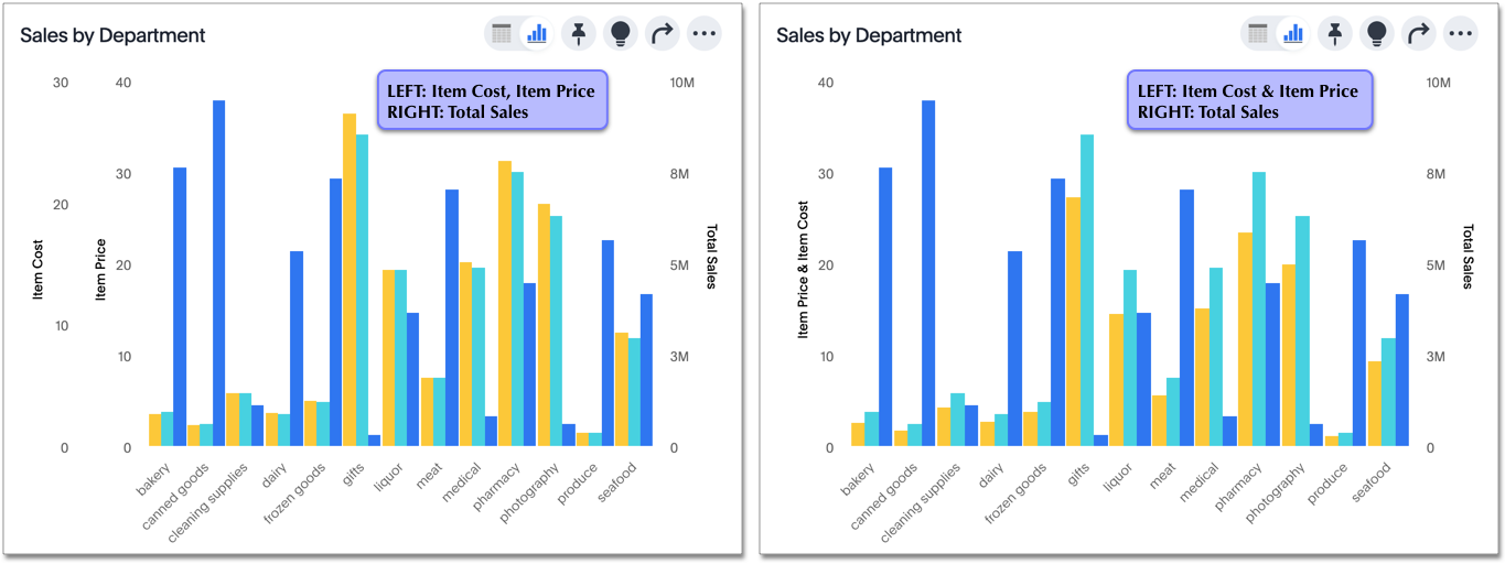
Notice that the Customize menu shows a linkage between the two grouped axes.
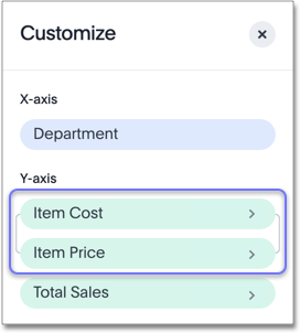
Rename the axis
You can always rename an axis for clarity, brevity, format, and so on.
In our example, it makes sense to rename the axis created from grouping as Item Price & Item Cost to something shorter, like Item Price and Cost.
To rename an axis, select the Rename option in the axis menu, type the new name, and either click out or select Enter/Return on your keyboard.
Edit the axis
When you choose to edit the axis, you get the comprehensive view of everything that can be changed on the axis: you can Configure the axis name, position (left or right), and the minimum and maximum values, and you can Format the category of the column, its units, and the representation of negative values.
To edit this axis (in this example, Item Price), follow these steps:
-
Select the Item Price axis.
-
In the dropdown menu, select Edit.
-
The Edit Axis menu appears.
-
In the Edit Axis menu, make the changes to the axis configuration and number format:
- Configure
-
- Name
-
Change the name of the axis. Also see Rename the axis.
- Position
-
Change the position of the axis relative to the chart. The options are Right and Left. Also see Change the position of the axis.
- Min
-
Change the minimum value on the axis. For example, most charts default to 0-based axis representation for numerical values; this setting overrides it.
- Max
-
Change the maximum value on the axis. Similar to Min limit.
- Format
-
- Category
-
This specifies the number formatting for the axis. Options include Number, Percentage, and Currency.
- Unit
-
Unit choice specifies the representation of numbers on the axis. Options include Auto (ThoughtSpot uses abbreviations for really large numbers only), None, Thousand (K), Million (M), Billion (B), and Trillion (T). Note that answer columns inherit the units from the underlying column in the model, and answer formulas inherit the units of the first column used in the formula.
- Negative values
-
Specify the representation of negative numbers in one of these formats: -1234, 1234-, or (1234).
Remove the axis
Removing the axis removes the data from the display, but not from the Answer entirely. Instead, the column that the axis represents appears in the Not visualized section of the Customize menu.
To remove an axis (in this example, Item Price), follow these steps:
-
Select the Item Price axis.
-
In the dropdown menu, select x Remove.
-
The Customize menu appears.
Notice that the Item Price axis and the corresponding data no longer appear on the visual. However, the Item Price column appears in the Not visualized section of the Customize menu.


