Pivot table
Pivot tables enable you to explore an alternate visualization of your data in a wide, customizable table. With pivot tables, you can use the same table to visualize some of your data horizontally, and some data vertically. A pivot table is a chart time table that uses a drag-and-drop interface.
| Starting in May 2022, ThoughtSpot rebranded pinboards as Liveboards. For backward compatibility, we currently support internal processes and external methods that use the older naming convention. |
If you would like to visualize your search as a pivot table, click on the change visualization icon ![]() near the upper right of your screen, and select pivot table.
You need at least one attribute and one measure in your search.
near the upper right of your screen, and select pivot table.
You need at least one attribute and one measure in your search.
You can restructure your pivot table by dragging and dropping the measures and attributes under edit chart configuration ![]() , or by dragging and dropping column headings on the table itself.
, or by dragging and dropping column headings on the table itself.
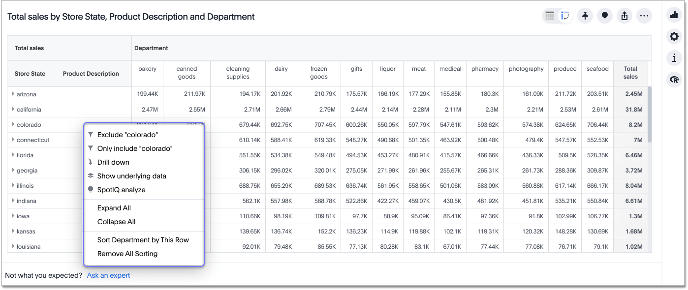
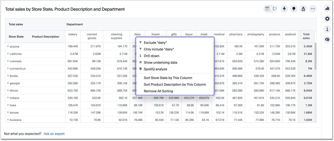
If you right-click a row or column heading, the system displays a contextual menu, allowing you to exclude or include values, drill down, show underlying data, SpotIQ analyze, or sort.
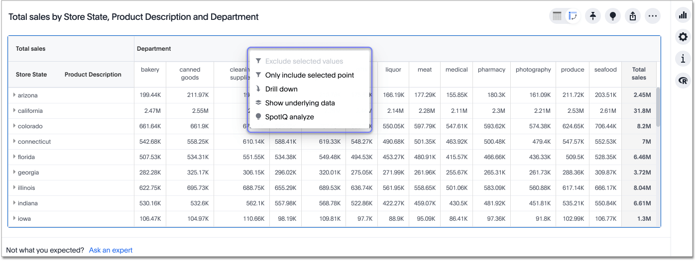
If you right-click a table cell, the system displays the contextual menu, so you can exclude or include values, drill down, show underlying data, or SpotIQ analyze.
If your pivot table contains more than 2 measures, the column header now has a horizontal scroll bar, so you can see all your measures without taking up excessive space in the pivot table.
Sort
To sort any column or row, right-click on a row or column heading or subheading or a measure or attribute name and select Sort. You can also sort from the search bar. Type sort by <column name> [ascending | descending].
You can sort a pivot table in many different ways. The ways you can sort a pivot table differ, depending on whether you are using the classic answer experience or the new answer experience.
Sort with the classic answer experience
If you use the classic answer experience, you have the following limitations:
-
You can only sort on one attribute at a time.
-
When you sort by a measure, it sorts both columns and rows.
-
When you save a pivot table that you sorted, any sorts you added do not save.
Sort with the new answer experience
If you use the new answer experience, you can sort in the following ways:
-
You can sort on more than one attribute at a time, as long as it works within ThoughtSpot’s logic. See the sorting logic table.
-
When you sort by a measure, you sort rows only. This allows you to sort the rows by a measure and the columns by an attribute. For example, in the sample pivot table at the beginning of the article, you can sort the rows by
Total salesand the columns byStore State. -
When you save a pivot table that you sorted, all sorting saves as well.
-
If you sort both from the search bar and from the in-context row or column heading menus, whichever sorting is the latest overrides the other. For example, if you right-click on a
Departmentrow heading and select Sort ascending, and then addsort by date monthlyto the search bar, ThoughtSpot sorts only bydate monthly.
| Starting state | Add sort on row attribute | Add sort on column attribute | Add sort on measure |
|---|---|---|---|
No sorts in place |
Adds sort |
Adds sort |
Adds sort, only across rows |
One or multiple sorts exist on row attributes |
Adds sort |
Adds sort |
Overrides previous sorts and sorts based on the measure |
One or multiple sorts exist on column attributes |
Adds sort |
Adds sort |
Adds sort, only across rows |
One sort on measure exists |
Adds sort. Overrides previous sort by measure |
Adds sort |
Overrides previous sort by measure |
Sort on both row and column attributes exists |
Adds sort |
Adds sort |
Adds sort. Overrides sort on row, retains sort on column |
Sort on column attribute and measure exists |
Adds sort. Overrides sort on measure, retains sort on column |
Adds sort |
Adds sort. Overrides sort on measure, retains sort on column |
Expanding or contract columns and rows
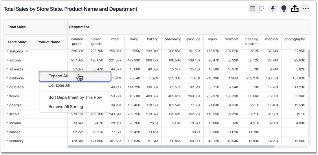
Click on a column or row heading to expand it. Additionally, you can expand or collapse all columns and rows by right-clicking the arrow on the upper left of a cell.
When you pin a pivot table to a Liveboard, it retains your expansion settings.
Display data as a percentage of the total
You can see your data as a percent of a row or column total, or as a percent of the grand total. Grand totals aggregate all the data in your pivot table.
To see your data as a percent, click the edit chart configuration ![]() icon, and click settings at the bottom of the chart configuration panel.
Click on the dropdown menu to choose whether you want to see your data as a percent of a row or column total, or as a percent of the grand total.
icon, and click settings at the bottom of the chart configuration panel.
Click on the dropdown menu to choose whether you want to see your data as a percent of a row or column total, or as a percent of the grand total.
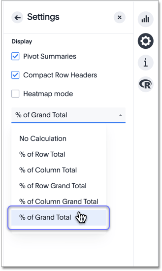
You only see 100% value when grand total rows is enabled. When it is disabled, the rows and columns have no parental total column, so the percentage cannot be calculated. All intermediate totals (columns or rows) display the percentage values calculated with respect to their parent. For each inner summary (column or row) the parental total values are assumed to be 100% internally.
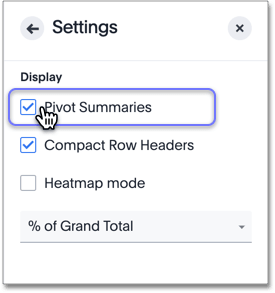
Select Pivot Summaries in the Settings menu to see row and column totals.
Format row headers
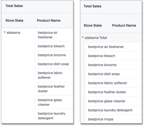
You can view your row headers in a more compact (tree) layout. To turn on compact row headers, select Compact row headers in the Settings menu.
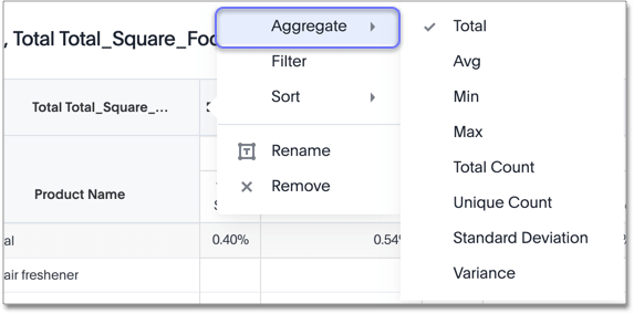
You can change the type of total shown for an aggregated measure from the header menu that appears when you click on a header’s more icon:
Heatmap mode
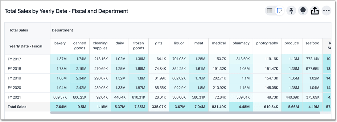
The heatmap functionality allows you to see which measures contribute more to the total than others within the table.
To turn on the heatmap, click the edit chart configuration ![]() icon, and click settings at the bottom of the chart configuration panel.
Select heatmap mode.
icon, and click settings at the bottom of the chart configuration panel.
Select heatmap mode.
Number and conditional formatting
You can perform conditional and number formatting on pivot tables. Both these features work the same way they work for regular ThoughtSpot tables, except that you cannot set different conditional formatting rules for pivot table cells and pivot table column summaries. Select Edit chart configuration ![]() , and click on the measure you would like to add number or conditional formatting to. Refer to Apply conditional formatting and Number formatting for more information.
, and click on the measure you would like to add number or conditional formatting to. Refer to Apply conditional formatting and Number formatting for more information.
Pivot table limitations
The pivot table chart type has these limitations:
-
The pivot table displays a maximum of 100k rows. If your query returns more than 100k rows, you cannot visualize it with a pivot table.
-
You cannot use conditional formatting, unless you use the new answer experience.
-
Pivot tables do not support use of group aggregation functions.
-
If the query the pivot table is based on contains the
toporbottomkeyword, column and row summaries are not accurate. -
You cannot filter aggregated columns or columns with aggregated formulas.
-
Pivot tables do not support cumulative functions.
-
Pivot tables do not support moving functions.


