Pie charts
A pie (or a circle) chart is a statistical graphic that divides data into slices to illustrate numerical proportion. In a pie chart, the arc length of a slice is proportional to the quantity it represents.
The pie chart is a classic chart type that displays your search in a circle. The default pie chart in ThoughtSpot displays data in the shape of a doughnut, or a thick ring.
How pie charts divide data
Pie charts divide your data into sectors that each represent a proportion of a whole circle.
To display the exact values of each slice and the percentage values, select the Chart configuration icon ![]() > Settings > All labels.
> Settings > All labels.
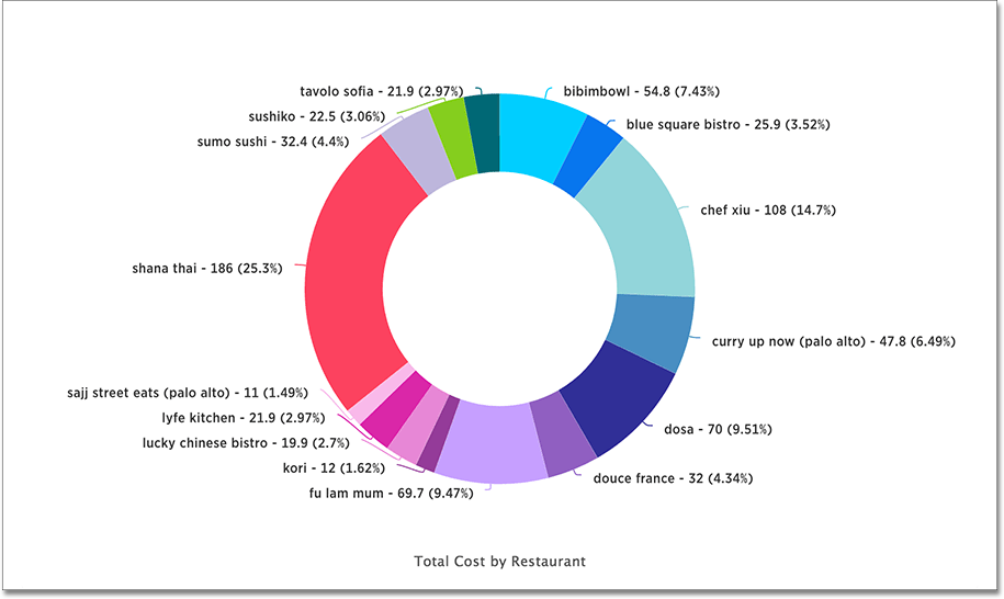
Your search needs at least one attribute and one measure to be represented as a pie chart. Also, there must be fewer than 250 values in the attribute column.
Pie in pie charts
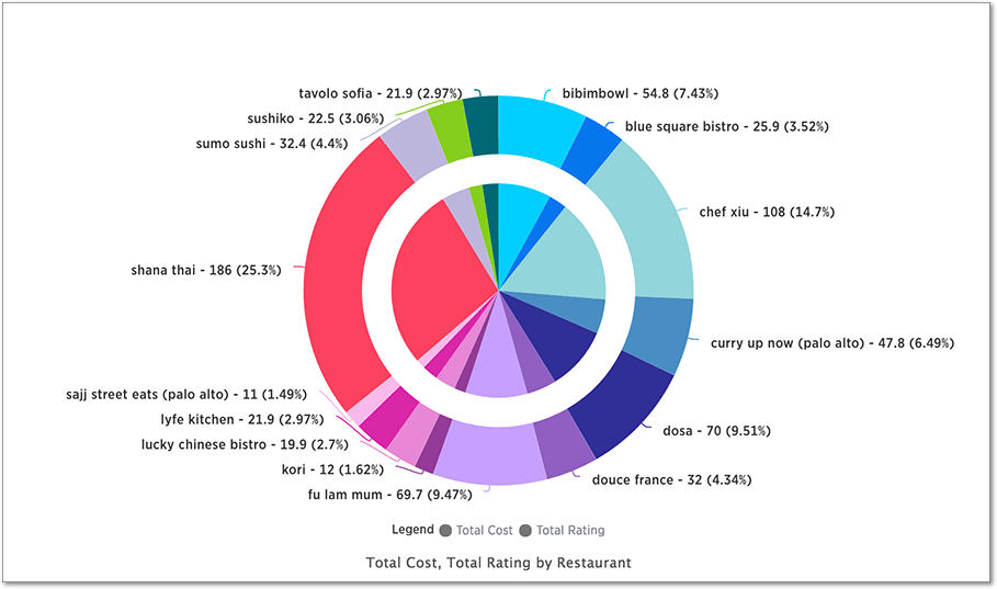
The pie in pie chart can be created from a regular pie chart in order to compare more than one component of an attribute. Pie in pie charts show two concentric pie charts comparing different measures.
To see a pie in pie chart, assign two different measures to the Size section under Edit chart configuration ![]() .
.
Color customization of pie in pie charts
You can customize the colors of each pie in a pie chart using the Chart configuration icon ![]() . Note that if you have a pie in pie chart, you change the colors for both widgets that apply to the same attribute value.
. Note that if you have a pie in pie chart, you change the colors for both widgets that apply to the same attribute value.
-
Click the Chart configuration icon.
-
From the Edit chart window, click the attribute under Category.
-
Click the color chip next to each item you want to change. You can also enter the Hex value directly. Your changes are saved immediately.


