Bubble charts
The bubble chart is a variation of the scatter chart, and its data points appear as bubbles. Your search must have at least one attribute and two measures to generate a bubble chart.
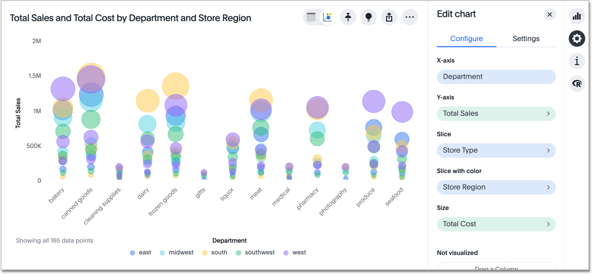
The bubble chart displays three to five dimensions or measures of data. In addition to the traditional X and Y axis, the size of the bubble represents a measurement. Bubble charts can show two more attributes, when you slice and/or slice by color.
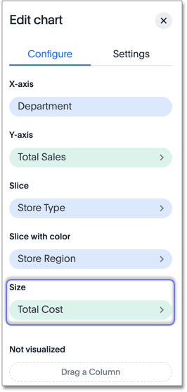
Slice and slice by color
This chart type lets you slice and slice with color. You can also slice scatter charts.
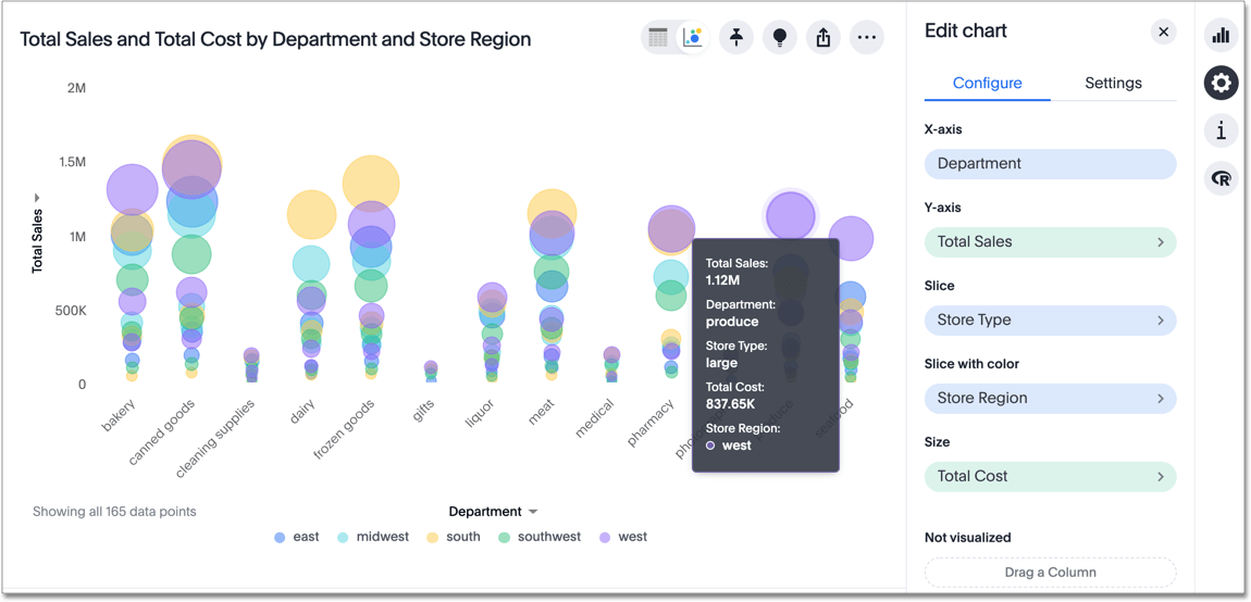
Slicing helps you to break up data based on a specific column. In the following illustration, we sliced the chart by store type. We also used store region to slice by color.
If you hover over a data point, you can see what store type and store region it represents. Here, we have a large store in the west region: