New scatter charts
The new scatter chart displays data as individual points positioned by two measures — one on the X-axis and one on the Y-axis. Each point represents a single data record, making scatter charts ideal for identifying correlations, clusters, and outliers across two variables.
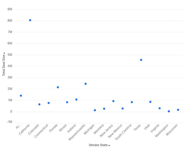
Your search needs at least one attribute and two measures to be represented as a scatter chart.
New features
-
Color slicing support: Apply an attribute as a color dimension to visually distinguish groups of data points within the same chart
-
Faceting support: When an attribute is added to the trellis section, the chart generates small multiples — one scatter plot per attribute value
-
When either of x-axis / y-axis has measures:
-
You can do grouped / dual / multivariate axis configurations
-
When a measure is present in the axis, attributes cannot be added to the axis
-
-
When either axis has attributes:
-
faceting is supported
-
-
Additional display settings:
-
New setting to toggle between solid and hollow marks
-
Marker style allows different shapes to be displayed instead of circular markers
-
-
Granular tooltip customization to control what information appears when hovering over a data point