New donut charts
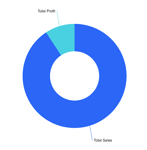
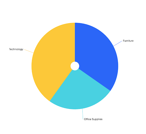
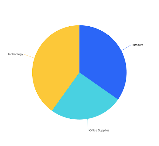
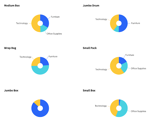
The new donut charts display data as proportional slices of a circle, where each slice represents a category’s share of the total. Donut charts use the same layout with a hollow center, which can be used to display a summary value or label.
These charts are best suited for showing part-to-whole relationships when there are a small number of well-differentiated categories.
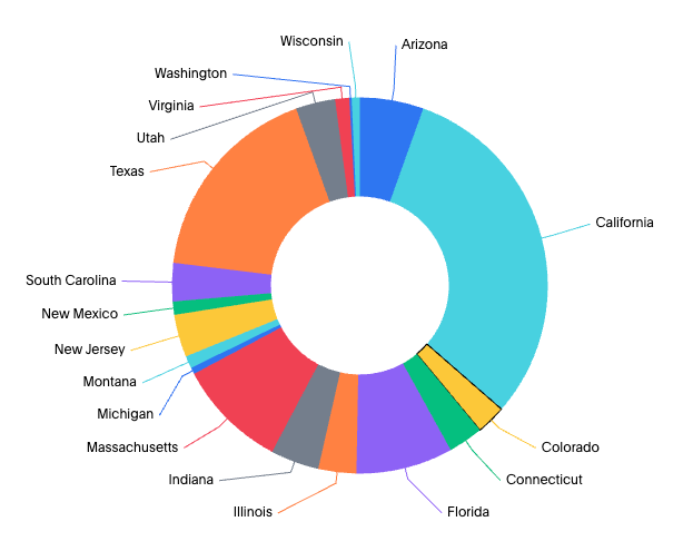
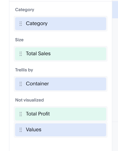
Your search needs at least one attribute and one measure to be represented as a pie or donut chart.
New features
-
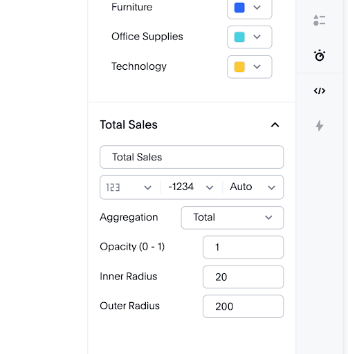
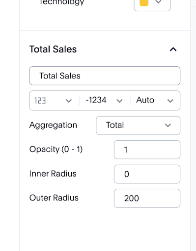
Switch between pie and donut display styles within the same chart configuration
-
Faceting support: Facet is created when attributes are added on the primary axis and trellis are created when an attribute is added to a trellis channel
-
Color slicing support to distinguish categories within slices
-
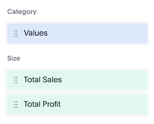
Values chip can be added as the last attribute chip in all the above cases