New bubble charts
The new bubble chart is a variation of the scatter chart that adds a third data dimension: the size of each bubble. Two measures define the position of each bubble on the X and Y axes, while a third measure controls its size.
Bubble charts are ideal for comparing three variables simultaneously and for identifying relationships between size, position, and category.
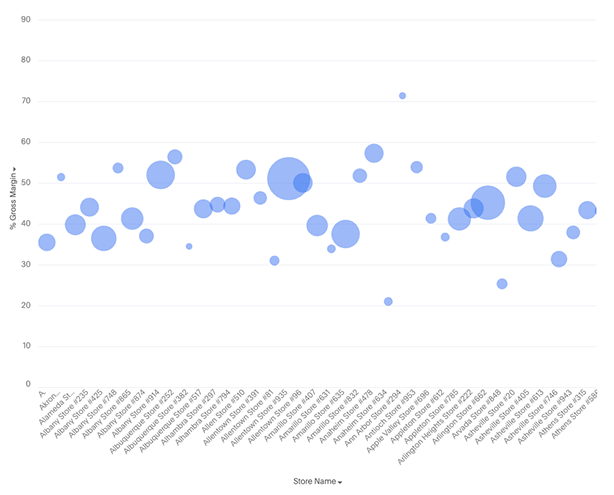
Your search needs at least one attribute and two measures to be represented as a bubble chart. Add a third measure to control bubble size.
New features
-
Three-measure visualization: Use the first measure for the X-axis, the second for the Y-axis, and the third to control bubble size
-
Color slicing support: Apply an attribute as a color dimension to visually distinguish groups of bubbles
-
Faceting support: When an attribute is added to the trellis section, the chart generates small multiples — one bubble chart per attribute value
-
Granular tooltip customization to control what information appears when hovering over a bubble
-
When either of x-axis / y-axis has measures:
-
You can do grouped / dual / multivariate axis configurations
-
When a measure is present in the axis, attributes cannot be added to the axis
-
-
When either axis has attributes:
-
faceting is supported
-
-
Additional display settings:
-
New setting to toggle between solid and hollow marks
-
Marker style allows different shapes to be displayed instead of circular markers
-