Change chart colors
You can change the colors used in a chart.
To change the colors used in a chart, use the Customize menu to dive into the chip for the column or value you would like to change. You can set colors for:
-
bars, lines, areas, bubbles, maps, and other visuals on charts
-
slice with color
-
legends on charts
-
tables for conditional formatting
You can also apply a conditional format to change the color, based on specified criteria. This type of conditional formatting does not work with Line charts.
Colors are maintained across searches within a session.
For example, when doing a search on revenue by state, each state will keep the color assigned to it even if you change the search or chart type.
Set colors on a chart
-
While viewing your search or answer as a chart, click the chart configuration icon
 to open the chart configuration menu.
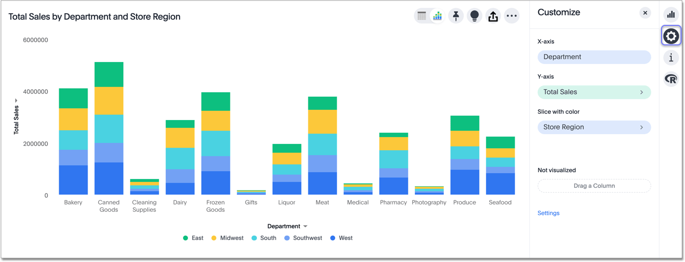
-
Click on the color chip for the column or value you would like to change. Editable chips have a more icon: >.
-
Use the color picker to choose a new color to represent that value.
You can also enter a HEX value directly.
Your changes are saved immediately.
-
Click the X at the top right to dismiss the chart configuration panel.
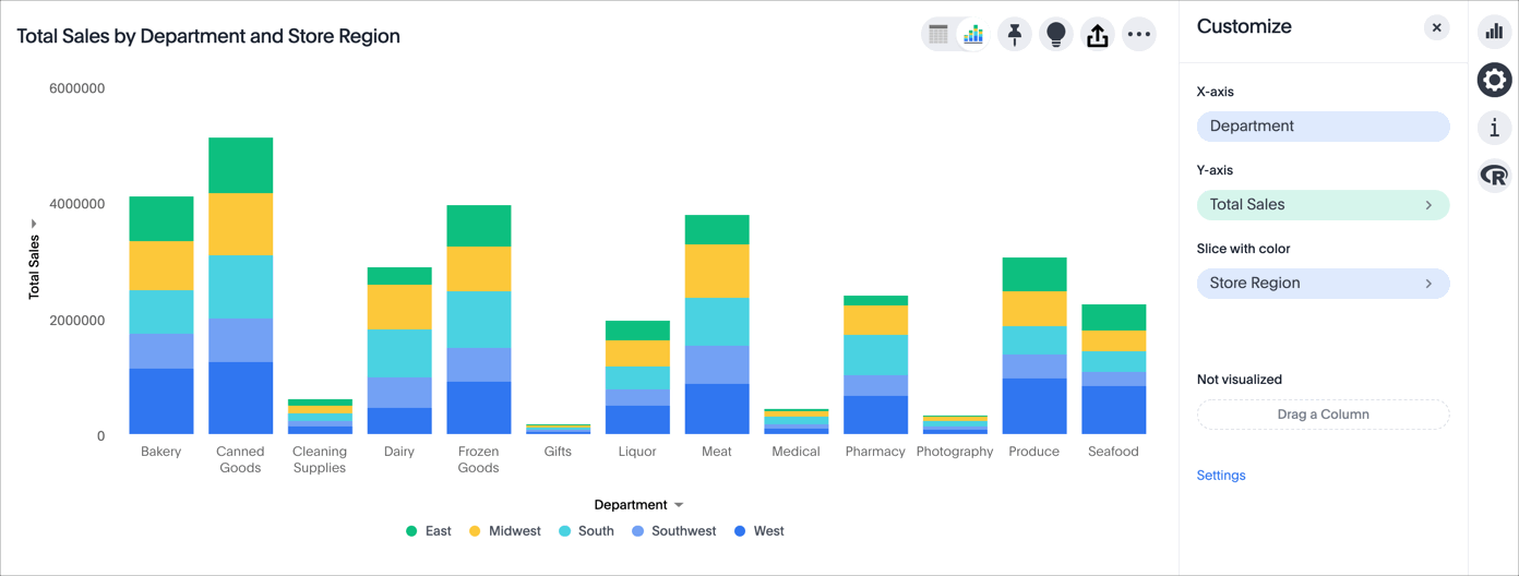
In the following example, we edited the colors used to slice with color.
Set colors from the legend
When you slice with color, or when you have more than one column on an axis, a legend appears next to or below your chart. The legend tells you the value each color in your chart stands for. You can change the colors in your chart directly from the legend. Simply click on the color circle next to a legend item, and click on a different color, or input a HEX value.
Note that you must click on the color circle next to the legend item to change the color. If you click on the legend item itself, you temporarily hide it from the visualization.


