Configure columns for the X and Y axes
You can configure specific columns to be on the X and Y axes.
You can specify which fields to show on the X axis and Y axis of a chart. When you first run a search, some measures or attributes may not be visualized. You can add them to the other measures or attributes on the axes of a chart by dragging these columns from the not visualized section in the chart configuration panel to the correct axis.
You can only add attributes to the X axis, and measures to the Y axis. If you cannot add a column to a specific axis, the option to do so does not appear to you when you attempt to drag and drop the column. Attributes appear blue in the search bar and in the Customize menu, while measures appear green.
| The X and Y axes on a bar chart work in a different way than other charts. In bar charts, attributes are on the Y axis, and measures are on the X axis. |
You can also drop attributes and measures to the not visualized section. This removes them from the visualization, but not from your search. Move items to the not visualized section either by dragging and dropping them, or by clicking the x that appears when you hover over an attribute or measure in the Customize menu. You can use this functionality to perform a hidden sort, by moving the measure column you want to sort by to the 'Not Visualized' section. Note that you cannot perform hidden sorts using attributes.
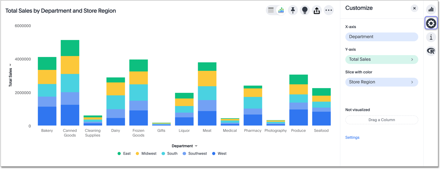
You can also drag and drop attributes into the slice with color section, which appears for certain chart types, such as column or bar charts, if you have more than one attribute in a search. Note that you can only use an attribute to slice with color.
Slicing with color enables you to separate data already sorted by an attribute into subcategories denoted by color, based on another attribute in your search.
In the following example, we sliced sales for each department by store region.
You can also drag and drop attributes into the slice section, which only appears for scatter and bubble charts. It allows you to break up data based on an additional column in your data. For scatter and bubble charts, you can both slice and slice with color.
To drag and drop columns to the correct axis, or to the slice with color or slice section, follow these steps:
-
Click the chart configuration icon
 on the top right.
 -
Drag and drop a measure or attribute from the not visualized section to the correct axis, or from an axis to the not visualized section. You can also move something to the not visualized section by clicking the x that appears when you hover over an attribute or measure. Or, drag an attribute to the slice with color or slice section.
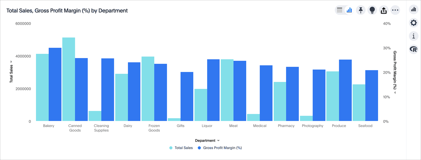
In some cases, the y-axis labels appear on either side of the chart (left and right) instead of stacked on the same side, depending on the parameters of the analysis. Refer to change the position of the axis and change the grouping.
For a list of chart types to which this applies, see Charts with multiple measures on the y-axis.


