Pie charts
The pie chart is a classic chart type that displays your search in a circle. The default pie chart in ThoughtSpot displays data in the shape of a doughnut, or a thick ring.
How pie charts divide data
Pie charts divide your data into sectors that each represent a proportion of a whole circle.
To display the exact values of each slice and the percentage values, select the Chart configuration icon ![]() > Settings > All labels.
> Settings > All labels.
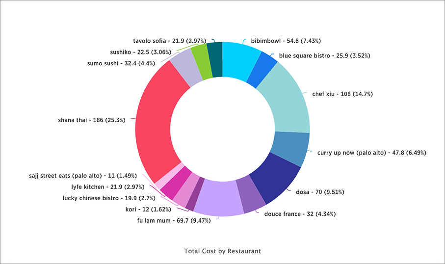
Your search needs at least one attribute and one measure to be represented as a pie chart. Also, there must be fewer than 50 values in the attribute column.
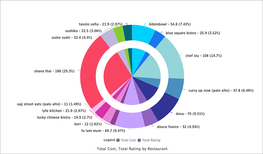
Pie in pie charts
The pie in pie chart can be created from a regular pie chart in order to compare more than one component of an attribute. Pie in pie charts show two concentric pie charts comparing different measures.
To see a pie in pie chart, assign two different measures to the Size section under Edit chart configuration ![]() .
.
Color customization of pie in pie charts
You can customize the colors of each pie in a pie chart using the Style widget. Note that if you have a pie in pie chart, you change the colors for both widgets that apply to the same attribute value.
-
Select the Chart configuration icon
 .
. -
Under Category, select the attribute whose colors you would like to change.
-
Select the Color dropdown menus for each attribute value and change them.
-
Select the x in the upper right of the panel.
-
Optionally, select Reset to use the default color.
-
Save your changes.


