Line charts
Line charts are good at showing trends over intervals of time. Like the column chart, the line chart is one of ThoughtSpot’s simplest, yet most versatile charts. ThoughtSpot often chooses the line chart as your default visual representation.
Line charts display your data as a series of data points connected by straight line segments. The system orders the measurement points by the x-axis value.
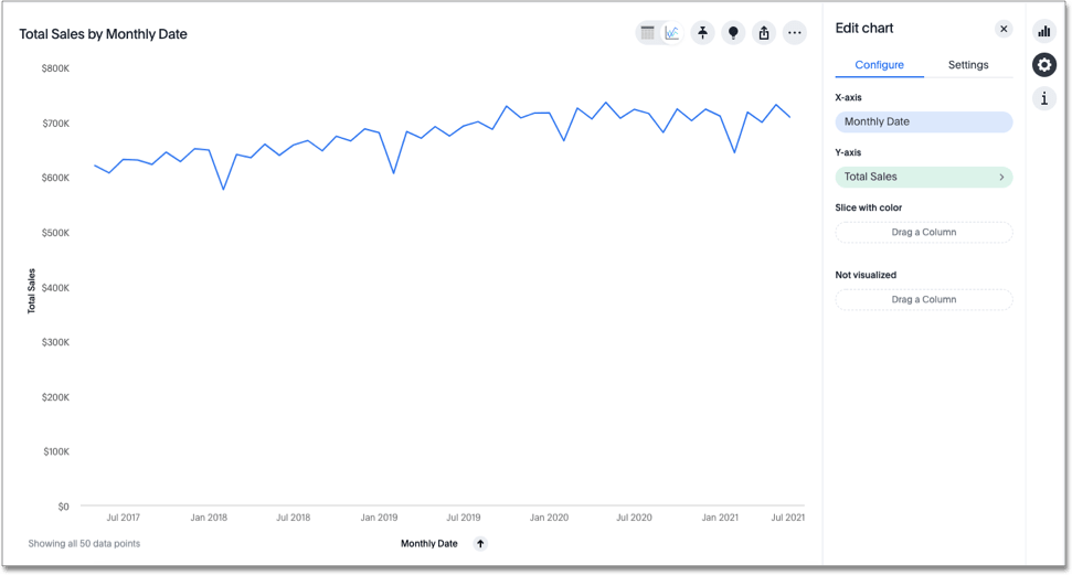
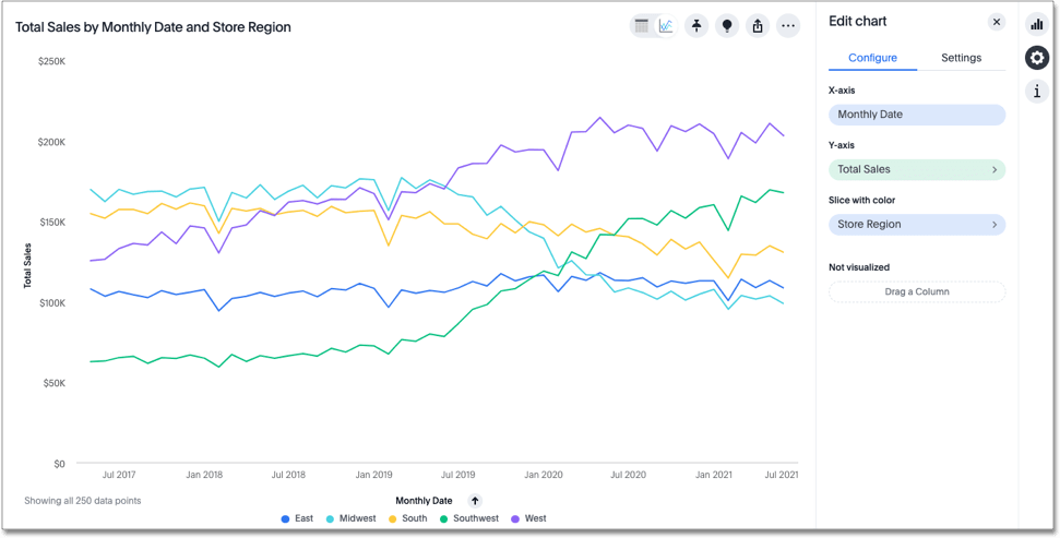
Your search must have at least one attribute and one measure to be represented as a line chart. If your search has multiple attributes, you can slice with color to sort by the second attribute.
Was this page helpful?Give us feedback!


