Column charts
A column chart is the most versatile chart type.
The column chart is one of ThoughtSpot’s simplest, yet most versatile chart types. More often than not, the column chart is your default chart type.
Column charts are vertical bar charts that display your data using rectangular bars. The length of the bar is proportional to the data value.
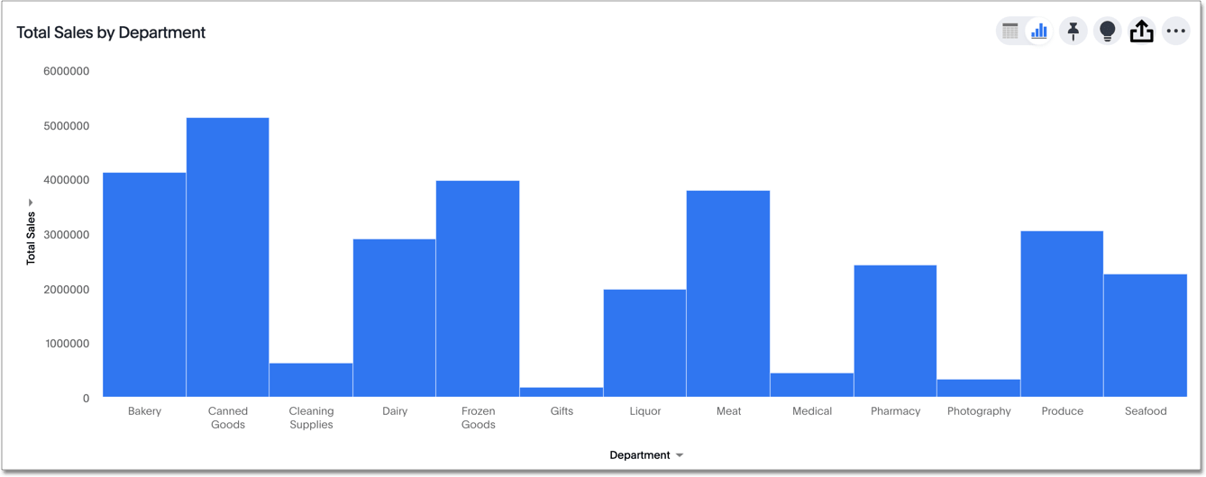
Your search needs at least one attribute and one measure to be represented as a column chart.
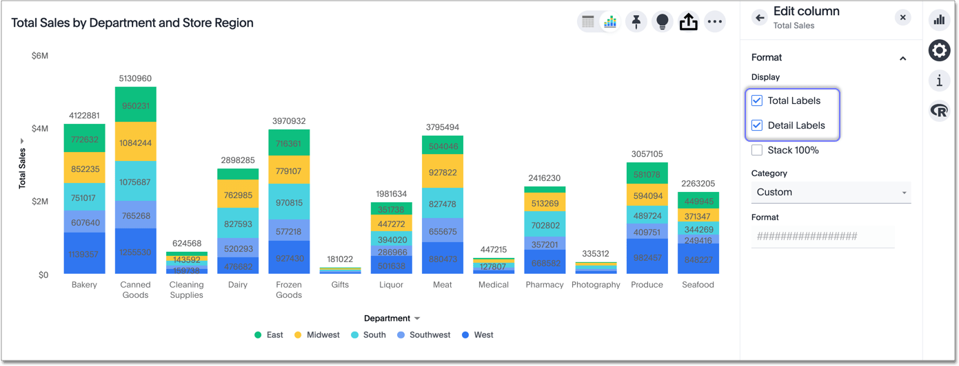
Stacked column charts
The stacked column chart is similar to the column chart, but with one major difference. It includes a legend, which divides each column into additional sections, by color.
Stacked column charts are typically used when you want to compare aggregated data and the data that it includes together. You can click on a configurable axis chip (any axis chip with a >) to show Detail Labels (summaries for each section of each bar) or Total Labels (show the sum of the stacks at the top of each stack).
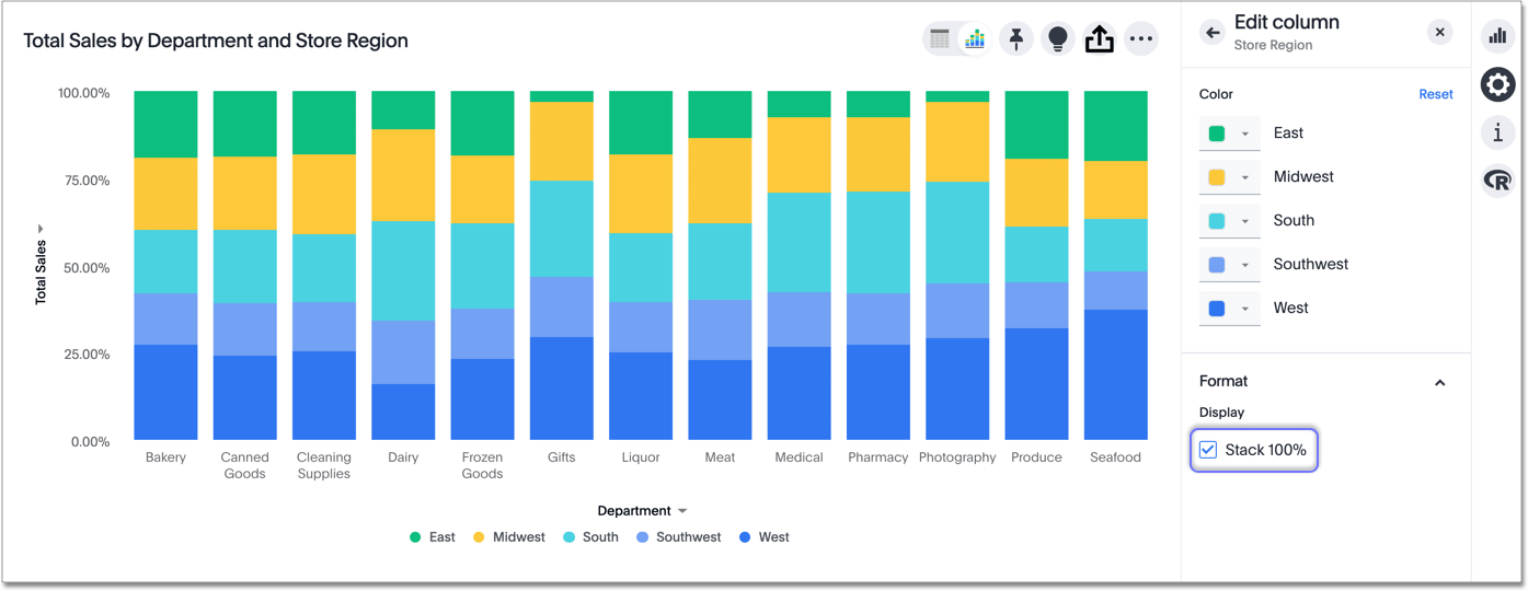
You can also plot the y-axis as a percentage, adding up to 100%. Click on the measure or attribute chip that you are using to slice with color. Under Format, toggle Stack 100% on or off. You can also toggle Stack 100% from an axis chip, as in the image above. This feature is also available for stacked area and bar charts.
Your search needs at least two attributes and one measure to be represented as a stacked column chart.


