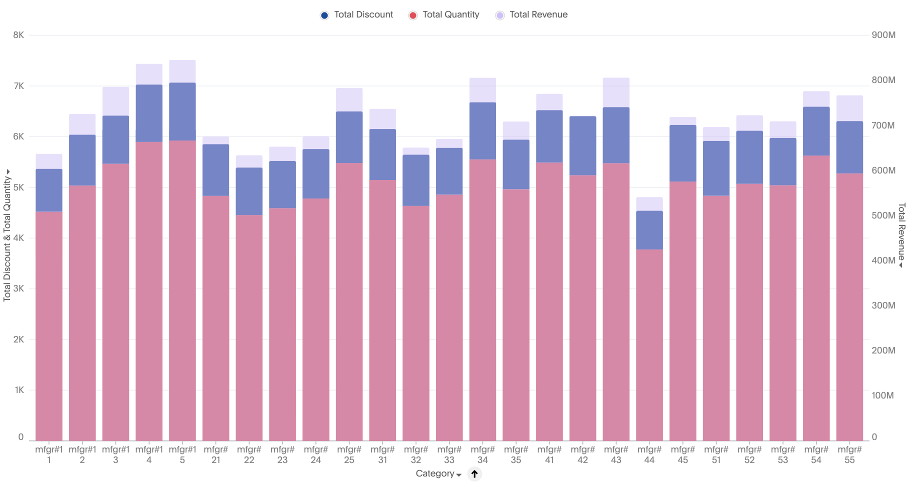
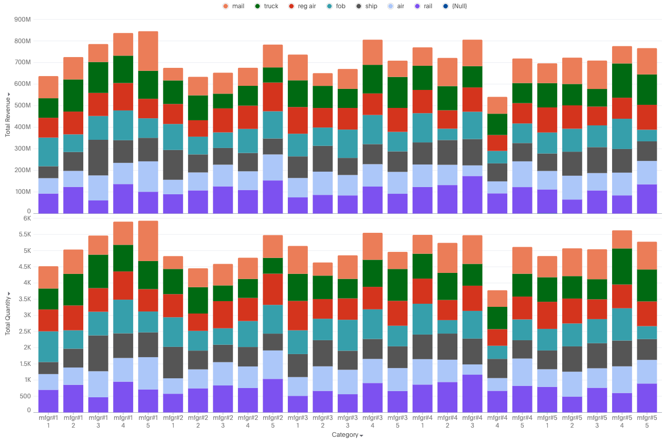
New stacked column charts
The new stacked column chart is similar to the new column chart, but it stacks different segments (based on an attribute) within each column, using color to distinguish the segments. You can only use an attribute to slice with color.
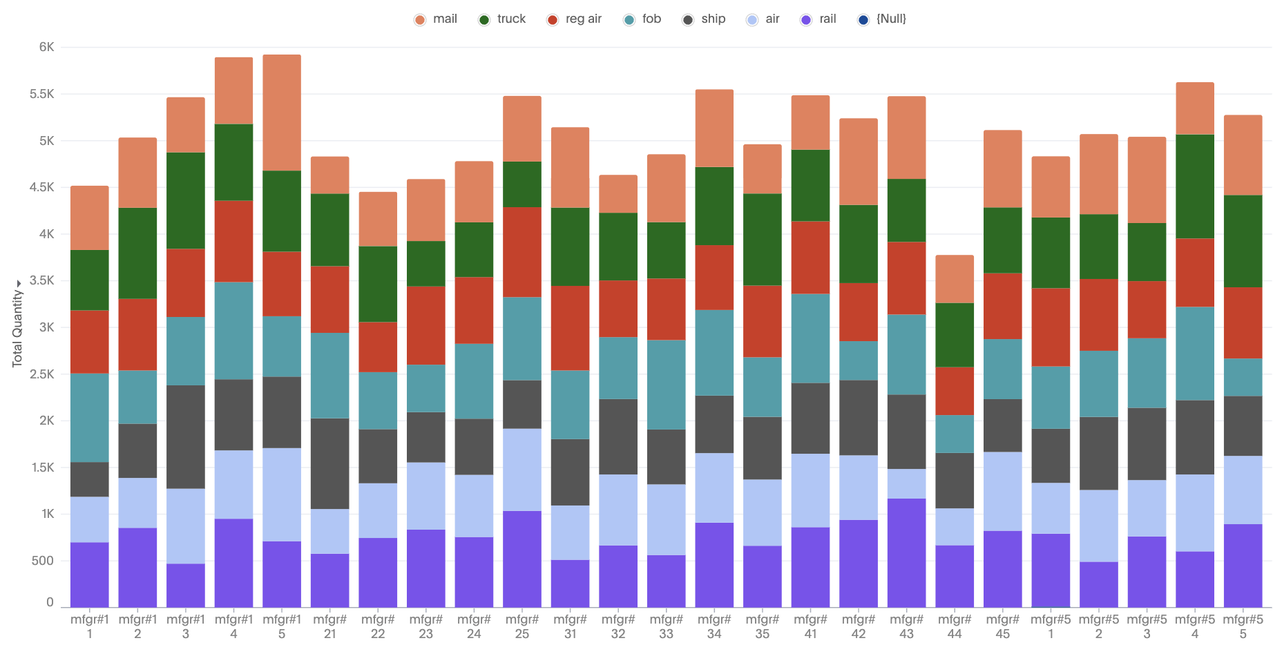
For any combination of attributes and measures, you will see a stacked column by automatically changing the configurations.