Combination: multiple panes
This example will walk you through how to create a chart that is a combination of different mark types.
-
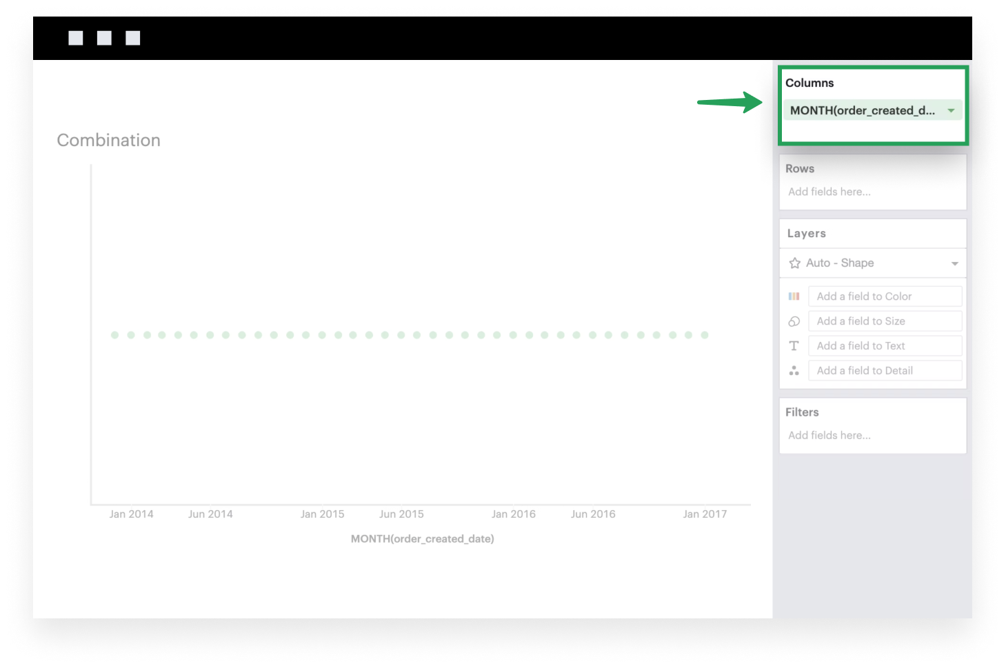
Add a field to Columns. This is generally what you want to see on your x-axis. The example below uses a time series.
-
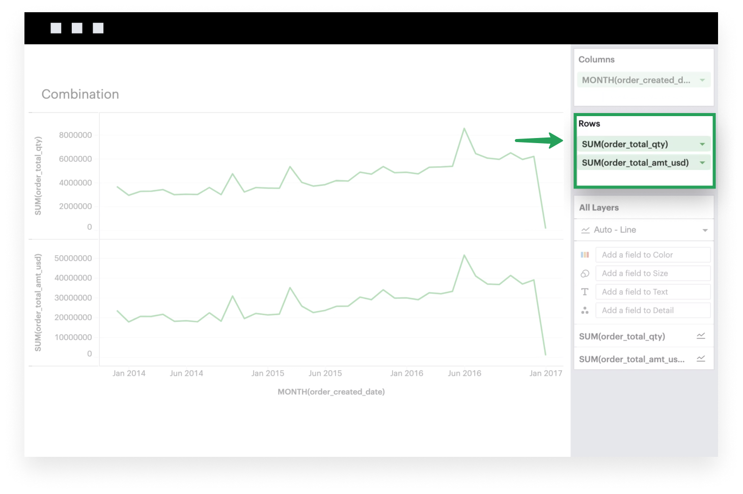
Add measures to Rows. These are fields that you may want to plot on your y-axis. Each measure corresponds to a Layer in your visualization. The example below examines the total quantity of orders received and the total dollar amount of those orders.
-
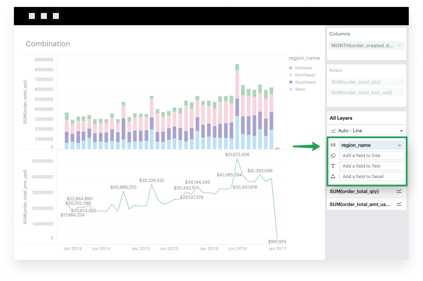
Each Layer has its own set of properties, which means you can configure each Layer independently of one another. In the example below, we’ve sliced the
SUM(order_total_qty)Layer by Region (top pane) and added labels to theSUM(order_total_amt_usd)Layer (bottom pane).