Line
One measure
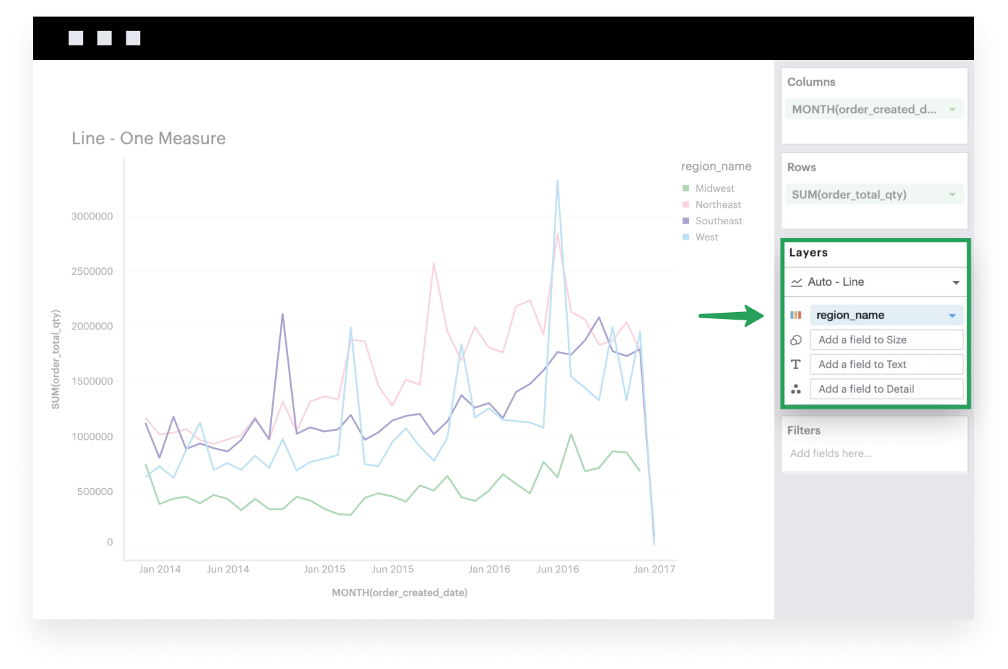
This example will walk you through how to create a simple line chart when you have one continuous, aggregated field that’s broken down by some dimension.
-
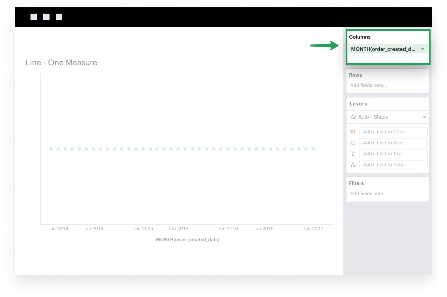
Add a field to Columns. This is generally what you want to see on your x-axis. The example below uses a time series.
-
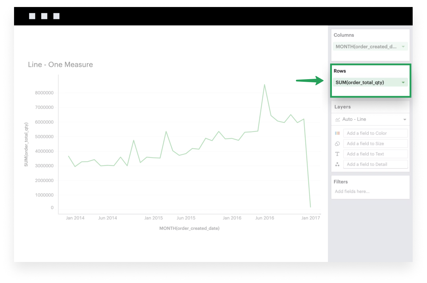
Add a continuous, aggregated field to Rows. It will be plotted along the y-axis of your visualization.
-
If it isn’t already, make sure to set your Mark Type to
Line.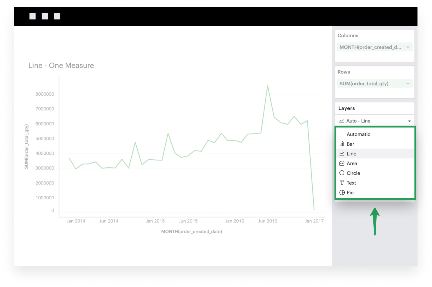
-
Add a dimension to the Color channel. Your chart will split into multiple lines, with each series representing a group within your dimension. You should also now have a legend that maps each color to the corresponding series names.
Multiple measure
This example will walk you through how to create a simple line chart when you have multiple continuous fields.
-
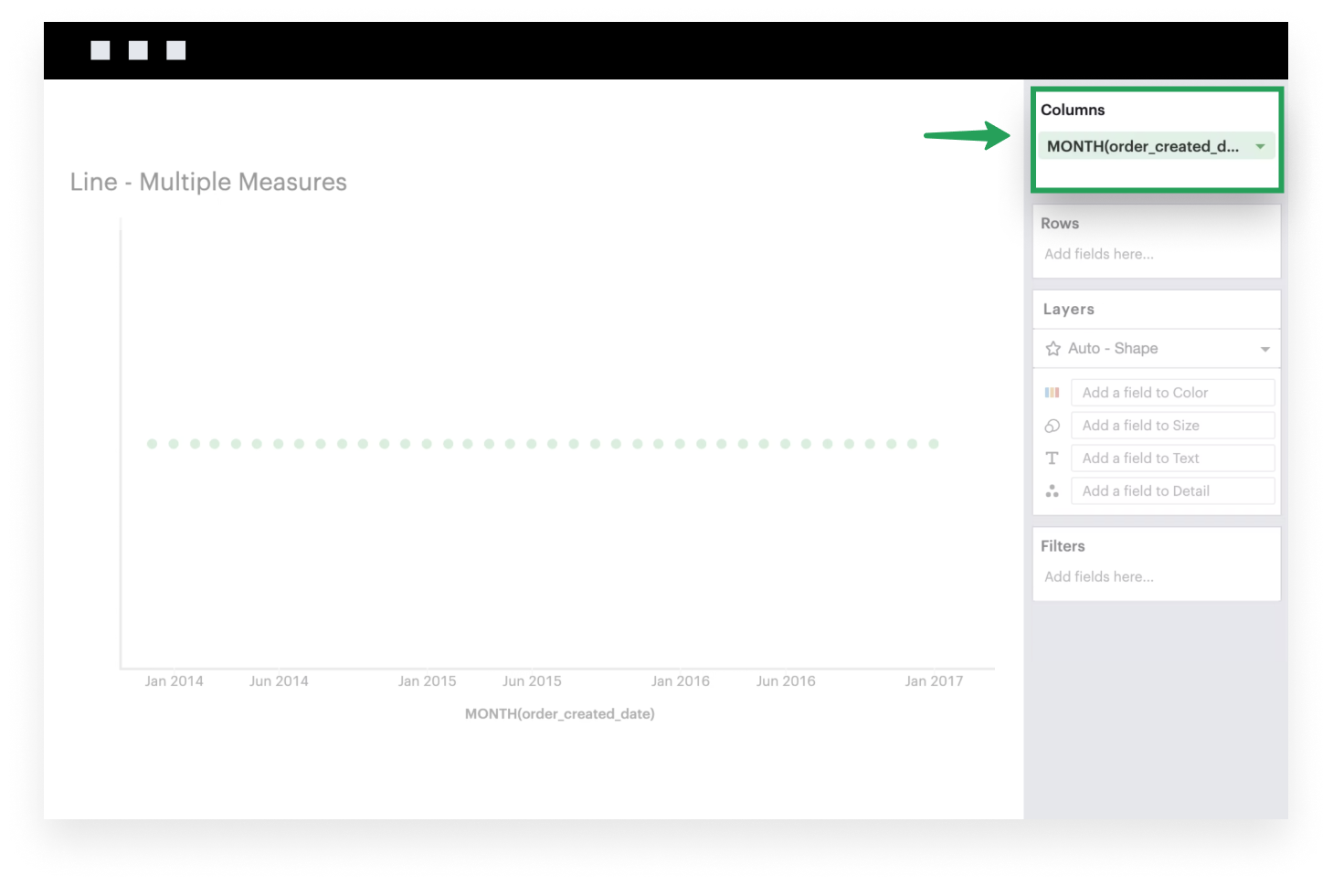
Add a field to Columns. This is generally what you want to see on your x-axis. The example below uses a time series.
-
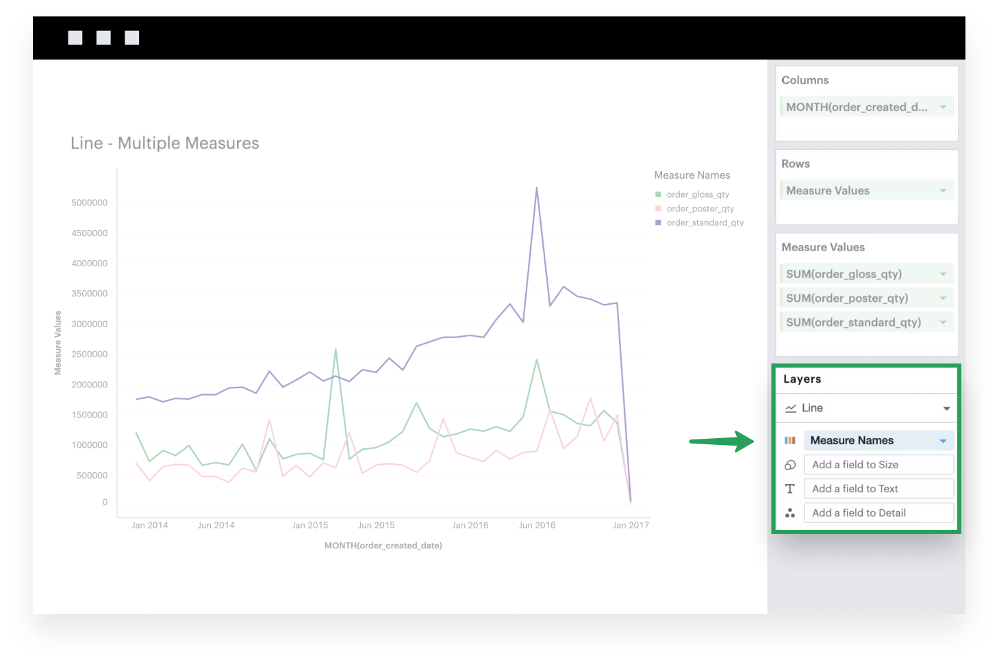
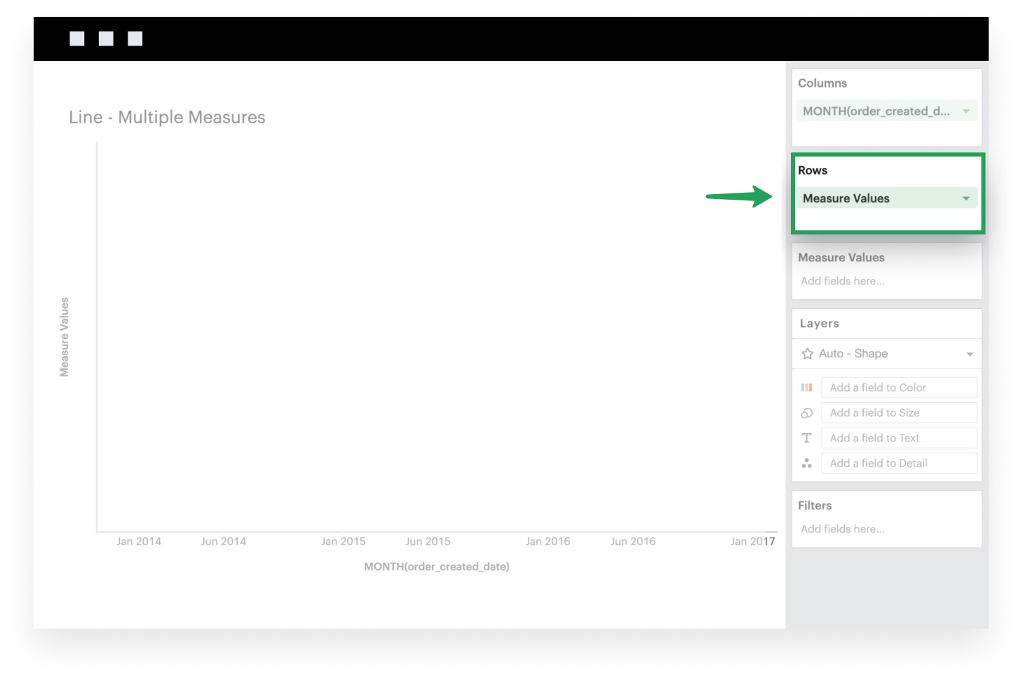
Add the system-generated Measure Values to Rows. After you do this, you’ll see that the Measure Values shelf appears.
-
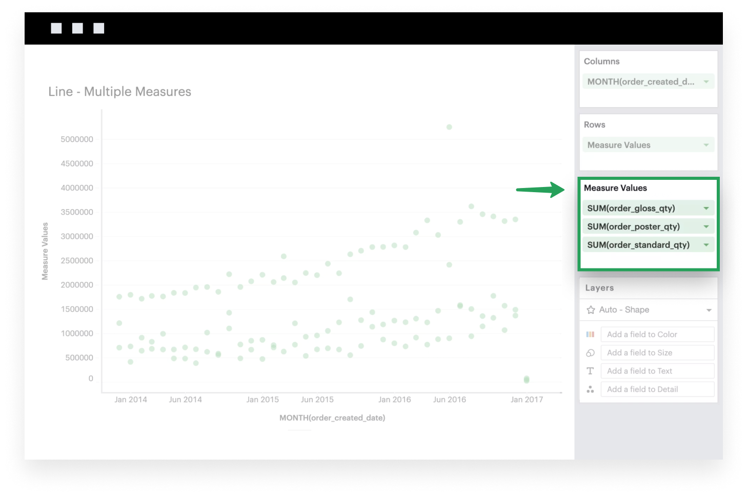
Add continuous, aggregated fields to the Measure Values shelf to plot them on your visualization. These fields will be plotted along the y-axis of your visualization. You can think of the Measure Values field as a placeholder or variable that references the list of measures you add to the Measure Values shelf.
-
If it isn’t already, make sure to set your Mark Type to
Line.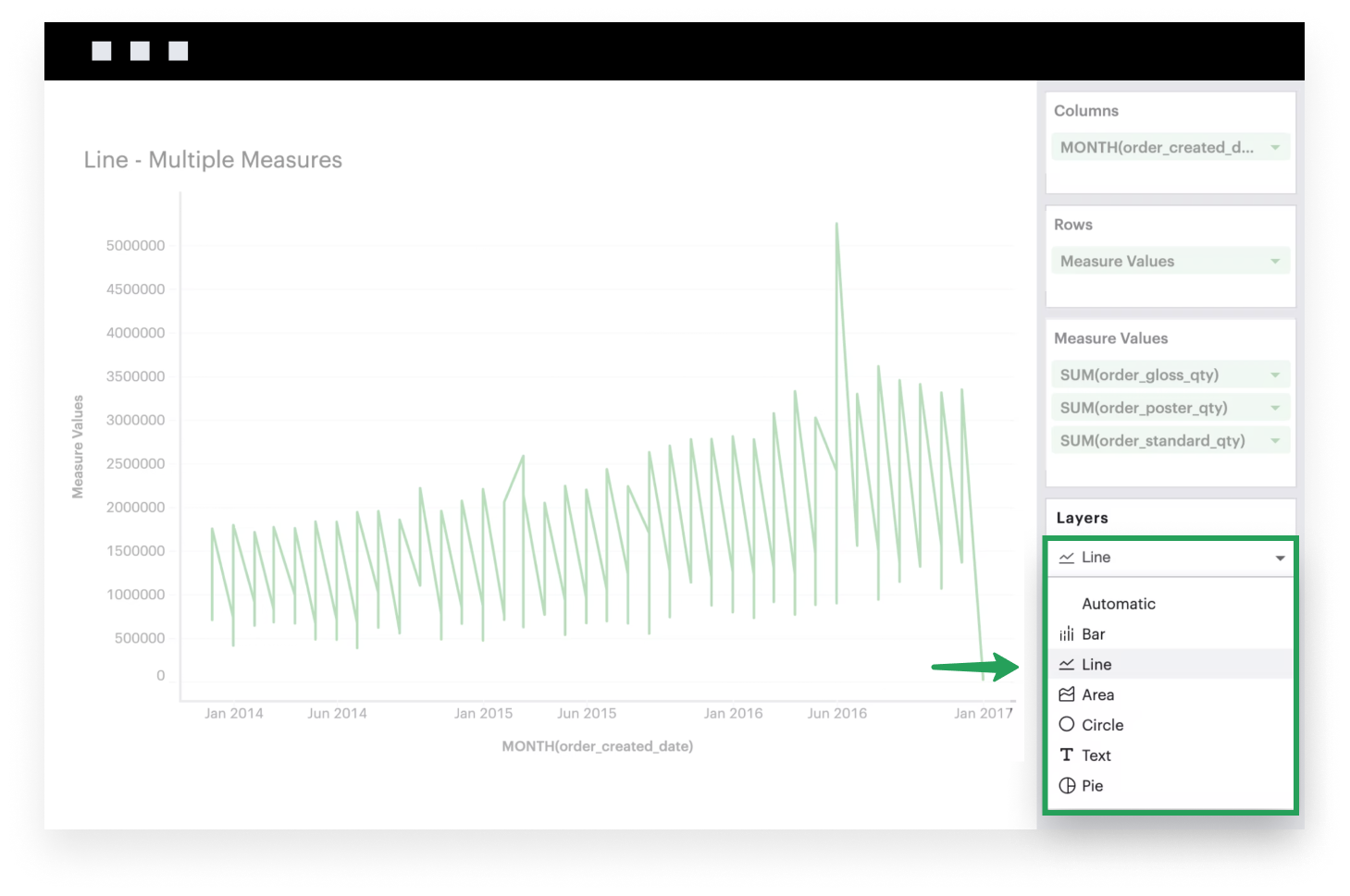
-
Lastly, add Measure Names to the Color channel. This will ensure that each field in your Measure Values shelf is now its own group within a bar. You should also now have a legend that maps each color to the corresponding field names.