Understand charts
Charts display your search answer in a visual way.
Your search needs at least one attribute and one measure to be presented as a chart. When you choose to display your answer as a chart, ThoughtSpot will assign it the best fit chart type.
| Colors are maintained across searches within a session. For example, when doing a search on revenue by state, each state will keep the color assigned to it even if you change the search or chart type. |
You can choose from a large number of chart types in ThoughtSpot. Each chart type provides you with a different visualization for your answer.
You can also adjust the axes, labels, and view of the chart.
About chart types
You can choose from a large number of chart types in ThoughtSpot. Each chart type provides you with a different visualization for your answer.
To change the chart type of your answer:
-
Select the Change visualization icon
 to get a palette of chart types you can choose from (scroll down to see more.)
See also Chart types.
-
Select a different chart or visualization type.
Control default and available chart types Beta
You can now control the default display mode for Answers (table or chart). You can also decide which chart types are available and default for your cluster. For example, you can set the default chart type for an Answer as a bar chart. You could also decide to remove pie charts from your cluster. To enable this feature, contact ThoughtSpot support with details about which charts you want to designate as available, or which chart you want to designate as default.
Choosing a chart
|
-
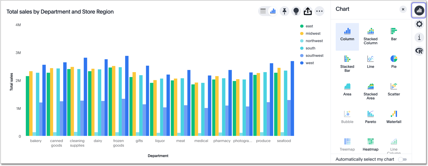
The column chart is one of ThoughtSpot’s simplest, yet most versatile chart types. The column chart is often the chosen default chart type, and displays data as vertical columns.
-
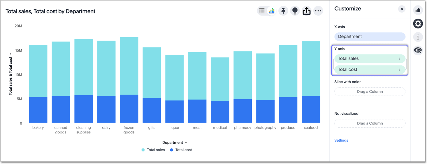
The stacked column combines the different secondary dimensions into a single column, stacking them.
The dimensions retain their relative size and color. -
The bar chart is nearly identical to the column chart. The primary difference is that it displays data as horizontal bars.
-
Stacked bar charts
Just like stacked columns, stacked bars combine the different secondary dimensions into a single stacked bar. -
Like the column chart, the line chart is one of ThoughtSpot’s simplest, yet most versatile chart types.
More often than not the line chart will be chosen as your default chart type.
-
When you search a single measure, such as
Sales, ThoughtSpot automatically creates a KPI chart displaying the topmost value of that column.Add a time-related keyword to your Search to view a sparkline visualization of your key performance indicator.
-
The pie chart is a classic chart type that displays your search in a circle. The pie chart ThoughtSpot shows is in the shape of a doughnut.
-
The area chart is based on the line chart, but has filled in regions.
-
This option stacks the values of one dimension on top of the other, enabling you to clearly see the relative volume of data under the line.
Contrast this with the presentation in the area chart, where data for different overlaps.
-
The scatter chart is useful for finding correlations or outliers in your data.
-
The bubble chart displays three dimensions of data with each containing a set of values.
-
The pareto chart is a type of chart that contains both columns and a special type of line chart.
-
The waterfall chart is used to show how an initial value is affected by a series of intermediate positive or negative values.
-
The treemap chart displays hierarchical data as a set of nested rectangles.
-
The heatmap chart displays individual data values in a matrix following a color scale.
-
The line column chart combines the column and line charts.
-
The stacked line column chart combines line and stacked column charts.
-
The funnel chart shows a process with progressively decreasing proportions amounting to 100 percent in total.
-
Pivot tables in ThoughtSpot use the well known drag-and-drop interface.
Creating a pivot table enables exploring alternate visualization of data in a wide table.
The basic idea is that some data is easier to consume when laid out horizontally, while others, vertically.
-
Sankey charts show a flow from one set of values to another, usually with visual emphasis (brighter colors or larger bandwidths) for comparison of the values (for example, top cities in terms of sales might be emphasized).
-
Radar charts display multivariate data on a two-dimensional chart of three or more quantitative variables that plot on axes (spokes) that originate at the same point.
-
Candlestick charts efficiently collapse financial information, such as price movements on a single day, into a unified representation.
A single 'candlestick' shows the open, high, low, and close prices for the same day.
Charts with multiple measures on the y-axis
You can have multiple measures on the y-axis of many charts, which is a great additional way of presenting information in a chart.
A stacked column chart displays the measures stacked in the same column, while a column chart displays the measures side by side.
The following charts support multiple measures on the y-axis:
To learn more, see Configure columns for the x- and y-axes.
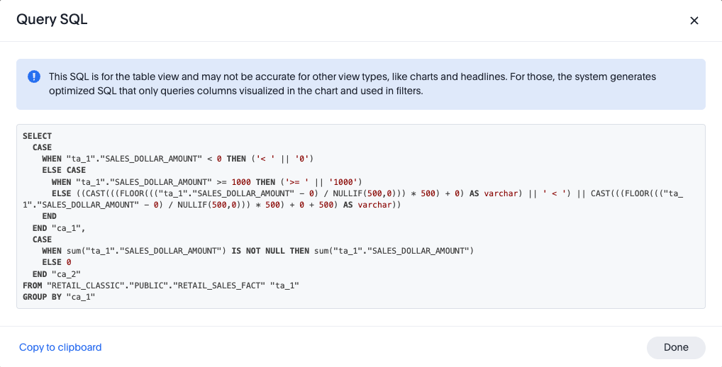
Query SQL
You can view the SQL query used to generate the chart by doing the following:
-
Click the Query visualizer button
 .
. -
Click the Query SQL button.
Parameters in axis and column names of charts and tables
You can add a parameter name directly in chart components like axis labels and column names in an Answer. When you select a different parameter value in the Answer, the data and contextual information (axis names, column names, and legends) change to reflect the parameter selected. Any place a parameter is used in Liveboards or Answers automatically displays the current information associated with the selected parameter value.
Adding parameters to an axis or column name in an Answer
To add a parameter to an axis or column name of a chart, do the following:
-
While viewing your Answer in either chart or table view, select the chart configuration icon
 at the upper right to open the Edit pane.
 -
Add your parameters by doing either of the following:
-
In chart view, click an X or Y-axis or Slice with color chip.
-
In the table view, click a Visible Column chip.
-
-
The Column Name field opens.
-
Enter an ampersand (@) to display the list of parameters available to you in your Answer.
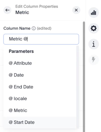
-
Click the parameter you want to use.
-
Add any additional parameters to other column names, if needed.
-
When you are finished, click Save.