New column charts
The new column chart is one of ThoughtSpot’s simplest, yet most versatile chart types. More often than not, the column chart is your default chart type.
Column charts are vertical bar charts that display your data using rectangular bars. The length of the bar is proportional to the data value.
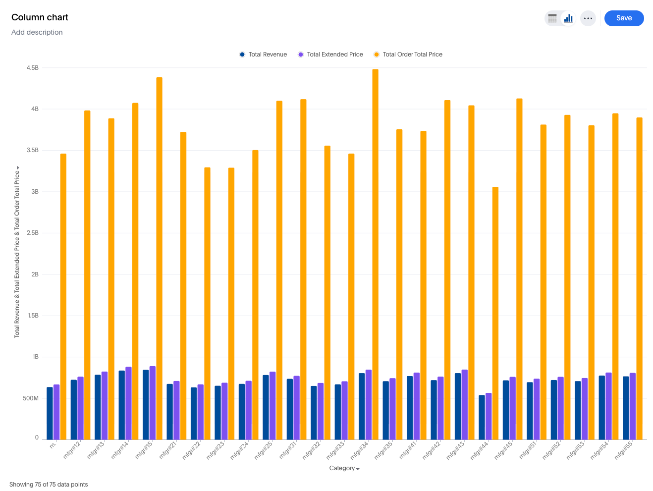
Your search needs at least one attribute and one measure to be represented as a column chart.
New features
-
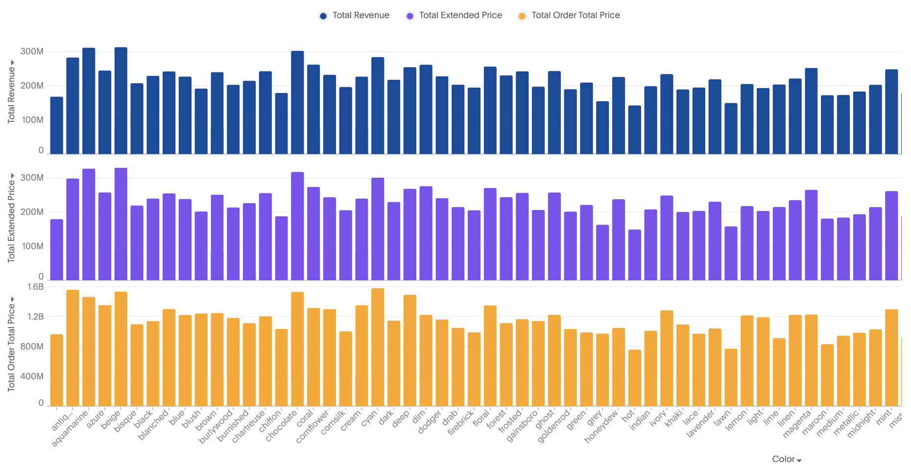
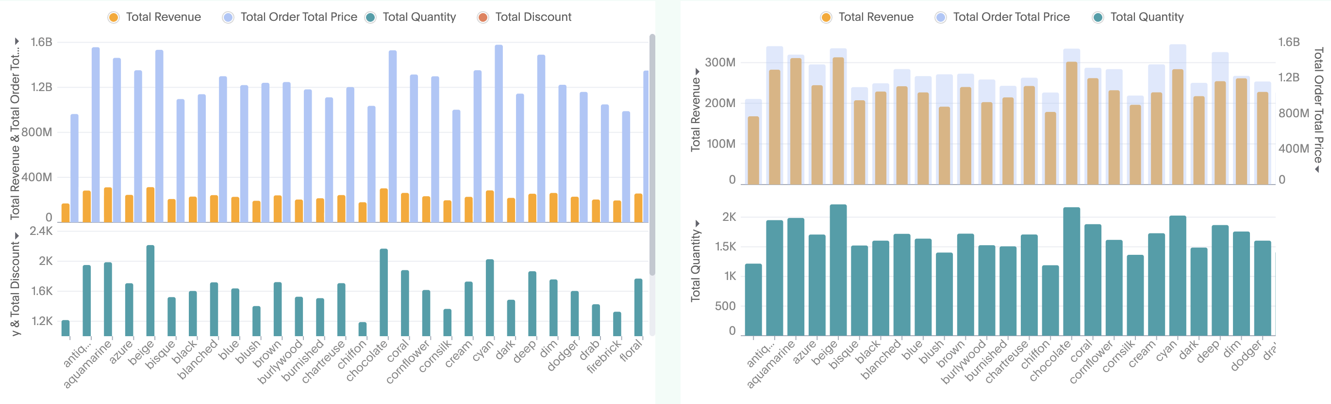
Multivariate charts: Each measure is an independent smaller chart
-
Multivariate-grouped chart for multiple measures: Small independent charts which belong to different measures, with the color slice of measure as a separate column
-
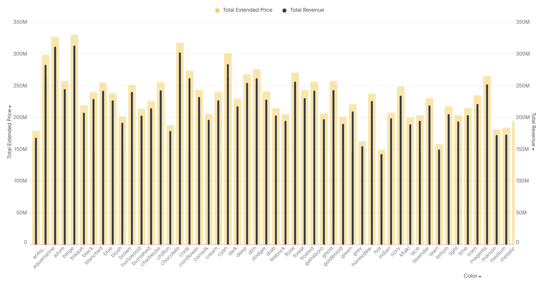
Bullet chart: Each measure is part of either axis in a dual axis configuration
-
Complete flexibility to handle any combination of grouped or dual axes
-
Ability to apply color slicing even when multiple measures are plotted